even though we are living in a rental house, one thing i really wanted to change about grady's room
was the existing ceiling fan. it was SO unattractive, and not fitting for a kids space.
i wanted something with a little more personality. i know--MORE personality than a ceiling fan? not hard to do, right?
since most of the items in his room have a traditional feel to them, i wanted
a light fixture that was a little more modern and whimsical.
my little man LOVES legos, and in particular, star wars legos. so, when i spotted the
orbit chandelier from z gallerie, i knew i had found the perfect light for his room.
this past weekend, i picked it up at the store, brought it home and begged my husband to install it:
grady's eyes lit up when the last bulb was in place, and when we flicked on the switch,
he grinned from ear to ear, and said "it looks like like an exploding death star!"
what a BOY.
:)
and, on a side note--i finally hung one thing on the wall...the cork board map!
yay!
▼
Jan 31, 2012
Jan 30, 2012
before + after: e-design library/music room
as promised- a few better images of a recently completed e-design plan
for a formal living room turned into a library/music room...
but first, some before pictures.
as you can see, the room is large, has high ceilings, and is open to the foyer.
the walls were already a dark red, so i knew the homeowners would be open to painting them an equally dark (but much less vivid) charcoal grey.
and, the AFTER pictures:
as you can see, we painted the walls a dark charcoal color, which the room can handle because of the high ceilings, and the fact that one wall is entirely open to the entry and hall. all of the bookcases, the piano, and the love seat already belonged to the homeowner...we added the chairs, the ottoman, a new rug, a new side table, and some lamps to spruce the room up and add some character.
there are still a few minor pieces missing--a side table for one of the blue chairs and a floor lamp next to the love seat, but overall, i am SUPER impressed with what my client has been able to accomplish. i finished this plan in late november, and even with the holidays, she managed to accomplish SO much.
interested in working together to create a more functional and beautiful space?
email me for rates at autumnclemons@yahoo.com
Jan 27, 2012
judging a book
admit it.
you do it too-
judge the interior of a house based on the way it looks from the outside...
i do it all the time. i love driving through historic and high-end neighborhoods, taking in all of the beautiful architecture. sadly, i am usually disappointed when i catch a glimpse of the interiors, as most homes are not as glorious on the inside as they are on the outside.
i am fairly certain the interiors of these houses are just as amazing as the exteriors.
happy daydreaming friends!
i liked this image so much, i pinned it THREE times!
(pinning past midnight is sometimes a bad idea)
happy weekend!(pinning past midnight is sometimes a bad idea)
Jan 25, 2012
design plan: library/music room
here is a look at a design plan that i recently completed for a formal living room
that will be turned into a library/music room.
the homeowner already had a piano that she wanted to keep in the room, and 4 bookcases (2 sets of 2 matching bookcases) scattered throughout the house.
here is the way the room originally looked:
and here is a peek at the room now....
that will be turned into a library/music room.
the homeowner already had a piano that she wanted to keep in the room, and 4 bookcases (2 sets of 2 matching bookcases) scattered throughout the house.
here is the way the room originally looked:
once everything is in place, i will get some additional pictures to show you!
Jan 23, 2012
where am i?
can you figure out where i am?
look carefully at the pictures, and let me know when you figure it out:
a close up of the above wall covering.
hand scraped wood floors.
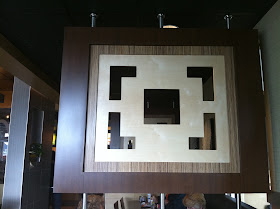
textured plexiglass panel separation.
wall tile.
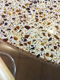
closeup of one of the three different countertops.
detail of regular height chair.
still having trouble?
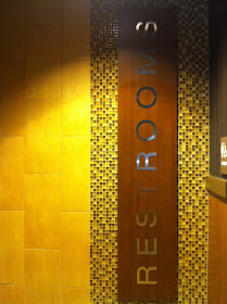
let go inside the restrooms. maybe that will help...
hmmmm.
fireplace. complete with a cozy ottoman.
ceiling details....
bar stool.
chandelier.
still trying to figure it out?
how about a bigger hint....
du-------wha?
are you are shocked as i was?
(and yes, behind the etched golden arches on that glass is a water feature!)
can you believe the finishes in this joint??
i just HAD to post this!
hey, i know all the hoopla surrounding mcdonalds....i agree that most of their food is not very healthy, and that we, as amercians eat way too much it, BUT, as a designer, i was totally impressed with this new mcdonlads that opened near my home. honestly, when my family and i first walked in, i felt like i was in an upscale cafe. i really appreciate all of those little and not so little details and layers that go into making a space feel cozy and interesting...and the design team behind these new restaurants did a great job accomplishing that!
what did you think?
did you figure it out? and if so, when?
have you been in similar mcdonalds?
do you like that the interiors of some fast food restaurants have been "super sized"?
does if effect how many times you will or will not eat there?
let me know...i am so interested in this!