Feb 28, 2013

kitchen plans

i know i am SO far behind in posting about my house....i have just been so busy laying the hardwood floors with my husband and working that i just haven't had the time.

however, i did want to share the design drawings for the kitchen. we went with millbrook cabinet designs. they don't have a website (yet), but they have been amazing to work with and i have been really pleased with their service and craftsmanship. they are located in north salt lake.

for reference, here is the main floor plan of my house:

all of the surround cabinets will be painted swiss coffee by benjamin moore, and will be a simple shaker style cabinet like this:

here is the "side" wall of the kitchen...the long wall to the side of the island:
the bulk of this wall will be the freezer and refrigerator, and pantry. we decided to go for separate freezer and fridge units. we love the look of built-tins, but they were out of our price range. we managed to find these from kenmore at a really reasonable price:


the back wall will have the range, two windows and upper and lower cabinets. the tower on the left will
have open shelving. i thought about doing floating shelves, but ultimately decided that i liked the enclosed open shelves better.


the hood will be slanted slightly, so that i can put some art up there if i want. we are still on the hunt for an affordable 36" range.

and finally: the island: (and a side view of the hood)
the microwave will be under the counter...something i have never had before in a house. since that back wall is visible from the front door, i didn't want the microwave there. the island was the only place it would really fit. one of the things i am really excited about are the drawers under the sink, instead of standard cupboard doors! things have a tendency to get "lost" in my under-sink cabinet, so i am looking forward to items being more accessible.

the island is going to be a mix of painted wood and straight grain oak that will be wire brushed and wiped with a wash! i will be sharing more about that soon. i am REALLY excited to show y'all!

Kitchens Glasgow offer a great service for design and installation for your new kitchen.

Feb 27, 2013

master vanity design in progress

since i knew i wanted the floor and shower in my new master bath to be a light marble, i decided pretty quickly that i wanted the vanity to be wood. i love the warmth that wood can bring to a space.
as a was looking around for inspiration, i turned to one of my favorite furniture designers--
the new traditionalists. 
they have the most beautiful pieces in their collection...pieces that are that perfect balance of traditional and modern.
here is a sampling:


 are you dying over the complete and utter gorgeousness of these??


here is the credenza that i used as inspiration for my vanity:

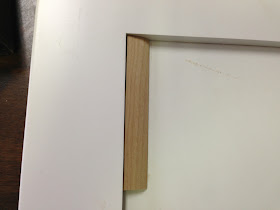
when i showed the pictures to my cabinet maker, he said it would be pretty expensive to duplicate, so he came up with the idea to make a simple, shaker style cabinet and then put a small piece of trim on the inside.

at first, he suggested an angular trim with a slight groove in it:


while i liked the way it softened the edge of the cabinet, i wasn't in love with it, so i asked if he could get some trim that had a softer, radius edge.


aha!
i liked that much better.


here are the two pieces next to each other for comparison:
i also asked if he could make the sides as slender as possible. i really like the delicate edges and detail on the credenza by the new traditionalists, and felt the proportions of the edges (rails) to the flat pieces (panels) would be improved this way.

here is a sketch of the vanity:

 i stopped by yesterday to check on a color sample for the island, and they had just completed the drawer fronts!
i am super excited to see them stained and seeing the entire vanity completed!


Feb 23, 2013

affordable find: hoof legged table

sometimes, all a room needs to elevate it is the addition of a very unique personal item, or something just a little bit quirky. i think either of these tables fit the bill...


hoof legged table $99 from z gallerie

heres to a happy weekend!

Feb 22, 2013

latest lighting purchases...

building a house means buying a LOT of stuff. (i have piles of boxes in my house right now, and i LOVE it!) i have been trying to slowly buy light fixtures and plumbing fixtures over the last few months to spread out the cost.

here are my latest lighting purchases:
i originally thought i wanted to put it in my laundry room, but i am also considering putting it in my oldest daughters room or even the entry.

it is really BIG, but the finish on it isn't ideal...it has a slight copper tinge to it that i don't LOVE, but once it is up, i don't think it will be very noticeable.


i also bought two of these for my mudroom:
seriously, how great are these lights? they look a lot like a few from circa lighting that i have been coveting for--ever, but they are only $129 each!
i had been searching for something that had some personality, was just a little bit quirky, and had at least 2 bulbs. most of the ones that i have been considering were only one bulb, and i was worried that i needed a little more light in the mudroom. i was so happy to come across these!

sorry i haven't posted a construction update post in a while! the last few weeks have been really, really busy. my husband and i have been installing the hardwood floors and it is brutal work. in fact, it kinda reminds me of being pregnant...the process can be messy, it takes FOREVER, and it makes you really, really tired, but it is SO worth it in the end!


Feb 21, 2013

my new house: master bathroom idea board

i am a lot closer to making some decisions in my master bathroom, and i thought i would share the design board that i created for myself...

the flooring is still undecided....i would LOVE to put in a double herringbone floor, but that may change. we may end up doing a basket weave pattern or even just laying larger tiles at an angle. we are doing all of the tile installation ourselves, and laying the hardwood has been a KILLER, so it all depends on how much time and money and ENERGY we have left. if we did opt to do a pattern tile, we will most likely but the grecian white 12 x 12 tiles from home depot and then cut them down ourselves. (which means a LOT of labor.)


i am really excited about the pattern on the shower floor! i am planning on the shower being a simple white marble tile, and i want something more bold on the floor. i looked at doing all kinds of patterns, and when i found the inspiration picture of the above pattern, i fell in LOVE. i also love that all of the materials can be purchased at my local hardware store, which means we can keep the cost low.

i ordered this light from restoration hardware, and it will be installed over the toilet. a little unorthodox, but i think it will look really fun and give some soft light.
another kind of lighting that’s a bit different for the bathroom is mirror lighting. these can really brighten up the room as well as give extra light for using the mirror you can Buy Bathroom Mirrors Online from Illuminated Mirrors.

i would LOVE, love to put this "lily" by cole and son wallpaper in the toilet closet:
but that may not happen for a while. 

i have met with the cabinet fabricator, and he has some drawings of what the vanity will look like...i will be sharing more details later in the week. (IF i have energy after we finish the hardwood floors! we are 80% done right now, and should finish everything but the powder room and mini-office tonight!)


Feb 20, 2013

the RIGHT white.

of all the paint choices to make, the most critical one is the exterior paint color. commiting to a color, means dozens of gallons of paint and thousands of dollars of labor. translation? you get it wrong, and it it going to be very, very expensive to fix. 

like i mentioned in this post, i will be painting the exterior of my house white. while that certainly narrows down my search a bit, it in no way makes it an easy one. 

i want a warm white that is slightly creamy.
but not too creamy.
a white that is soft and a little crisp at the same time. 
but not too crisp.
a white that will look great with the grey tones of the stone on the bottom of the house, and also isn't too stark to blend in with the surrounding houses.

after looking on houzz, doing a little googling, and staring at my paint deck, 
i started the sampling with 5 colors:

**i always, always tell my clients to test the colors that they are considering for the outside of their house OUTSIDE. the direct, unfiltered light can dramatically change the way colors look! a color that looks soft and neutral inside may look washed out and green outside. it is absolutely essential that you paint a swatch of the color(s) you are considering and leave them up for a few days. you NEED to see the colors in different times as well....midday, morning, evening....the colors will shift and you may "see" that the white you thought might be perfect inside the house starts to look PINK at midday. (see below)


my thoughts so far:

#1
cedar key wasn't one of the samples i went to the store to get. the paint 
guy accidentally mixed it up, and so i decided to try it out. it is a pretty color, but much darker than what i want.


#2

i LOVE the ballet white. it is a true "neutral" white. while if may look really dingy next to the snow, i am pretty confident that it will look crisp yet soft. it is my favorite so far, and once the siding is up, i am going to test it out (along with one more color) on a much larger swatch. 

#3. maritime white.
i painted the samples inside the house, and originally liked maritime white the best. but as soon as i took the samples outside, i noticed it has some slight pink undertones. i think the undertones will be even more noticeable next to the very grey tones of the stone base.

#4
baby fawn is another really nice color. it is almost the same color as the dry wall that i applied the samples on, so it gets a little "lost"...but i think it is a nice option. i think it might look great with the stone.

#5
creamy white is just that. creamy and warm and really beautiful. however, in this hunt for the right white, the cream white is just a little too warm for what i am dreaming of.


here are the samples at different time of the day....


i asked my stone mason his opinion, and he was stumped. i think they all looked the same to him.
what are your thoughts?

once i get the siding on, i will select two colors and get a large sample up, and then i will be asking for some more opinions!


Feb 18, 2013

instagram randomness

the last few weeks have flown by at light speed. the selections for my new house have been in HIGH gear, and i have a lot to share with you, but first, i thought you might like a peek at the last few weeks via instagram...and iphone pics.


 considering  some lights at ikea.

 here is the light that i posted about last week. looks great in person too!

if you want to know 5 things about me that you didn't know, click here

 
paint samples with my little assistant.

 probably going to do a simple classic tile in the kids bathrooms.

 ugh. thigh deep in snow trying to hang up some exterior paint sample boards.

 got to see this little treat at parent teacher conferences...

 narrowing down carpet.

 cute rope mirror at hobby lobby...

 and a great looking hook with some fun details.

 family cleaning party at the new house!

 a foggy morning.

 more cleaning...

 and MORE cleaning.

 primer! this was very exciting.

 new chairs, rug and paint color for a clients office.

 selecting paint and tile for a clients new house.

and THIS is what has been keeping me busy the last week. my husband and i are installing ALL of the hardwood on the main floor ourselves.

want to see more?
you can follow me on instagram here: