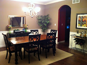
the walls had recently been painted, and my client wanted to keep them the same color (if possible)
(unless the color is 100% NOT working, i always accommodate my clients requests to keep their existing paint color. i thought the color here was really nice, and acted as a soothing backdrop to the fun bursts of color.)
as you can see, she already had her seat cushions covered in schumachers chiang mai dragon. (yummy!) she was looking to add a touch of chinoiserie and wanted to bump up the style and add a touch of chic to this formal room.

here is what we discussed during our phone call:
* adding a larger buffet to the back wall, and painting it a kelly green. to keep costs down, we talked about this piece being a craigslist find.
* adding an ornate vertical hanging mirror, some vase prints and some blue and white china (using the fabric on the chairs as inspiration for the color palette) on some shelves above the buffet. (i had a fabulous inspiration picture that i pinned to her board that she used as a guide.)
*replacing the lamps with larger ones...simple sculptural lamps with black shades.
*adding a zebra rug for a touch of chic
*replacing the light fixture
*changing out the bar cart for the existing buffet.
*adding a ceiling medallion
*removing the fake tree
after:
these pictures were a treat to get in my inbox!
sometimes i will wait months or even a year to get "after" pictures of e-design projects. this client sent the after pictures within 3 weeks of our consultation! i was blown away, to say the least. way to go, kathleen!
isn't this vignette fun?
the esty pagoda prints are perfect with the ornate mirror.
and check out the great craigslist dresser that she found! before, she had a fun dose of green in the lamps, but they were too small, and the green was a little less elegant. now, the larger, green dresser really anchors this wall and the sculptural new lamps with black shades add some sophistication.
the zebra rug really adds a style punch to the room!
and finally, the flimsy, dated bar cart was replaced with the buffet that used to be on the back wall.
the size and color of this piece are perfect here paired with the colorful art...and the best thing? this simple yet dramatic change didn't cost a dime.
if you want to get a peek at the pinterest board that i created for this client, you can click here. (she also had some questions about seating for her family room, so there are a few additional pins...
have a space that needs help? interested in working together?
contact me at autumnclemons@yahoo.com to set up a consultation!


I just found your blog and wanted to say that I love what you did in that dining room. It looks much more pulled together and interesting. Love that rug!
ReplyDeleteOh I love seeing my dining room :) It is definitely one of my favorite rooms in our house now. I have already told you, but will again, you are a genius, and you have excellent taste in all things reality TV...I forgot to email you to see if you have experienced TLC's new gem, "Gypsy Sisters?"
ReplyDeleteoh NO. i can't do it. that is where i draw the line. love my housewives, but there is NO way i am going to watch gypsy sisters.
Deleteof course...if YOU like it, i will probably LOVE it. maybe after we move into the house....
:)
This comment has been removed by a blog administrator.
ReplyDeleteWhat a transformation with only a few steps! Love it!
ReplyDeleteSuch a great transformation Autumn, you guys made a great team!!
ReplyDelete