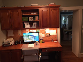
BEFORE:
as you can see, the room had a lot going for it....two windows, tons of storage, and a nice layout. this client opted for my pinterest board + phone call consultation and added on two design boards, so she could see how different chairs/window fabric/details would look.
the items we discussed during our one hour phone call:
*adding a seating area in the corner
*painting the walls a soft, almost white neutral
*adding some contrast by painting the backs of the bookcases envy
*installing new window treatments with some pattern
*replacing the hardware on the cabinetry
*hanging a gallery wall
*adding some casual seating under the window
*painting the built-ins
you can see the TWO design plans that i came up with for this space here.
AFTER:
the custom window treatments add softness, color and pattern to the room! in a space like this, where minimal furniture needs to be purchased, i encourage clients to get WELL MADE window treatments. the new seating area helps round out the office and creates a more comfortable and inviting vibe.
the woven ottomans can be moved around the room and used as seating. painting the built-ins white and adding new drawer pulls created a fresh, updated look.
we kept the gallery wall simple with matching frames and a combination of personal photos and art.
super fun agate pulls added some whimsy and another pop of blue to the space.
interested in working together on a room in your home? e-design is a great way to get professional interior design guidance at a fraction of the cost of hiring someone local. PLUS, you get to tackle projects as your schedule and budget allows.
i am nearly booked until the end of august, but have a few spaces left in my schedule. if you are interested in working with me, email me at autumnclemons@yahoo.com!


