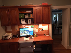
BEFORE:
as you can see, the room had a lot going for it....two windows, tons of storage, and a nice layout. this client opted for my pinterest board + phone call consultation and added on two design boards, so she could see how different chairs/window fabric/details would look.
the items we discussed during our one hour phone call:
*adding a seating area in the corner
*painting the walls a soft, almost white neutral
*adding some contrast by painting the backs of the bookcases envy
*installing new window treatments with some pattern
*replacing the hardware on the cabinetry
*hanging a gallery wall
*adding some casual seating under the window
*painting the built-ins
you can see the TWO design plans that i came up with for this space here.
AFTER:
the custom window treatments add softness, color and pattern to the room! in a space like this, where minimal furniture needs to be purchased, i encourage clients to get WELL MADE window treatments. the new seating area helps round out the office and creates a more comfortable and inviting vibe.
the woven ottomans can be moved around the room and used as seating. painting the built-ins white and adding new drawer pulls created a fresh, updated look.
we kept the gallery wall simple with matching frames and a combination of personal photos and art.
super fun agate pulls added some whimsy and another pop of blue to the space.
interested in working together on a room in your home? e-design is a great way to get professional interior design guidance at a fraction of the cost of hiring someone local. PLUS, you get to tackle projects as your schedule and budget allows.
i am nearly booked until the end of august, but have a few spaces left in my schedule. if you are interested in working with me, email me at autumnclemons@yahoo.com!


Autumn, this office is BEAUTIFUL. I have never seen furniture with a combination of wood and white finishes that looked so modern. Thanks for sharing!
ReplyDeleteYour design plan came together beautifully Autumn! What a difference the white painted cabinets, navy blue back of the bookcases and those gorgeous window treatments make!!
ReplyDeleteLove the knobs and how the change in color of the cabinetry worked well in the space! Seems more bigger and more relaxing in there!
ReplyDeleteWow! A profound difference! Thank you for sharing the befores and afters!! xo Leslie
ReplyDeletebeautiful design than before :)
ReplyDeleteGet Best Info for Alaska Fishing Trips vacations
Thanks, Autumn. It was so much fun working on this with you. You have great ideas!
ReplyDeleteThanks for sharing such a great information. It is very interesting and helpful.
ReplyDeleteDesign Square Architects
OK Autumn...right out the gate I noticed you stayed with a cool color to go with the red-brown of the furniture. Nice choice in my opinion! They strengthen each other as they are opposite color ranges. The clean almost-pure white frames everything nicely.
ReplyDelete