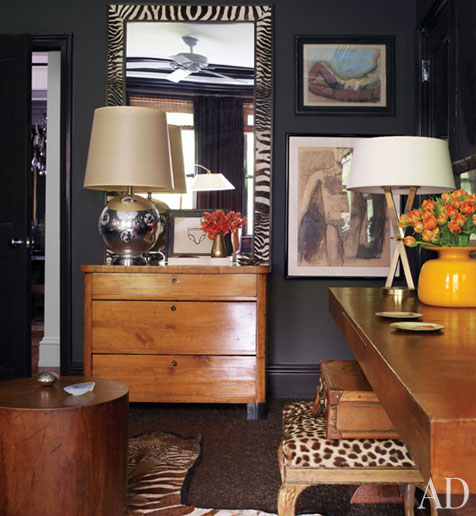
it's been a long time since i flipped through a copy of architectural digest and felt inspired. several weeks ago, i was at the doctors office with my daughter, and picked up the july issue and was STUNNED at the transformation that margaret russell has made to the magazine. (a fact that i failed to realize until janell left a comment on my post here.)
margaret left elle decor to become editor at architectural digest, and i know i was not alone in thinking..."what is she THINKING?!"
well, she is a true genius. she has turned what was (at least in my mind) an 150 page advertisement with a few pictures of obscenely expensive european estates and mega mansions into a streamlined, sophisticated display of jaw-dropping interior design.
feast your eyes:
thank you ms. russell. if i was young and daring, i would move to new york and beg to be your intern/assistant/errand girl. unfortunately, i am only sometimes daring and definitely verging on...NOT young.


So glad to hear that AD has gone in a new direction. I couldn't relate to the interiors that are soooo out of reach.
ReplyDeleteI could stare at these images for hours. You're right - it's a total magazine makeover!
ReplyDeleteI have been similarly AMAZED. My mom always had a subscription to AD and I never understood who looked at it, or why. Now it's a whole new game.
ReplyDeleteLove the images you chose for this round up.
Beautiful!!!!
ReplyDeleteAnd you are NOT old, unless you are really 90 and haven't told us....
These are beautiful images. I have to say although I can't read the magazine (being in Australia) their website never seemed particularly interesting. Now everytime I've found myself drawn to an image I spot the little AD symbol in the corner! Margaret Russell is incredible!
ReplyDeleteYep, a really great decision. I've found myself picking up AD more and more.
ReplyDelete