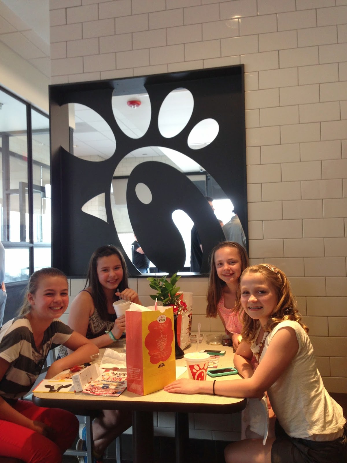
can you guess where i am?
hmmm. classic subway tile with dark grout....
white carrara-like countertops with light gray shaker type cabinets...
darker gray walls with ribbed glass inserts...
reclaimed/distressed wood tables, classic metal stools.

fun metal detail on tables.

wood paneled walls...
brown "leather" seats with top stitching and metal legs...


HAVE YOU GUESSED YET?
no?
need more pictures??
ok.....
red bar stools and tall tables...
long glass and metal light (i think the glass is made from recycled coke bottles!)
ribbed glass...

red penny tile with gray grout...
there was also this fun low kids table area, complete with little stools:
LOVED the ceilings!
have you guessed yet??
ok, how about a wider shot?
chick fil a!!
who'd a thunk it?
not me.
way to go chick fil a. i am super impressed.
now that you know where i took these, here are a few wider shots of the place:
inspiration is everywhere!!
what do you think?
have you been in any fast food restaurants lately and been pleasantly surprised by the finishes and attention to the design of the interiors?
(i blogged about another fast food resaturant that caught be pleasantly off guard here...)
do nice interiors make you want to eat at a place more often?


So great! and yes, the surroundings where I eat are a big deal to me. It makes food taste way better.
ReplyDeletei so agree! there is the cutest place just down the road with the best food, but the decor leaves lot to be desired! sometimes i will avoid going there just because the crazy floor plan, questionable lighting and weird/ugly art drives me insane!
DeleteThere is a new chic fil a near my parents house in Atlanta with similar finishes. Awesome lighting fixtures too. So nice to see this!!
ReplyDeleteits such a nice surprise after bad florescent lighting, dirty tile floor and cheap looking lamanite plastered everywhere! it is nice to see even fast food places step it up and make their establishments LOOK good! designers really are worth the money!
DeleteWe have several Chick Fil A's near us…but I just never, ever go to fast food places. Hmmm. Might have to stop in after all! (I will starve myself before I go into one of these places. But then again, I don't have children in tow!)
ReplyDeletegood for you for not going to fast food places! my jeans would be much looser if i didn't! of course, this one is brand new and they have really upped their game! the mcdonalds across the street is really nice as well--super nice finishes and has a really nice atmosphere. they must be trying to step away some customers! ;)
DeleteDarling girls! I never would have guessed it.
ReplyDeleteWow. Totally impressed. I never would have guess. I'd be curious about the marble look-alike. I'm sure it has to take a beating and still look good. Did it look as good in person as it does in the pictures? I normally don't like the "fake marble" but there are a few that look good.
ReplyDeleteit looked REALLY nice in person. i was impressed!
Delete