Showing posts with label boys bathroom. Show all posts

Sep 30, 2013

grady's bathroom reveal + source list

finally, a look at grady's finished bathroom, with photographs by the very talented (and funny and chic) sara boulter.


sources:

flooring: 12 x 24 black montauk slate purchased locally from modern tile

shower tile: dal tile 2 x 4 from home depot

wall color: cumulus cloud, benjamin moore

countertop: absolute black granite

pendants: joss + main (purchased about a year ago)

vanity: logan vanity, restoration hardware (discontinued)

mirror: tj maxx homegoods

polished nickel toilet tissue holder: ebay

moving buffalo print: print collection

vintage buffalo lithograph: ebay

jado faucet: ebay

wire baskets: target

shower curtains: marshalls (similar)

towel holder: vintage, ebay

wood stool: tj maxx homegoods

cork map: custom made by sweet pickle designs

pit stop sign: made by me

happy monday!

Sep 10, 2013

a peek at grady's finished bath

well, after weeks months of delay, and a massive paint spill, grady's bathroom is finally finished!
i am working on getting a professional photographer to take some pictures in the next week or two, but until then, here is a quick look with some lame phone pictures:


i will be posting more about both the sign above the toilet and the framed "divided" bison print soon!
oh, and i had a small miracle happen to me a few weeks ago---after an exhaustive online search for the perfect mirror for above the vanity, i walked into my local homegoods store, and spotted THIS beauty:


and the best part??


yeah. that was a pretty. good. day.


some sources: 
(a complete list will accompany the final photos)
wall color: cumulus cloud-benjamin moore
flooring: montauk black slate, 12 x 24
vanity: logan vanity-restoration hardware (discontinued)
shower curtain: 84" drapery panels-marshalls (similar)

Aug 27, 2013

new favorite thing: double tension shower rod

ok.
first of all, let me just state that--NO, gradys bathroom has NOT been painted yet.
i have thought about it at least 355 times since june, but i still have not taken the plunge.
this is due, in part, to me trying to spend as much time as possible with the kids before they went back to school (yesterday was the first day!). the other part is just sheer laziness. i just haven't made it a priority!

that being said, i am making p-r-o-g-r-e-s-s.
everything EXCEPT the paint is ready to go.
i shared my new design plan of this bathroom here, and one of the things i decided was that i wanted two separate, decorative shower curtains. i looked online to see if i could find a nice looking, double shower rod, and spotted one at bed bath and beyond.


i was going to order it online, but i decided to swing by my local store instead. luckily, they have one in stock, and so i brought it home and tried it out.


i am in love with this! it was really easy to install---it just went up like a normal tension rod. i actually think it was a tad easier because it was larger, and easier to keep lined up in the same place on both sides.


i placed mine right at the top of the shower tile.


 because the decorative panels have grommets tops, i did have to thread them onto the rod before tightening it into place. i put the rings for the curtain liner on after the rod was up.
because my panels are 84" long, i purchased an extra long (84") liner. i purchased this hotel fabric one because i want it to last for a long time, and want the option of washing it.


here it is!
i love that the shower is still totally functional, but the shower liner is hidden. i LOVE being able to see the tile in the shower, and feel that having the opening between the panels helps make the bathroom feel a little bigger.
*oh, and see??---the paint and all the supplies are just sitting patiently on the floor, waiting for me to get started. and i will. someday.


Jul 23, 2013

choosing paint for grady's bathroom

gradys bath WILL be painted by the end of the week.
(at least, i hope so...)
i want a warm gray that adds some depth to the wall, but i don't want it to be too dark, because the room doesn't get any natural light.


last week, the second pendant over the toilet was installed. more progress! (because of a code that doesn't allow a hanging fixture to be within 3 feet of a shower/tub we didn't install it before we moved in.) it definitely helps with the amount of light in here. to UP the light a bit more, i have since swapped out the 60 watt incandescent bulbs for 75 watt warm fluorescent ones. (by the way, am i the only one who HATES the "cool" or "daylight" fluorescent bulbs? ugh! i think they are awful. remind me of being inside a 7-11.)


 i also replaced the flush mount light with a simple 3-light spot light, which made a HUGE difference! i actually love this flush mount light, and will repurpose it somewhere else in the house...

the new light:
 found for $5.99 at ikea...and that included the three bulbs! how could i resist?

but anyway, i am getting a little sidetracked, aren't i?
we were talking about paint...
ok, so the plan is to get a paint color that adds some subtle color, and supports the masculine feel of the room.
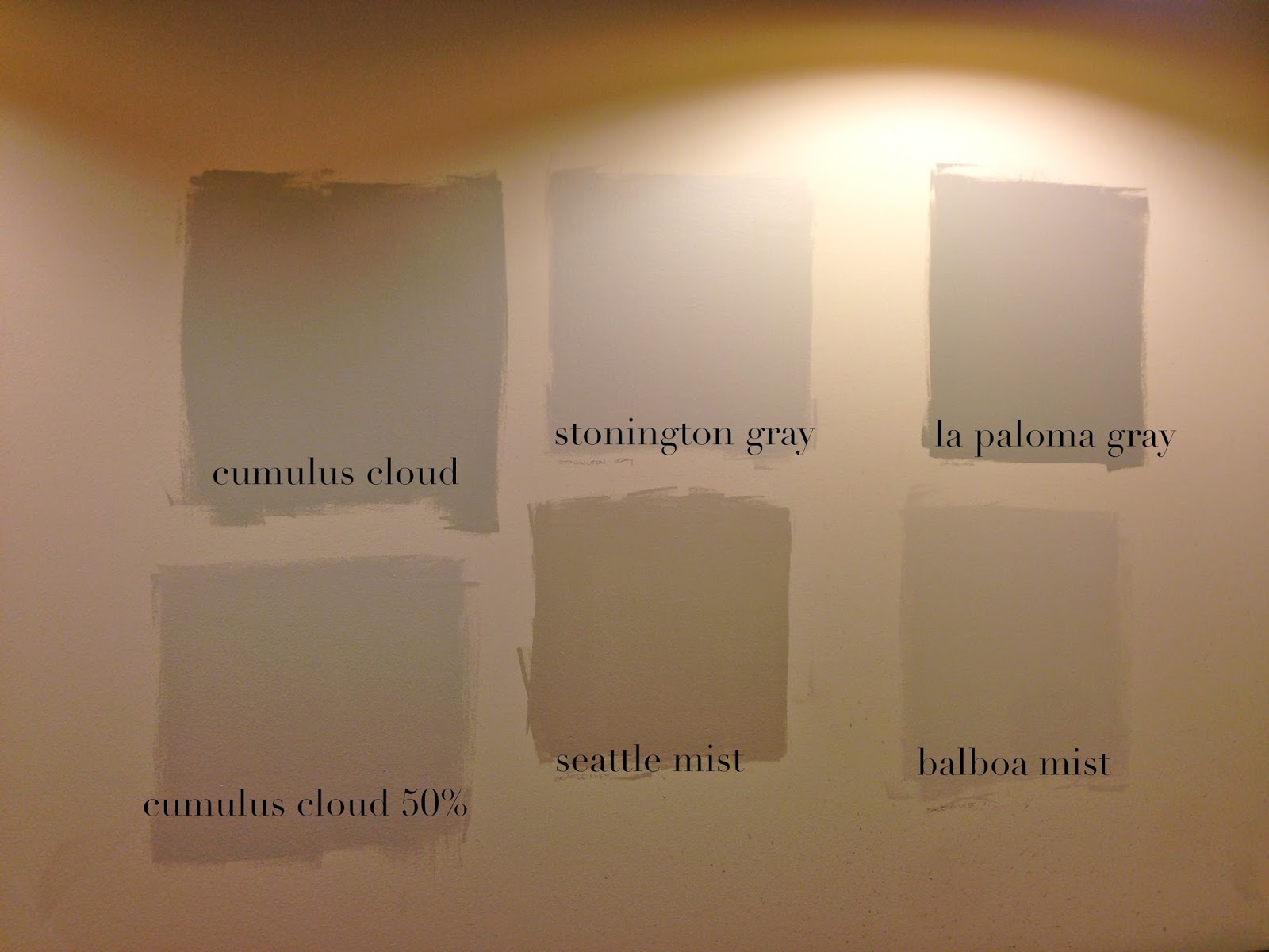
here are the colors i sampled on his wall:
this is the wall above the vanity:
  all colors are benjamin moore: cumulus cloud, stonington gray, la paloma gray, cumulus cloud @50%, seattle mist, balboa mist.

this is the wall opposite the vanity. as you can see, it seems a little darker:


for comparison, here is that same wall, after i replaced the flush mount ceiling fixture with the ikea spot light:


my favorites are balboa mist, cumulus cloud and cumulus cloud at 50%. i also really like stonington gray, but i like the warmth of the others just a tad more.

before i swapped out the ceiling light and changed the bulbs in the pendants, i was definitely leaning towards "cumulus cloud at 50%", but with the added light, i think the room can handle the slightly darker "cumulus cloud".

what do you think? which paint is your pick?

Jul 18, 2013

grady's bathroom-the new design plan

ok.
hang on to your wigs.
i might actually be finishing a room in my new house in the next few weeks!

after 5 years of renting, i feel a little bit like rocky balboa when he climbed up the steps of the museum of art in philly! can you hear "the eye of the tiger" playing softly in your head right now?
i hope so! (becuase i can!)

as i mentioned earlier, the first spaces i will be working on in my house will be the bathrooms. i am going to start with my sons bathroom, which is upstairs, near the bonus room:

while the house was under construction, and i was selecting the tile, vanity, plumbing fixtures and lighting for the bathroom, i came up with this design plan:


now that the "hard" decisions are made, i need to move onto phase 2: the decorative stuff---art/shower curtains/mirror, etc. this bathroom has a simple, masculine feel to it, and i want to inject a little fun with the accessories and art. it needs to function as the "main" bath for guests who are hanging out in the bonus room, but my little man will be the one using it everyday.

i originally wanted to do a screen printed shower curtain, something like this:

however, i also wanted the shower curtain to be open, so i could see the tile work in the bath surround, and ultimately decided that i wanted two panels, so any detail in a "cool" screen printed panel would be lost if it was gathered on the side of the shower.

when i was at home goods a couple of weeks ago, i found a pair of grommet top curtains for $25 that look almost identical to these ikat grommet top curtains from west elm:

i decided that they would make a great addition to the bathroom....they will add subtle pattern and some softness, but still have a masculine look that my son will appreciate.

i want to hang a buffalo print that i have had for a while. (i still love the "tree" print that i have on the first board, but think i will hang that in grady's bedroom instead) i like the graphic feel of the buffalo print, and think the orientation (landscape versus portrait) will work better here.

here is the revised design plan:


still to do:
hanging the other pendant (this just got done last week! (can i get a "CHECK!?")
paint decisions
hardware (towel ring, toilet paper holder)
finding a mirror
hanging/buying the shower curtain rod
final art decisions
buying some baskets for under the vanity


stay tuned! i WILL have this bathroom done by the end of july!
i just need to keep channeling my inner rocky balboa....

Mar 26, 2013

design board: upstairs "boys" bathroom

after weeks of trying to narrow down the possibilities, i finally decided on the tile for the upstairs bathroom that will be used primarily by my son. i wanted a simple, masculine feel in this room, with a few fun details.
 i started with the floors. at first, i wanted to use some patterned concrete tiles from villa lagoon tile. i even called and talked to the owner of the company (who was completely amazing and sweet!), but realized that there was just no way that their gorgeous tiles were going to fit in my budget. in fact, just the shipping alone was more than could spend on tile for both the shower and the floor!

onto plan B.

i looked at a LOT of tiles, and kept coming back to black slate.
i ended up choosing 12 x 24 tiles in montauk black slate. the slate retails for around $6 a square foot. i purchased my tile from modern tile in salt lake city.  they have been amazing to work with!

at first, i was considering using the black slate in the shower as well, but ultimately decided that i wanted a contrast to the larger tiles on the floor. i selected a mosaic white subway, available here.
of course, there are still some details left to select...i need to find some remnant stone for the counter top still...i am hoping to find a simple black granite. i would prefer honed, but i may have to go with whatever our fabricator has one hand.


here is the design board:


i am really excited to see it come together!
our target move-in date is the end of april, so things are moving fast!
can't wait....!