let the design a.d.d continue...
another room that i am working on in my house is my son's room. it is currently LAVENDER, and already a few of his friends have asked him why his room is purple. poor little guy!
here is the plan i have pulled together for grady's room:
i want to create a room that is masculine but isn't too bright. i love the idea of layering lots of patterns like plaids, herringbones, houndstooths, and a geometric or two. most of the fabrics will be neutral, with accents in oranges and blues. i CANNOT help myself, and have to add a few vintage inspired touches like the lamp, pillowcases and vintage travel posters. i may also add in the vintage licence plates that he had in his last room.
items from his "old" room that i am keeping:
dresser
bed skirt
black + white plaid curtains
items coming from other areas of the house:
ikea malm 2 drawer dresser (i think)
bedding:
ikea malou duvet cover
lands end tile gate print sheets in khaki
brooklyn bridge pillowcases
ikea ps vadmal wool blanket
other items:
metal lamp-the foundary
cardboard safari rhino head
vintage travel calendar, purchased here
thoma filicia's lawrence in taupe
orange holli zollinger fabric (i am working on getting this custom colored. it is currently only available in blue.)
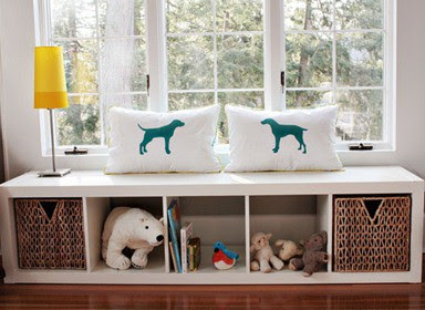
in the alcove, i am planning on using an expedit shelving unit as a window seat, an idea i spotted on pinterest via here.
this will provide storage for grady's books and some toys.
i will have to raise it off the ground a bit because there is a vent in the middle of the window alcove.
initially, i wanted to paint the walls a dark blue, but now i am considering a lighter blue to keep the room from feeling too dark. it has one large window but because of the trees outside, the room doesn't get a lot of light. i had to restrain my self from planning stripes for the wall! i just don't want to repaint the room whenever we move out. yeah...i know that's totally lazy. but really, anything is better than the color it is now...the lavender is NOT a hit with my little man. i am getting paint samples up this week.
and, just for fun, a NEVER before seen glimpse of his "old" room as
i originally designed his bedding, the drapes, and, well, EVERYTHING....5 years ago for house #4.
i originally designed his bedding, the drapes, and, well, EVERYTHING....5 years ago for house #4.
(sorry, i took the pictures, and obviously had no clue how to hold the camera...or how to turn the flash off....or how to get the camera strap out of the lens...phew. i am still a major rookie with the camera, but these pictures are just plain embarrassing. sorry!)
all of the trim and bead board was painted black. schumacher burlap wallpaper is above the bead board, and a black and white ticking wallpaper is on the ceiling. the ikea cowhide rug was originally purchased for this room....
man, they grow up fast...


Your plan is amazing as always! Head over to my blog today because I have a holiday giftcard giveaway going on that just may help with some of those redesign expenses! http://flowerhilldesigncompany.blogspot.com/2011/11/50-west-elm-holiday-giftcard-giveaway.html
ReplyDeletelove the new plan! Feels like such a good mix of prints, and just the right amount of color.
ReplyDeleteHis last room was amazing! I'm a bit surprised that you are not keeping more from his last scheme and just changing out the paint colour. Switching up things from elsewhere in the house is a great idea.
ReplyDeleteThat rug is my favorite of all time, you'll love it!
ReplyDeleteMarissa
www.roost-home.blogspot.com
I love the new design plan! His old room was fabulous too! I am loving the idea of using the expedit shelve as a window seat!
ReplyDeletewww.thefamilyroomdesign.blogspot.com
Glad you are starting with this guys room! Looks great! Can't wait to see the reveal! :)
ReplyDeletePurple? Poor guy! I love the room he's getting...and that window seat idea is awesome (I pinned it as well in hopes that I can use it someday!)
ReplyDelete