Aug 31, 2010

kitchens to love

a few gorgeous NON white kitchens...
of all the kitchen images i scanned, this one may be my favorite.
it has the feel of a white kitchen, 
but the cabinets are a lovely gray color.
i love the ceiling height, 
the wood countertop on the island, 
and the overall feel of this kitchen.
pretty gray mixed with lots of white and wood!
aren't the coffered ceilings great?
the planks in between them are a particularly nice feature.
oh wow.
this one may tie for first place.
notice the mix of dark and light?
the island is dark with light countertops,
and the perimeter cabinets are light with dark countertops.
so loving the sophisticated 
feel of this kitchen...
and check out the metal grate/cover
over the cabinet over the oven!
just gorgeous!
as you may know, i love a black kitchen!
this one is a stunner.
love at first sight!
i love everything about this kitchen.
green cabinets done right.
love the punches of red!
rustic beauty.
aren't those light fixtures amazing?
*sigh.
if i had this kitchen,
i would a lot of time gazing out those
spectacular windows.
(i don't think i could reach those pots
above the island though...)
this kitchen has so many great 
textures and materials,
and they all mix together beautifully.

Aug 30, 2010

master bath-after


here's what we did:
the tub was removed, 
and the angled wall was straightened to 
accommodate a larger shower. 
a larger, custom made vanity was installed with new
fixtures and marble countertops.
storage benches now occupy the space where 
the unwanted bathtub once was.
(terry cloth cushions will eventually sit on the built-in benches)
a beautiful storage tower was installed where the
shower once stood. a new door adds 
privacy to the toilet closet.
the new shower is much larger than the old one.
(and a lot prettier!)
a new cased opening, complete with a custom designed 
stained glass transom
separates the bathroom from the bedroom, and maintains the
open feeling the homeowners wanted.

the simple marble countertops tie in with the travertine floor
and keeps the color palette soothing.
the front edge of the countertops have an "ogee" edge,and the back and sides have an "eased" edge.
all fixtures are from the victorian collection by delta.


the pottery barn lights have already tarnished beautifully.
(sadly, they are no longer available)
a glimpse of the chandelier that we used over the toilet.
aren't the shadows fabulous?
a close up of the custom made vanity.
hardware is from restoration hardware.
small subway tiles in a dark  brown marble
were used on the floor and as an accent.
new lighting highlights the great texture of the tile walls.
we ripped 12 x 12 tiles in half  to create the 6 x 12 tiles on the
bottom of the shower. the top tiles were placed at a 45 degree angle.
simple, subtle changes like this really add a lot to a bathroom!


a peek at the storage tower i designed.
i love the way it turned out!
the adjustable shelves and drawer add a ton of storage to this
once formerly storage-starved bathroom.
the bottom drawer is a hamper for dirty laundry.
the closet door (now a pocket door) was relocated to the bedroom. 
(just to the left of the hanging plate)
as i was talking to the homeowner about a door for the toilet closet,
she mentioned that she loved the look of old out house doors.
we took her idea, and designed a refined yet slightly rustic swinging 
saloon-style "outhouse" door that is now a fun conversation piece!
isn't it great?
i love it when a homeowners personality and ideas
are reflected in a finished space. 
the chandelier is from z gallerie.
a peek at incredible amount of storage in the built-in benches!
the homeowners are thrilled with the new view from 
their master bedroom...
and the view from the windows is pretty fabulous too!

this bathroom was such a fun project. the homeowners
were totally open to suggestions, and yet had a clear vision
of what they wanted. allen and i went through several layouts before we settled on the final floor plan, and i think the plan
we came up with was the best solution for what the homeowners
wanted. as with all designs, things were changed/left out due to budget reasons. for instance: we had originally planned on tiling the entire toilet closet in glass tiles, two matching venetian mirrors for the vanity were replaced with a more budget friendly large, simple mirror, and i had proposed the floor to have a pattern with the travertine and the dark marble. even with all of the changes, i think the bathroom turned out great, and the homeowners are happy.
as a designer, what more could i ask for?

 sources:
woven blinds from lowes
all cabinetry custom built 


Aug 29, 2010

master bath-before

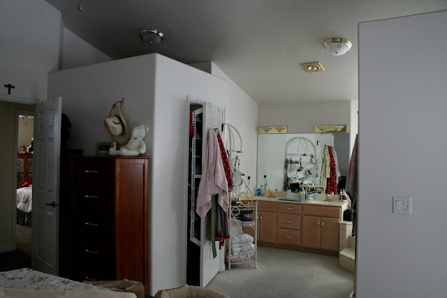
a few more before pictures of the master bathroom that allen and i remodeled before i load the after pictures tomorrow. 


some of the issues we needed to address:
1. the owners never used the tub, and wanted it removed.
2. they needed more storage
3. the entrance to the closet was in an awkward place
3. the lighting needed to be improved
4. the toilet closet had no privacy
the owners loved the light coming in from the windows, and 
wanted to keep the bathroom open to the bedroom.

the shower was on the small side
no privacy!
the homeowners wanted to leave the toilet *open,
but we encouraged them to conceal it.
we reached a great compromise!
outdated fixtures and cabinetry needed to be updated.
stay tuned for the reveal!

Aug 27, 2010

white kitchens: a touch of modern

i've seen this kitchen dozens of times 
and it still stops me in my tracks.
the light coming in from those windows is marvelous, 
and the lighting is unique and fabulous.
such clean lines.
modern country at it's best.
love the paneled ceiling,
and the simplicity of this kitchen.
i had to include this...
the shelves over the windows is not  something you see very often,
and done very well here.
hey! more wood countertops!
this one totally reminds me of dean and deluca.
clean, simple, modern and there is something
utilitarian about it as well. me likey.
hello gorgeous orange tile backsplash!
don't you love the orange and the soft blue together?
so refreshing.
i like the way the two cabinets finishes
were integrated in this one.

***
i can't believe that the first week of school is over.
i had a list of about 37 things that i was going to
get done while the kids were at school, and so far 
i have managed to cross of about 6 from my list. 
ah well. 
i also enjoyed getting to do a few things that
were NOT on my list.
like hanging out at target.
for an hour.
(when all i came to get was a few sweet potatoes) 
like taking a nice long walk.
by myself.
without a stroller.
and a bored child.
like going out to lunch with my sweet husband.
twice.
yes, a meal alone.
and we weren't paying someone to watch our kids.
("day dates" are great.)
life is good.
and now, back to those 31 "other" things
i need to get done.
happy weekend friends!