Sep 30, 2011

house update:wallpaper for powder room

if you have been following along with me, you have seen the progress on a home that i have been working on with a client since before the footings were dug. i am looking forward to sharing more pictures as we move along. one of the decisions we made was to install a high wainscoting in the
main floor powder room. i still wanted some color and pattern, and so we opted to wallpaper the walls on top of the wainacoting, and paint the ceiling blue.

the wallpaper is called "fioretti" by cole & son. it's going to add some fun pattern and i am looking forward to seeing it installed.


here are some pictures of the bathroom:
 the chandelier is from overstock...and i promise that we will put some more bulbs in it soon!


 do you see the color on the ceiling? (i LOVE painted ceilings.)

i can't wait to see it all come together.


Sep 29, 2011

inspired by: louis vuitton

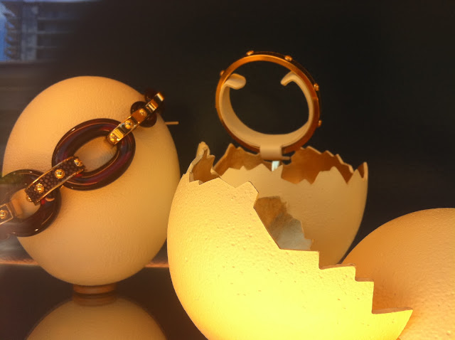
check out the amazing louis vuitton window display i spotted while on vacation:
i have to admit, i am more of a coach gal, but these displays had me wanting to sell my car and get
a big fat louis vuitton purse. or wallet. or bracelet. or...whatever they were selling!

uh....wood herringbone floors??
peacock blue with touches of white and gold??
i'm dying of gorgeousness...

i immediately thought about what a beautiful room this window display would translate into...
maybe a little something like this:
(design by markham roberts)

or this:
(design by jan showers)

or this:
(censational girl)


these iphone pictures don't do the blue paint color justice. it was dark and moody, and had a bit more
green than what the photos are showing.

i would love to paint my new office this gorgeous deep blue-green color, but not certain how thrilled i am at the prospect of painting it back when we move again in 1-2 years.
hmm...do i go for it? or play it safe, and paint the walls a more neutral color and bring that gorgeous color in with the drapes? or some art?
i am having such a hard time deciding what to do!

 sorry about the glare! 
but aren't these displays genius?


well played, louis vuitton, well played.

(and aren't you happy that i refrained from using the word "EGG-cellent" during this entire post...
until now?)

Sep 27, 2011

e-design update

when i first saw pictures of this clients home, i knew it was a fun and happy home. my client really loves to mix patterns and bright colors, and i adored that she had already slathered "aviary" from thomas paul on her family room windows. to me, it was a great cue that she was up for adding even more color and texture into her already creative and colorful space. 

before:


even though the room had a great start, there were just a few missing elements that i knew would make this room come to life. (that mirror for instance....don't you think he needs a friend or two? he looks a little lonely on that wall, all by himself!) because so many major pieces were in the room, my client opted for the mini-design plan.

here is what we discussed:
1. changing out the rug. with the tile floors, and the brown leather sectional, the floor really needed some pattern to break up the neutrals.
2. replacing the coffee table with something a little more sleek and less bulky. that table is a little too stodgy for this room.
3. adding tables to the sides of the sectional...it was currently "floating" in the room, and needed
some tables to help anchor it, and make it easier to set a book or a drink. also, adding a lamp will create a more comfortable place to read.
4. finding a chair for the corner, as well as a real plant. it looked a little empty and dark, and needed some white and life to break up the browns.
5. pairing a shallow console table with the white mirror. 
6. adding new pillows for additional color.
7. new art over the fireplace.

here is a sample of the idea board i came up with to update the space:


after:

the chevron rug adds pattern, and the smaller, sleeker table is family friendly and still bulky enough to hold it's own against the large sectional.

the chair, lamp, table and plant really round out the seating area, and the art adds additional
 color and height.

we originally talked of adding the bamboo chair from wisteria, but my client was able to find this
chair locally at a fraction of the cost! i love the way the white breaks up the neutral tones of the walls, floors, and built-ins, and the addition of the coral fabric is fun and adds visual energy to the room.

adding this slim console table helps the mirror look less lonely and gives my client another
place to put accessories.
it's amazing to see how a few small additions can really perk up a room and make it feel more functional and cohesive. my client did a great job of improvising and saving some money, which i think is one of the best things about having a design plan for a room! if you know the basics of the items to look for, you can find a similar looking item locally for less.

interested in working together to make you space more beautiful and functional? you can see a sample of my services here.
email me at autumncle@yahoo.com for pricing. 
* i currently have a waiting list of about 6 weeks on full and mini room designs, but can fit a phone consult in anytime!

Sep 26, 2011

4 simple ideas for accessorizing

just in case you missed it, here is the post that i wrote earlier this month for megan brook handmade :

***
accessories can add a lot of personal charm and warmth to a room, as well as tell a story about the people that live there. using objects that you truly love, whether they have been found at a thrift store, collected on travels, created by or inherited from a family member, or snagged straight from mother nature, is a guaranteed way to end up with objects worthy of a striking display. 

here are a few simple ideas that you can rely on to assure a polished and interesting look:

1. add some "life". 
i think every room needs to have something alive in it. plants, or fresh flowers are a great way to do this. orchids are a favorite of mine because they last for months and are relatively low maintenance. another  low maintenance way to add some life to a room is with a succulent arrangement, these draught tolerant plants need very little water and add interesting texture and color to a room. consider pairing your greenery with mismatched frames, and other small objects to round out 
any vignette.
low-maintenance succulents look amazing in these diy planters.

a lavender orchid adds some color to this muted, sophisticated foyer.

2. stack some books. 
i am continually amazed at the impact that a small stack of books can add to a room. limit the stack to no more than 5 or six books, but even two large books is adequate. you can either leave the books by themselves or top the stack with a sculpture, decorative bowl, a piece of coral or driftwood, a frame, or some fresh flowers in a vase.
in this dramatic bookcase, featured in lonny, stacked books are topped with decorative objects
resulting in a glamorous, eclectic look.

books are paired with candlesticks, and fresh hydrangeas to complete the blue and 
white theme in this room.

3. use matching lamps to add balance and symmetry to a side table. 
add in other items like frames, or small sculptural objects, taking care to vary the heights of the different objects to create more interest. mixing in candles, mirrors and reflective surfaces like mercury glass can add a romantic glow. 
matching lamps and a large mirror create drama in this foyer.

this dark and dramatic study gets a boost of contrast from matching brass lamps.

4. corral a grouping of unrelated items in a tray. 
a tray will keep the items looking orderly. this look is especially useful when accessorizing an upholstered ottoman. the tray can be moved out of the way when you want to relax and put your feet up.
 flowers, a decorative box, magazines, and other objects look orderly in this wooden tray
 placed on an ottoman.

this shallow bowl/tray holds votives, stacked boxes and a few small objects that together create
a cohesive and interesting vignette.

as you shop, keep an eye out for objects that really speak to you, and only purchase
items that you feel have a timeless appeal to YOU. trends will come and go, and your tastes will
evolve and change. but objects that you love or hold a memory will never change...
and will always look great telling the story of YOU.

hope everyone is having a great monday!


Sep 23, 2011

repurposed closet

i came across this image on pinterest, and thought it was way too 
inventive and creative not to share.
i like how this space doesn't feel like a closet. the small seating area and pendant light really add some
character, and the gallery wall is intriguing and fun. i have seen a lot of closet conversions, but this one
is among my favorites.

* has this week whizzed by, or it is just me? i had BIG plans this week to finish unpacking my house and at least get the beds frames set up. yep...we are still sleeping on mattresses on the floors! the move took SO long (3 days) that by the time the hauling was over, we were both too wiped out to set up the beds. we hired some movers to help us for 5 hours (at $100 an hour!), thinking that we would get two truckloads of stuff transported, but one of the movers happened to be the chattiest guy on earth. i swear he talked 10 times more than he lifted. as a result, we only had professional assistance with one of the 8 loads we took over. everyday, i wake up with a list of about 10 things that i plan to get accomplished that day, and only get about 3 of them done. i am hoping by the end of this weekend, things will feel a little more settled around here...but i will settle for our beds being off the floors and being caught up on the laundry!
have a great weekend, y'all!


Sep 22, 2011

maui memories part 2

one of my favorite parts of our trip was driving the road to hana. hana is a tiny town, tucked away on the
south side of maui, and is right in the middle of a rainforest. the drive meanders through spectaular views, waterfalls, beaches, and an amazing variety of plants, trees and flowers.


again, i was sorta obsessed with seeing plants and flowers and moss springing out of and in between rocks and concrete....
i loved seeing this red plant, which i think is a red ti plant popping out of this lava rock wall...
and these roots growing on top of this decaying rock wall.


this pretty church looked ethereal surrounded by tropical plants, a lava rock wall, and a manicured lawn.

the color of the window trims was the prettiest shade of grey-green. 

this was, by far, my favorite house that i saw while we were in maui. i love the way that this traditional home has been infused with a huge dose of island style....love those wide eaves and the porch railings.

i know its hard to see from my pictures, but the entire foundation is covered in lava rock.

the wide front steps are covered in a light green slate that looks beautiful with the  blue shade of the house.
isn't the detailing on this house gorgeous? 

these lava walls were all over hana, and each one seemed to have it's own personality.

i love the texture and colors!

this one had a really great undulating top.

along the drive, we spotted this arched top red door nestled in a tall rock wall...
wouldn't you love to see what on the other side of that door?

 
a few miles past hana, there was this little outdoor "farmers market". i have to admit that when my husband pulled in, my eyes got really big, and i looked at him like "uh...i REALLY hope you know what you are getting us into here..." well, it turns out that this was one of our favorite things we did on our entire trip.

 
we were able to taste sugar cane, star fruit, avocados, passion fruit, pommelo, mangos, coconuts, apple bananas, breadfruit, and had an AMAZING dessert---fried bananas wrapped in phyllo, coconut ice cream and sweetened breadfruit.

 it was similar to pf changs friend banana dessert, but WAY better. all of the fruit was grown right there on this little local farm, an it was all SO good.

the "back side" of the drive was amazing, and like the way to hana, was along the coast, so you go to the the ocean at every turn...the first few miles are rainforest, and then the landscape slowly changes until you are driving through what looks like a desert.

this church was standing all by itself in what seemed like the middle of nowhere. can you see the ocean in the background?

we spent the last few nights at the hyatt regency. it has an open air lobby, that was really impressive and filled with vegetation, sculptures and even parrots.

the decor had an asian flair, which i thought was pulled of really well.

there were orchids everywhere. i liked how these shades of purple perked up the neutral interiors.


i loved, loved these wood benches. there were three of them near the pool restaurant.
the *pool was spectacular!
the best hotel pool i personally have ever seen.
we all had a great time enjoying the pool!

can you even stand how gorgeous this is??

*sigh.

this is the view from the edge of the resort...

this is a picture of the marriot in wailea. we went there for a luau one night, and i really liked this open 
seating area.

i was particullay drawn to the furniture, the rug, and the banding on the "drapes". the whole thing has
a very laid back, tropical vibe without being too much.

i also loved the contrast of the light stone and the dark subway tile on this fountain/pool.

anyway, thanks for coming along with me! the trip was really wonderful. i felt that it was the perfect balance of activities and down time, city life and wild nature. we felt like we really got to see and do everything that we wanted to, and the kids were SO excited to get to tag along with us. 
happy 15th sweetie!
i look forward to the next 15 with you...