Apr 28, 2014

design plan: colorful shared office

this design plan is for a repeat client who LOVES color. she wanted to turn her dining room into an office she could share with her husband.

the walls were currently painted a soft neutral. i suggested we paint the walls charcoal to balance all the bright colors, and bring in an affordable desk and wall of storage from ikea. here is the design board, which should give you an idea of what the finished room will look like:


interested in working together to create a more beautiful and  functional space?

i only take limited clients during the summer months so i can spend as much time with my kids as possible, so if you would like to schedule a consultation for june, july or august, email me at autumnclemons@yahoo.com!


Apr 24, 2014

one room challage-week 4: working on a budget gallery wall

it is week 4 on the one room challenge!
week 1 
week 2 
week 3

i was really busy with work, and didn't have time to tackle some of the projects i was planning on.
what i DID do was work on gathering some art for the gallery wall, which will be on the back wall of the office.
i am a big fan of gallery walls. i want the one in this room to feel loose, eclectic and a reflection of things i love and items that have meaning to me.

building a gallery wall can cost a small fortune. even the smallest wall may need 10 or more items, and by the time photos are printed or art purchased, and are either custom framed or mats and frames are bought, the cost can be staggering.

while working on my gallery wall, i have employed a few tricks to keep my costs down.
lucky for you, i am going to share them with you today! (not a single idea costs over $25!)


1. soft landscape original art in white frame
total cost: $25
ikea ribba frame = $10
original art purchased at local craft fair = $15

this piece is on the high end of my affordable gallery wall ideas, but i think the texture and movement from and original piece of artwork adds so much to any room! to save money, consider making the art yourself!


2. fossil fish in wood tone + linen shadow box
total cost: $21
target shadow box = $12
fossil fish, purchased on ebay = $9

i used loctite indoor adhesive to attach this fossil to the linen background of this shadow box, and let it dry overnight. if you haven't shopped on ebay before, you need to give it a try! it is a wonderful place to hunt for one of a kind treasures for your home. i have bought pages from books, vintage postcards, original art, and embroidery pieces...just to name a few. to make this even less expensive, find a shadow box at a thrift store, paint it, cover the back with a scrap of linen and use a piece of driftwood, a great rock from a hike or a pressed flower from your wedding or other special occasion!

3. snake print in wood frame with gold accents
total cost: $2
thrift store frame : $1
print taken from old calendar: $1

this is the cheapest and easiest artwork ever! thrift stores can be amazing places to find good quality, unique frames for almost nothing! 


this frame was a little beat up, so i just rubbed it with some stain (leftover from here and here) that i had on hand and used a gold marker to highlight the edges and the very inside lip of the frame. 


the snake print was a little bit larger than the frame, so i just trimmed it to size. 


4. mustard deer embroidery on black
total cost: $17.25
ikea ribba frame: $10
embroidery from trip to mexico: $7
black paper: .25

if i am ever feeling lazy or cheap and don't want to get a frame cut for a piece, i just mount it directly onto a sheet of good quality scrapbook paper. if the piece is larger than 12" in any direction, then i use canson paper. for this piece, i just used adhesive dots to attach the embroidered fabric onto a piece of black paper. this project can also be done with a beautiful scrap of fabric or wallpaper. bonus points if it has some meaning---a small cutting of your mothers wedding dress? wallpaper from the home of your grandparents? 


5. sepia wave print in modern wood frame
total cost: $11
target frame: $11
art printed from internet: 0

the cheapest and easiest artwork ever! there are so many resources for printable art. just choose your favorite, print it and frame it! so easy and you can customize the print to fit your mat!
my favorite source is the new york public library digital gallery.
jennifer did an amazing round up you can check out as well!


6. small fossil in two tone shadow box 
total cost: $7
frame, bought on sale at michaels: $6
stone fossil, purchased on trip to southern utah: $1

this frame was super cute and cheap, and i couldn't resist. if you like the look of this two tone frame, recreating it would be super easy with some spray paint and tape. for this piece, i simply put a small fossil from a family trip onto a piece of scrapbook paper (i like the paper to have some texture) with some adhesive dots! simple, cute, and every time i look at it, i am reminded of being on vacation with my favorite people.

7. pastel beach scene in gold rope frame
total cost: $8.25
thrift store frame: $1
original art, purchased on etsy: $8
paper: .25


this piece was a little more tricky than it looks. i actually "made" this thrift store frame into a very shallow shadow box by adding a spacer.


i got mine free from my local framer since this was such a small piece, but you can see something similar here. you just trim the spacer to fit, peel the paper off of the adhesive, and stick it to the glass. this created enough space for me to mount this tiny pastel beach scene onto some double stick foam, which gives the piece some dimension, and since it is held off the glass, will also keep the artwork from smudging.


there is still a lot to do! i am hoping that a LOT will get done this week, including:
finding the perfect wall light
stripping and staining the desk
adding the shelves!!

stay tuned, and thanks for following along!


Apr 22, 2014

affordable find: marble column lamp


noah snow marble lamp
$792

pilani scroll table lamp
$165
($330 for a set of 2, on sale for $264, so $132 each!)

happy shopping!

Apr 21, 2014

where am i? (again.)

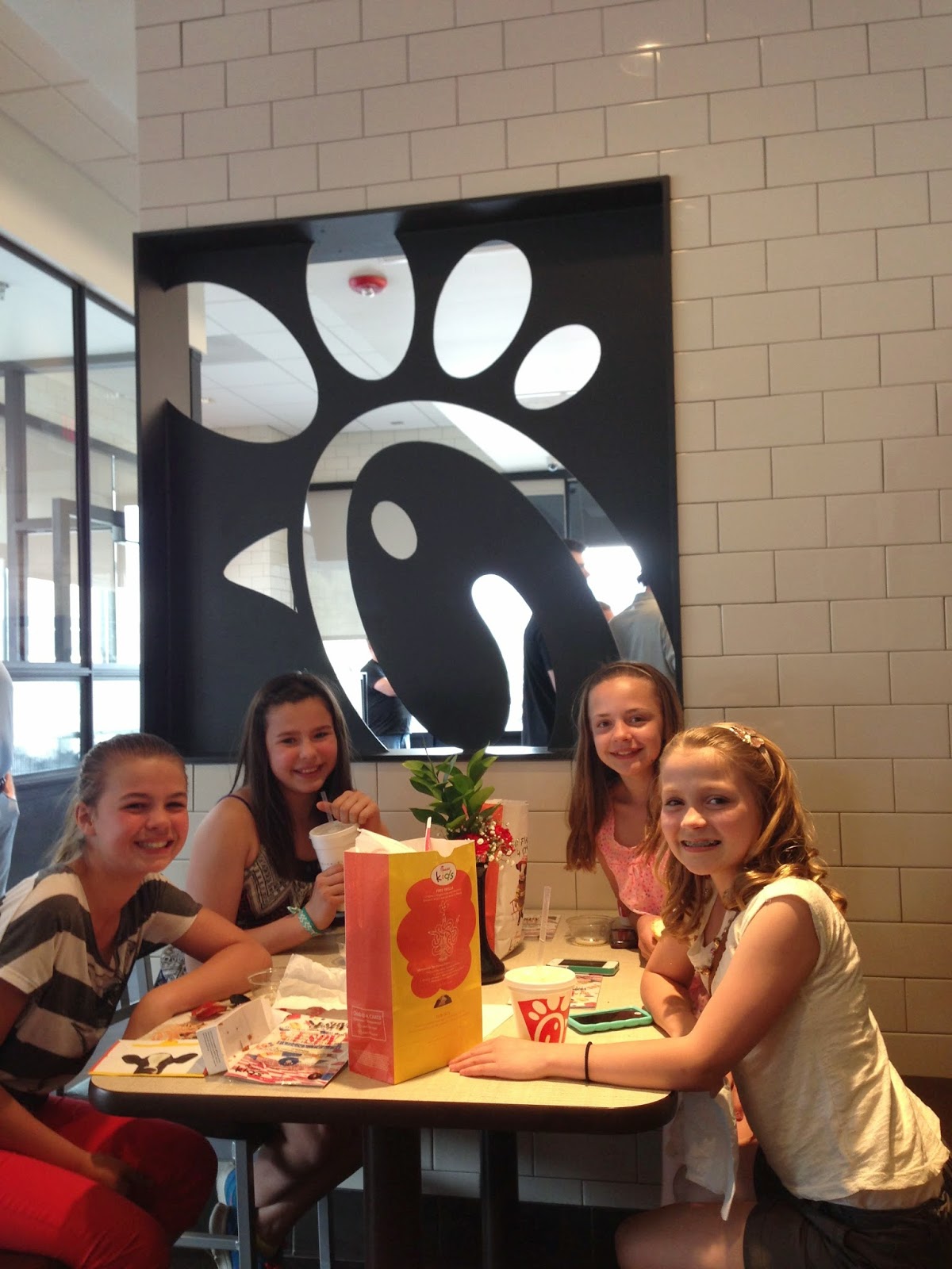
i walked in an eatery last weekend, and was really impressed with the finishes.
can you guess where i am?

 hmmm. classic subway tile with dark grout....

 white carrara-like countertops with light gray shaker type cabinets...


 darker gray walls with ribbed glass inserts...

 reclaimed/distressed wood tables, classic metal stools.


fun metal detail on tables.


wood paneled walls...

brown "leather" seats with top stitching and metal legs...

 cross hatch/strie laminate tables with geometric print upholstered banquette backs.


HAVE YOU GUESSED YET?
no?
need more pictures??
ok.....

 red bar stools and tall tables...

 long glass and metal light (i think the glass is made from recycled coke bottles!)


i really loved the details on the inside of the women's bathroom!

ribbed glass...


red penny tile with gray grout...

there was also this fun low kids table area, complete with little stools:

LOVED the ceilings!

have you guessed yet??


ok, how about a wider shot?


and finally-----!
chick fil a!!
who'd a thunk it?
not me.
way to go chick fil a. i am super impressed.


now that you know where i took these, here are a few wider shots of the place:


inspiration is everywhere!!

what do you think?
have you been in any fast food restaurants lately and been pleasantly surprised by the finishes and attention to the design of the interiors?
(i blogged about another fast food resaturant that caught be pleasantly off guard here...)
do nice interiors make you want to eat at a place more often?


Apr 16, 2014

ikea besta hack in the works: one room challenge, week 3

it is now week three of the one room challenge hosted by linda at calling it home!

as you remember, i managed to barely squeeze the ikea besta storage unit into my office...
see week 1 of the challenge here
see week 2 of the challenge here

i knew that some changes needed to be made in order to keep it in place. i had a few suggestions to wrap some molding around the front to make it look more built-in, but after thinking about it a bit more, i wanted it to float off the floor. this room is already SO small, and i feel that the open space under the storage unit will visually expand the feel of the room...even if it is by just a few inches! PLUS, i have discovered that i can actually sneak in a few shallow items under the unit, which means more storage!

i started looking into some new legs for the piece...ikea didn't have any that i thought would work, and so i ran to lowes just to see if there was ANYTHING that might work. i found these, hoping that the threads of the top screw might fit...

and as luck would have it, the threads of the legs fit EXACTLY into the holes in the besta unit! i was so excited! i thought i was going to have to order legs online or get something made!

 i screwed the legs into place and added some felt pads to the bottom to prevent scratching the hardwood floors.


 i also knew that i wanted to add some hardware...i took a trip to ikea and spotted these metrik pulls...i love that they are really long--about 10", and at $9 for a pack of two, they are a bargain!


i decided to give them a coat of gold paint. i thought that the gold tone would look really pretty with the white storage piece and the dark blue walls.


 i used krylons "18K gold plate" spray paint, and was really happy with the results....


and now, onto to drawers:
i bought some stick on house numbers to apply to the drawers. they come with adhesive already on the back---you just peel of the paper and stick them wherever you want them.

(i bought mine at lowes, but here are some similar ones)
  i spray painted these off white.

and yes, i realize that i bought silver pulls and painted then gold and then bought gold numbers and paired them white...its kinda funny, actually!

i attached the numbers to the drawers, and added the pulls....
(i was so excited to finally have storage that i filled the drawers before i even added the pulls!)


then, i used rub n buff on the legs so that they coordinated with the pulls. i just put on a glove and rubbed it on---i was careful not to get any on the floors!

i also need to add quarter round trim to the bottom of the base boards...we were so exhausted by the time we finished building the house that we never got around to it.

 here is the almost finished piece!


i am still deciding whether i want to add a top or not...the  unit is actually two separate pieces, and i would like it to look a little more "built-in". i think added the top would  help. i am leaning towards as simple painted white mdf top OR something in wood, stained in a medium tone.


getting the unit in here has already tripled my storage! 
of course, having the walls painted and the new piece in there have made me realize that it might be time to refinish my desk.
it was already in rough shape when i bought it, and i think the time has come to give it a little makeover.

i am MADLY in love with this piece, and think i will use it as inspiration:

SO. 
what else?
my roman shades were made!
 
i purchased the trim at joann fabrics, and the fabric is a quadrille fiorentina (greige on tint) remnant
that i bought on ebay.

i hung it up, and it looks amazing! it does a great job of controlling the light when this side of the house get blasted by the sun in the morning.
 can you see the sad state of the top of my desk in this picture?
yeah--definitely time for a makeover.


up next week:
*adding shelving to the wall above the storage unit
*adding crown molding? still haven't decided if i want to yet...
 *getting a light for over the desk. i had an ikea one on the design board, but i have looked at some vintage ones on ebay that i also really like. i loved this one, but it went for a little more than i was willing to pay:
i will keep looking...if i don't find one i love, i will just get the ikea one.

also...this chair is getting a makeover!

 
i dropped it off at the upholstery shop this week.

(also a remnant that i purchased on ebay for a fraction of the retail cost.) 
 

* i am also in the process of gathering artwork for the gallery wall!

you can see progress of my ideas and selections by following me on instragram! i just did a piece that cost $2, and i think it looks great!

stay tuned!!