week #5 of the one room challenge, and i'm making a little detour.
not with the design plan of these spaces, but with the "estimated completion".
the cabinet installers showed up this morning. they are currently working on not only getting the trim and crown up on the walls in the mudroom, but will install the cabinets in the mudroom today.
the laundry room...well, thats going to have to wait.
at least a week. one of the cabinets was made incorrectly, and the new cabinet will not be ready for at least a week. without the cabinets in, the template for the counter also gets delayed.
they haven't even started making the shelving for the closets.
so.
i will not make the deadline for next weeks big reveal.
i am a little bummed, but..life happens, you know?
mistakes are made.
deadlines aren't always met.
i will still have some great after pictures of these spaces, but not for at least two more weeks.
here is a peek at the cabinets going in:
Nov 5, 2015
Oct 30, 2015
one room challenge week 4: the calm before the storm. (i hope.)
its week 4 of the one room challenge, and i am having a bit of a challenge with my cabinet guy.
if i could write a summary of the last week, it would be a little something like this:
email cabinet guy.
*
wait a day.
*
obsess over whether i should email him again.
*
make a list of what can't be done until after the cabinets are INSTALLED. (hint: everything)
*
email him again, with some mirror detail, hoping it will jog his memory and make him email me back with information. changes. ANYTHING.
*
wait a day.
*
obsess over whether i should email him again.
*
make another list of what can't be done until after the cabinets are INSTALLED.
*
email him again, with some mirror detail, hoping it will jog his memory and make him email me back with information. changes. ANYTHING.
so. what i am trying to say is that pretty much nothing has changed.
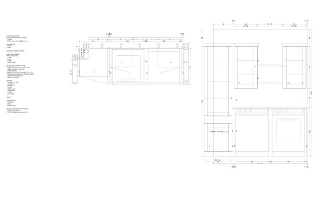
except i did FINALLY get a set of revised plans back:
the laundry room:
i have ordered everything that can be ordered...
including these for the upper laundry cabinets in the mudroom room:
found these for about 40% off on ebay. they will go on the three lower drawers in the mudroom.
i am a little bummed that the knobs won't be available until DECEMBER. boo! but i love them, and figured it is better to wait for what i know i want than buy something for now just to "get a good picture" for the finale.
SO.
here is my progress shot for the week:
the backsplash tile.
the 18" tolson cabinet pull (how dreamy is this??)
trim for the roman shades. ( not kidding. i have been dragging this trim around for about 12 years, just waiting for the perfect spot to use it. )
wish me luck.
and happy halloween!
if i could write a summary of the last week, it would be a little something like this:
email cabinet guy.
*
wait a day.
*
obsess over whether i should email him again.
*
make a list of what can't be done until after the cabinets are INSTALLED. (hint: everything)
*
email him again, with some mirror detail, hoping it will jog his memory and make him email me back with information. changes. ANYTHING.
*
wait a day.
*
obsess over whether i should email him again.
*
make another list of what can't be done until after the cabinets are INSTALLED.
*
email him again, with some mirror detail, hoping it will jog his memory and make him email me back with information. changes. ANYTHING.
so. what i am trying to say is that pretty much nothing has changed.
except i did FINALLY get a set of revised plans back:
the laundry room:
the mudroom:
i have ordered everything that can be ordered...
including these for the upper laundry cabinets in the mudroom room:
found these for about 40% off on ebay. they will go on the three lower drawers in the mudroom.
ordered the tolson hardware for the laundry room: (8" pulls for the drawer and the pull out, and the 18" pull for the large storage cabinet. )
the two cabinets over the washer/dryer will get knobs.
i am a little bummed that the knobs won't be available until DECEMBER. boo! but i love them, and figured it is better to wait for what i know i want than buy something for now just to "get a good picture" for the finale.
SO.
here is my progress shot for the week:
the backsplash tile.
the 18" tolson cabinet pull (how dreamy is this??)
trim for the roman shades. ( not kidding. i have been dragging this trim around for about 12 years, just waiting for the perfect spot to use it. )
wish me luck.
and happy halloween!
Labels:
hardware,
house #6,
laundry room,
one room challenge
Oct 22, 2015
one room challenge, week 3: cabinet plans
week 3 of the one room challenge...this is always the week where you realize you better GET SOME STUFF DONE if you're going to make the deadline!
i finally got some preliminary plans from the cabinet fabricators!
the spaces are pretty small, and i have definite ideas of what works for our family.
in order to best communicate the changes i needed, i sent a revised copy of the plans with some notes and images. when communicating with sub contractors, it always helps to provide not only specific dimensions, (or a range of acceptable dimensions), and some pictures that show what you are looking for.
here are the changes/notes i sent:
the ceilings on the main floor of my house are 9 feet. i want there to be some breathing room on top of the cabinets, and so i asked that they NOT be brought up to the ceiling. i think it will help the space feel a bit less claustrophobic. another reason i decided to lower the cabinets was because the light fixtures in both spaces are centered....if i brought the cabinets all the way up to the ceiling, the lights would feel off center.
i have placed some orders for most items, and should have most all of the components by next week!
still waiting to see some revised drawings, but with my notes, and pictures, they should be a pretty quick turn around.
Oct 15, 2015
one room challenge week 2: the plan
week 2 of the one room challenge is underway. i am making some progress on decisions.
now that i have committed to getting this area done in the next few weeks, i have been getting nervous about getting the cabinets made and installed. no kidding---i have emailed my cabinet fabricator 4 times in the last 5 days. i think he gets the hint that i am READY for those drawings.
i still don't have them yet, and i feel like i am sprouting grey hairs waiting around...
anyway.
here is the design plan for the area:
i love to pull together these plans for clients, and always make one for rooms i am designing in my own home. for me, having a visual guide for a room helps me finalize finishing touches, and motivates me to complete the project!
the mudroom PLAN:
*add a seating/storage built-in (the longer leather pulls will be installed on the lower drawers, and the leather pulls will be on the upper cabinets)
*add planking. i am considering a "random" look to the panels.
*adding grasscloth to the ceiling. i scored some ralph lauren herringbone grasscloth wallpaper about year ago on ebay, and i am hoping i have enough!
* adding some art. still up in the air about size, style, color...
*adding shelling to the closet, along with the bird wallpaper. i have been in love with that wallpaper for a while, and i like the idea of getting a little rush of happiness when i open that cam closet.
laundry room PLAN:
*add cabinets with some great hardware
*add counter. i am hoping to find a rem ant of a black veined marble, but i will settle for some honed absolute black granite.
*install a backsplash. this might be one of the items that doesn't happen happen due to time and money.
*add a roman shade
*install some trim to the ceiling in an "x" detail
*get a new light.
if anyone want my cabinet guys email, so that you TOO can bug him about getting those drawings to me, let me know! he might need a little more email motivation! ha! i'm only kidding. (or AM i?)
you can see pictures of the space in my week 1 post here
Oct 9, 2015
affordable find: brass terrace side table
i actually own the first table...the more expensive one! if i had waited a year, i would have for sure snagged the look alike bargain!
jacana accent table
$169
terrace side table
$249
happy shopping!!
Labels:
affordable find,
furniture,
get the look
Oct 8, 2015
one room challenge week 1: mudroom + laundry room
its hard to believe its that time of year again! you know....the one room challenge! (yaaaaayyyy!!)
if you follow my blog you know what this is pretty much the ONLY TIME THAT ANYTHING GETS DONE IN MY HOUSE.
so yeah. i get a little bit excited.
i have participated in the last three rounds of the one room challenge, and was one of the featured designers in the last round when i transformed my teenage daughter olivia's room:
it started as this:
you can see more pictures of this project here
the year before, i finished my mini office:
which started out here:
(you can read more about this project here)
and my daughter charlottes room:
which started out like this:
you can read more about this project here)
this time around, i will be tackling this area:
as you can see, my mudroom, laundry room and back hall closet are VERY compact spaces. my laundry room could almost be listed in the guinness book of world records are the smallest laundry room EV-uh.
seriously, its pretty tiny.
this is the view looking into the hall from the kitchen:
so much potential!
looking into the laundry room. (sorry about the crazy iPhone pano shot!)
back towards the kitchen:
and....because i want you to get a real sense of the true nature of whats really happening in behind those closed closet doors:
ta--daaaa!!
right now, there is a freestanding bookcase and everything else is literally just thrown in there.
its a disaster.
my goal for these spaces is to dress them up with some custom cabinetry,
pretty hardware, loads of storage, some special ceiling treatments and a little bit of wallpaper.
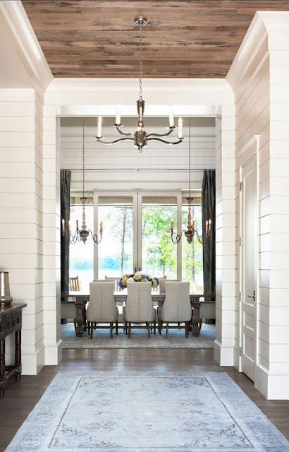
i am still in the midst of planning the final details of this space, but here are some of my inspiration pictures:
stay tuned! i am hoping to have some drawings of the cabinetry back by next week, and i should have a solid plan for the look of everything as well!
if you follow my blog you know what this is pretty much the ONLY TIME THAT ANYTHING GETS DONE IN MY HOUSE.
so yeah. i get a little bit excited.
i have participated in the last three rounds of the one room challenge, and was one of the featured designers in the last round when i transformed my teenage daughter olivia's room:
it started as this:
you can see more pictures of this project here
the year before, i finished my mini office:
which started out here:
(you can read more about this project here)
and my daughter charlottes room:
which started out like this:
you can read more about this project here)
this time around, i will be tackling this area:
as you can see, my mudroom, laundry room and back hall closet are VERY compact spaces. my laundry room could almost be listed in the guinness book of world records are the smallest laundry room EV-uh.
seriously, its pretty tiny.
this is the view looking into the hall from the kitchen:
so much potential!
looking into the laundry room. (sorry about the crazy iPhone pano shot!)
back towards the kitchen:
the rug and light fixtures will be staying.
we just got a dog, and i was totally unprepared for the amount of STUFF they need and space they take up!! i am hoping to find a better place for the dog crate...
and....because i want you to get a real sense of the true nature of whats really happening in behind those closed closet doors:
ta--daaaa!!
right now, there is a freestanding bookcase and everything else is literally just thrown in there.
its a disaster.
my goal for these spaces is to dress them up with some custom cabinetry,
pretty hardware, loads of storage, some special ceiling treatments and a little bit of wallpaper.
i am still in the midst of planning the final details of this space, but here are some of my inspiration pictures:
stay tuned! i am hoping to have some drawings of the cabinetry back by next week, and i should have a solid plan for the look of everything as well!
Oct 1, 2015
design plan: family room with accents in lime + teal
sometimes, color is just the right addition to perk up a neutral space:
interested in working together?
email me at autumnclemons@yahoo.com to schedule a consultation!
PS: these consultations make amazing christmas gifts! yes....i just said christmas. and it's the first day of october!
Sep 26, 2015
before + after: masculine bedroom (the power of an hour)
pretty much the best thing i get in my inbox are "after" pictures of clients that i have worked with! when i saw these, i was absolutely giddy.
of course, in order to appreciate an AFTER picture, you need to see where the room started:
behold...the BEFORE:
my client already had some key pieces that would be staying: the bed, night stands, lamps + the restoration hardware dresser.
what we talked about in our hour long phone call:
* cooling things down with a deeper, moodier blue wall color (especially necessary since this home is in a tropical climate.)
*reworking the wiring on the tv so that it could be mounted to the wall in between the entry and the closet.
*styling the dresser with mirrors and accessories
*adding custom window treatments, new pillows on the bed and a small seating area in between the entry and the sliding doors
*layering in some masculinity + texture with a cow hide rug
*replacing the mirror above the bed with a great piece of art
when working with a client that has requested a pinterest board + phone call consultation, the design and inspiration period is pretty fast and furious. by that i mean that i will spend a couple of hours pinning ideas and options for the room, and then, during our hour long phone call, we "build" the room, based on the suggested items and my clients needs and preferences. the pinterest board becomes a place to shop items, and (if selected), the mood board/design board acts as a visual inspiration and guide for the final look of the room.
painting the walls made a tremendous difference in this room. we ended up with "smokestack gray", by benjamin moore. before, the gold walls were competing with the warm tones of the tile floor, and clashing with the neutral, linen toned headboard.
my client: stated:
custom linen window treatments made by etsy seller martha and ash really dress up the window and french doors.
another big change was the location of the tv! before, the tv was on the dresser, which drew attention to it. now, the tv, paired with a narrow shelf and some artwork, feels like part of a gallery wall.
the new seating area rounds out the feel of the bedroom, and provides another usable space to lounge.
here is what my client had to say:
"My favorite single piece is the Thom Filicia artwork. I debated for months and months over this piece because of the expense. I'm so glad I splurged because it looks amazing. The custom drapery panels are my next favorite. The linen fabric was so affordable. Due to the size of our windows, going custom wasn't much more expensive than buying stock panels and was actually cheaper than panels I considered from Restoration Hardware. "
of course, in order to appreciate an AFTER picture, you need to see where the room started:
behold...the BEFORE:
my client already had some key pieces that would be staying: the bed, night stands, lamps + the restoration hardware dresser.
what we talked about in our hour long phone call:
* cooling things down with a deeper, moodier blue wall color (especially necessary since this home is in a tropical climate.)
*reworking the wiring on the tv so that it could be mounted to the wall in between the entry and the closet.
*styling the dresser with mirrors and accessories
*adding custom window treatments, new pillows on the bed and a small seating area in between the entry and the sliding doors
*layering in some masculinity + texture with a cow hide rug
*replacing the mirror above the bed with a great piece of art
when working with a client that has requested a pinterest board + phone call consultation, the design and inspiration period is pretty fast and furious. by that i mean that i will spend a couple of hours pinning ideas and options for the room, and then, during our hour long phone call, we "build" the room, based on the suggested items and my clients needs and preferences. the pinterest board becomes a place to shop items, and (if selected), the mood board/design board acts as a visual inspiration and guide for the final look of the room.
painting the walls made a tremendous difference in this room. we ended up with "smokestack gray", by benjamin moore. before, the gold walls were competing with the warm tones of the tile floor, and clashing with the neutral, linen toned headboard.
my client: stated:
"I am in love with the wall color. It is a beautiful steely blue and is the perfect backdrop. I also love that the room is a mix of modern/traditional, masculine/feminine, but overall has that tailored, masculine vibe we discussed."
custom linen window treatments made by etsy seller martha and ash really dress up the window and french doors.
another big change was the location of the tv! before, the tv was on the dresser, which drew attention to it. now, the tv, paired with a narrow shelf and some artwork, feels like part of a gallery wall.
the new seating area rounds out the feel of the bedroom, and provides another usable space to lounge.
here is what my client had to say:
"My favorite single piece is the Thom Filicia artwork. I debated for months and months over this piece because of the expense. I'm so glad I splurged because it looks amazing. The custom drapery panels are my next favorite. The linen fabric was so affordable. Due to the size of our windows, going custom wasn't much more expensive than buying stock panels and was actually cheaper than panels I considered from Restoration Hardware. "
a pair of matching mirrors and some fun accessories make a statement over the dresser.
some final words from my client:
"The transformation is dramatic! We absolutely love it and are so thankful to you for your help and amazing vision. Though this took us way longer to pull together than I originally thought, it was comforting knowing a plan was in place that we could work toward as time and budget permitted. We had many unexpected expenses come up last year. Working to the plan helped us save money in the end because items were purchased as they went on sale or we found alternative sources."
interested in working together on a room in your room?
email me at autumnclemons@yahoo.com and lets get going!
i currently have availability for late october and november.
Subscribe to:
Posts (Atom)