Apr 30, 2012

linen + silk striped curtains

i sent this snapshot and a quick sketch and some measurements to my client when i proposed
having some panels made from stripes in a charcoal silk and an ivory linen.
when she approved the plan, i sent the specifications to the village workroom...one of my sponsors
and my favorite source for custom silk panels.

here is what they look like installed:
i am doing the happy dance after seeing this picture!
i couldn't wait to share it with you.
(i will be sharing a few more pictures of this bedroom later in the week.)
what do you think? are you getting tired of seeing striped curtains? i have to admit
that there are times when i get a little jaded at seeing the same design elements over
and over again, but there is something so classic and fresh about stripes that i NEVER
get sick of them....especially in silk + linen.
am i RIGHT or am i right or am i right?
sorry..had to sneak in a little quote from one of my favorite movies of all time.
happy monday friends.


Apr 27, 2012

milo baughman

have you heard of milo baughman?

i sure hope so.


if not, here is a brief introduction, taken from the thayer coggins website:


"Milo Baughman pioneer in modern design and one of the leading modern furniture designers of the second half of the 20th century. Baughman was brought east from his native California by Thayer Coggin in the 1950s to design the first lines for his collection of related upholstered groups. Baughman's uniquely American designs were forward-thinking and distinctive, yet unpretentious. The relaxed and timeless quality of his furniture created a ready and consistent response and his highly influential work continues to be collected and reinvented and revived by designers around the world. Paramount to Baughman's design philosophy was that good design is enduring design. Baughman's characteristic restraint does not permit the look of mere novelty to enter in. Rather, he achieved a look that is uncompromisingly modern, but which never violates the timeless standards of classic good taste."


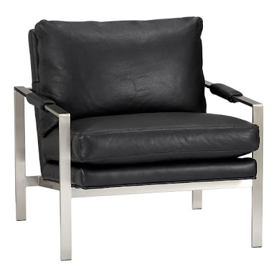
(lounge chair design by milo baughman-elle decor)
i first learned about milo baughman when i was in college.
a professor of mine announced to my interior design class that milo baughman (pronounced my-low boff-man) was going to be teaching a furniture design class the following semester, and encouraged us to take it.

 i signed up immediately, even though the only information i know about him was very limited....this was before the internet exploded (1995. yeah. that makes me feel really, really old, by the way)

not only did i take the "intro to furniture design" class with milo baughman, but i also took the "advanced furniture design" class and did an internship with milo for a few months, assisting him in a few local projects he was working on. he was a kind, and deeply thoughtful and intelligent man with a quick wit and a deep love and knowledge of interior design and modern furniture design.


(a console table design by milo baughman-elle decor)

one of the things he said to our class that has resonated with me for the last 17 years is this: 
(and i am paraphrasing a bit...)
"everyone thinks they have good taste. but this cannot be. inevitably, some of the people who think 
they have good taste are wrong"
whenever he said it, he would softly chuckle. 
(and that would make the entire class chuckle!)

milo's work has become a lot more popular in the last few years.
you can do a quick search on ebay, and come up with dozen of items.


(i would LOVE to own this baby!)


crate and barrel is now carrying several pieces that he designed:


it was a great privilege for me to get to know such a wonderful man. because of the internship i did with him, i spent more time with him than the other students, and he was always an inspiration to be around.

you can read more about him here.
you can shop on ebay for his furniture here.
see his collections for thayer coggins here.
to shop his furniture at DWR click here.

happy friday!

Apr 26, 2012

kelly wearstler groundworks fabrics


i've been in love with these fabrics for a long time.


on a recent visit to the showroom here in slc, i got to look at them in person.
if you have never used a high-end fabric in your home before, you should consider buying a pillow in your favorite designer pattern. i promise it is worth the cost... the fabrics are thick and have a great "hand" (or feel) to them. i think that just as a great accessory or handbag can really elevate or transform an outfit, a great pillow in a fabulous designer fabric can transform  an entire room.
shown above are "ombre maze" in teal and "katana" in jade/teal.

i REALLY loved this pattern. it's called "agate".
i am already dreaming of how i can use this in my house. i think it would
look great on my ottomans.

the colors on this fabric ("oblique") were perfection. i kinda have a thing for a deep,
mustardy yellow. i love the diagonal stripes, and would love to have a very tradtitional
french chair upholstered in this quirky velvet stripe...of course, knowing me, i would 
look for a striped fabric that wasn't $370 a yard and put that on a diagonal! 

you can shop for kelly wearstler groundworks fabrics at inside fabric.

Apr 24, 2012

confessions of a plant killer

in rooms that i design, i always suggest my clients have at least one live plant.
orchids are some of my favorites, but i also love palms for height, ferns for fullness and succulents for sustainability...especially for plant killers like me.

about 3 months ago, after all of the christmas decorations were down, i noticed that i needed some real, live green things in my house. when i comes to plants, i am no snob. if i can't find it at ikea or home depot, it doesn't live at my house.
of course, each time i bring home a plant, i tell myself the same things...
THIS time, it will be different.
i will take the time to find out exactly how to care for the plant.
i will fertilize.
i will water regularly.
i will NOT neglect.
i will NOT throw this plant away, a dry carcass dumped unlovingly and embarrassingly into my trash.
nope.
not this time.
not THIS time.
and yet...the sad evidence to the contrary:
 (this one is so dead, it is actually crispy!)

i am so sorry plants. i tried.
ok, so maybe i didn't.
but i MEANT to.
really, i did.

so, this time i am starting a little smaller, and going for a plant killers best friend:
succulents.
i was out and about last week and stopped by ikea and grabbed some succulents, pebbles and a small pot, and then stopped at crate and barrel where i spotted a cute little chalkboard herb pot. while i was there, i also spotted an unlikely plant holder in the kitchen department
---a footed soup bowl!

i thought it would be the perfect scale for a single succulent. i put a large handful of pebbles into the bottom if each container, placed the plant on top, and covered the top of the plan with more rocks.

the chalkboard herb pot is now in grady's room,
(uh, yeah---that says "avengers assemble".... just in case you thought my 8 year old
was writing swears.)

the ikea pot is in the family room,

and the footed soup bowl is on my husbands nightstand.
i am pretty confident i can keep THESE plants alive.
THIS time, it will be different....

****
one more confession....do you have a blog?
are you NOT loving the new blogger interface? i know they "introduced it a while ago, and i chose to use the old format, but now they are FORCING me to use the new one!
i am grumpy about it.
i feel like such an OLD lady trying to figure things out. i find  myself muttering things like
"well, it was perfectly fine before. why'd they have to go and move things around? harummmph!"

oh, and while i am confessing, i have to apologize for my lack of posting regularly over the last few weeks. i am still learning how to balance it all---
laundry
and blogging
and being there for my kids
and design work
and homemade dinners (sadly lacking as of late)
and keeping up with other blogs
and keeping the house clean
and answering e-mails
and taking time for myself.

there are  times when i realize that something has "gotta give"...and lately, writing a post for my blog has been that thing to "give". i guess at the end of the day, i don't want to feel like i HAVE to write a post. i want to WANT to write a post. i want to be excited about what i share with you.
i hope you understand. my passion for blogging and interior design hasn't' waned...just my ability to balance LIFE.
i should be a little more productive blog-wise over the next several weeks...grady's room is almost finished, and i am going to start working on the master bedroom in my rental house. i have also been asked to create an inspiration board for a party table for a new online magazine focusing on celebrations and gift giving. i came up with the inspiration, and my sketches and ideas are going to be realized and photographed. i am pretty excited!
so, i guess what i am saying is...thanks for sticking around.
it's good to feel back in the swing of things...


Apr 23, 2012

luxe at the lake

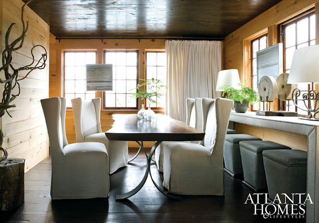
when opened my last issue of atlanta homes and lifestyles magazine, i was immediately taken with a spread on an alabama lake house designed by bobby mcalpine and susan ferrier. the interiors have a rustic, luxe warmth that is accentuated with industrial touches and textural elements that had me wishing there were a dozen more pages in the feature.

 the horizontal planking on the walls adds a texture and warmth that contrasts dramatically with the
soft, solid upholstery and white linen window treatments. 

i love the huge scale of the art above the fireplace and the metal light fixture.


 simple, sculptural chairs and furnishings keep this room modern and classy...notice the art hanging on the 
windows? 


 the leather benches and cowhide stools provide lots of seating in the kitchen. (my kids would have those chairs stained in SECONDS, but aren't they pretty?)
one other thing that i love about the room is the botanical collection that is hung floor to ceiling. 
framed botanicals have a very traditional feel to them, the the monochromatic look and the way they are displayed keep them feeling edgy and fresh.

 yep.
i could get some goooood sleep here. (love those dark ceilings...)

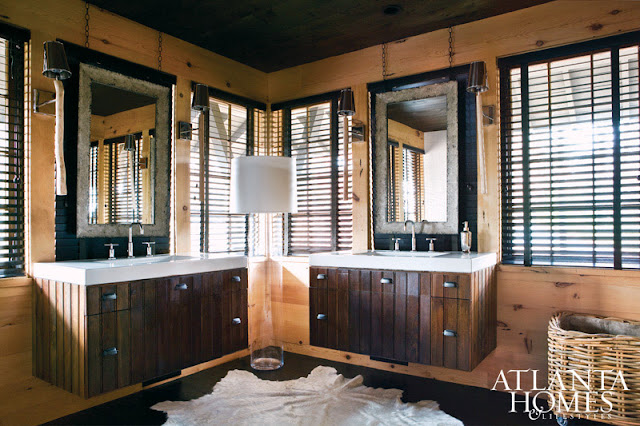
 this is such an untraditional floor plan for a bathroom...the corner windows and large cylinder floor lamp are so interesting. and the fact that a rough hewn wood was used for the vanities, definitely lends itself to that lodgey feel...but a very updated and modern lodgey feel.

 did you have a favorite space in this house? if i had to pick one, it would be this lounge area...i seriously let out an audible sigh when i saw this picture. how great would it be to curl up here with a book?

Apr 18, 2012

e-design bathroom

a look at a new construction bathroom for an e-design client that is coming along nicely:


we decided pretty early on that we wanted a feature wall behind the vanity. the oval glass tiles add a nice 
iridescence without being over the top. 

the glass tiles need to be grouted, and the seam between the countertop and the wall needs to be caulked, but other than that, this bathroom is done.


we kept the color palette neutral, and used the same tile on the floor and in the tub surround. the kraftmaid cabinets are dressed up with mercury glass knobs from anthropologie. (some of my favorites!)


because their was a window in the bathroom that couldn't be moved, we opted to lower the counter in front of it and create a little vanity area...just add a nice mirror on a stand and it can become the perfect place to apply make up and get ready for the day!
the wall color is benjamin moore's "sea haze" 2137-50


\


Apr 16, 2012

grady's room-a few last details

i am still making s-l-o-w progress on grady's room...i still need to decorate the walls, and have a pillow made with this fabric.

i bought the brooklyn bridge pillow cases before we moved, and FINALLY found them while digging through the garage on saturday. (isn't that sad?? ugh. i hate being so disorganized!)
i am going to attempt to put together the rhino head from cardboard safari this week sometime and MAY or may not hang it. (still waiting for my "g" to bet back from the framers)
when i finally get some stuff up on the walls, i will take a picture to share!
to see sources for the above items, click here.