oh, i know.
everyone with kids has
school on the brain.
(either your kids started school a week ago or more, or they started school yesterday (ME!!), or they are about to start!)
well, of course i have
school on the brain, but i also have the
BEACH on the brain. we returned just over a week ago from our summer vacation to florida.

we stayed in an area between two busy beach towns in the panhandle (panama city beach and destin)...an area that is laid back, family and bike friendly, and one of our very favorite places to visit.

if you like easy-going beach towns, great local restaurants, white sand beaches and emerald green/turquoise water, then you might want to check out this little strip of heaven, generally called the "30-A area."
this year, we stayed in an neighborhood called
watersound west beach. it is part of a larger development known as watersound.

here is the house we stayed in:
now, the neighborhood where we stayed had a GREAT pool, and some beautiful houses, but the real gems were in the development next door: watersound. take a looky:
ummm.
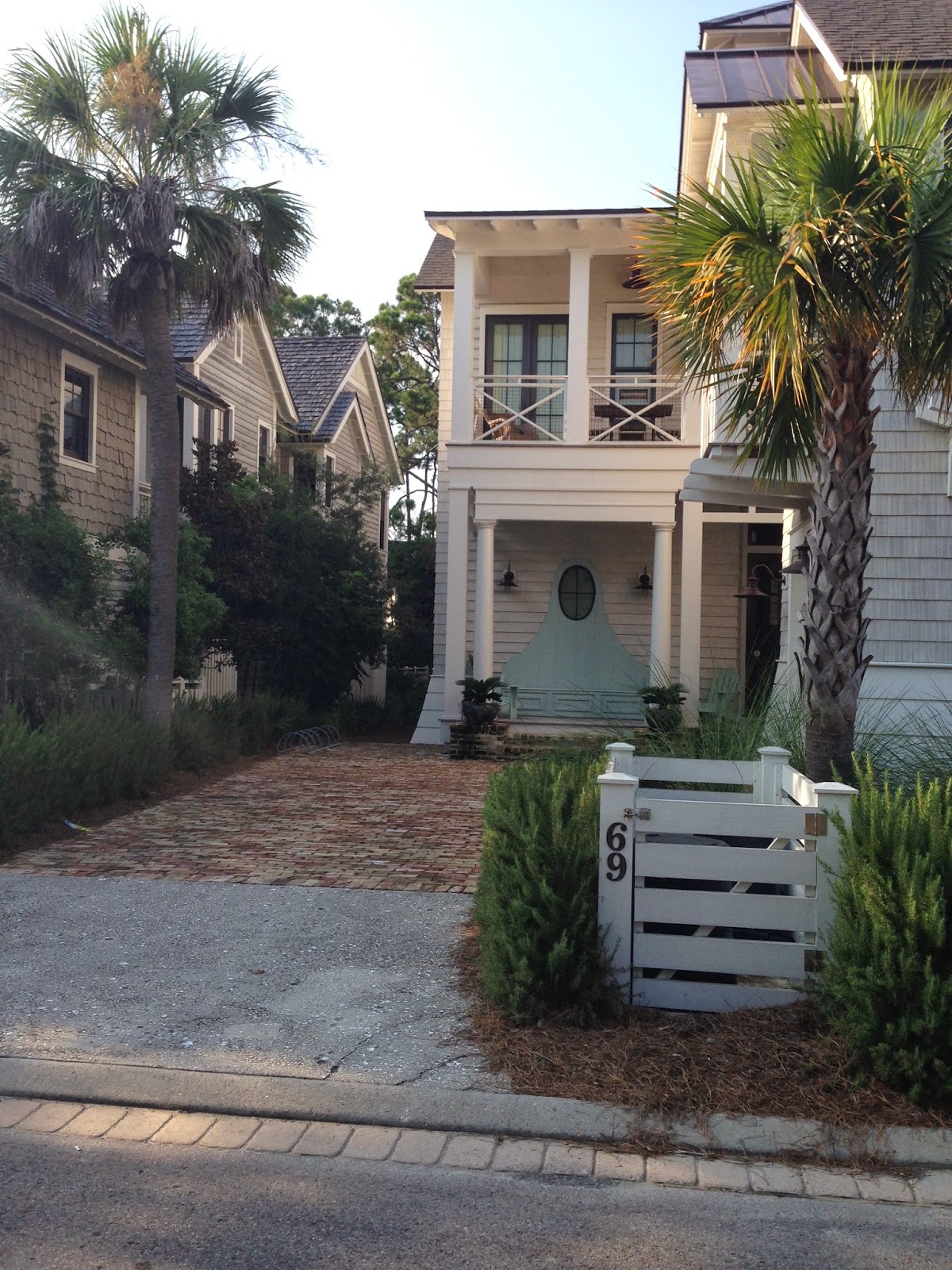
i almost crashed on my bike when i was taking these pictures. these houses are so full of detail and charm! i loved the little recessed porch on this house, as well as the trellis under it (which is a great way to disguise a "blank" area on an elevation!)
whats to love here?
--"x" detail on the porch and garbage door
--mix of shingles and planking
--flared base on garage
--small balconette on garage with metal roof
--trellis detail over garage windows
--aqua shutters and detail around built in bench on front porch
the details on this house are just lovely, don't you think?
the entire neighborhood definitely has a new england/cape cod feel.
(yah, know...if cape cod was on the gulf of mexico, and everyone that lived there was super rich. and wanted to live really close to their neighbors!)
a gate leading to a lawn area, pool, and the ocean!
i really like the arched door on this house. and i like that they kept the door wood. its actually a little unexpected at a beach house.
really nice detail on those garage doors! oh, and i love the corbels, and the slight overhang!
the horizontal slats on the second story porch makes this house feel a little more causal. that conner trellis is a great way to add some detail, as well as some shade!
hello there gorgeous, shingled tower!
you know what i think when i see this house?
if THIS is the beach house, what in the world does the REAL house look like??
shed dormer. metal roof. simple lines. herringbone brick roads.
i posted this picture on
my instagram feed.
such a charming house! the gambrel roof is a nice touch.
one detail about all of the watersound neighborhoods is the fabulous detail on the roads and curbing!
pretty phenomenal, if you ask me.
great use of trim to break up the facade!

stunning.
detail on the tabby chimney.
isn't the dark color a surprise? i love it.
love that porte cochere too!
LOVED the detail around the upper window!
(and the windows, flared eaves, and the neat detail at the top!)
another simple, great way to dress up an elevation!
this one is nice too, don't you think? so much detail.
and, even though you didn't ask, here are a few more snippets of our stay:
amazing artisan popsicles. a must after a 9 mile bike ride!
a walk through seaside:

a look at the pool and pool house at watersound west beach:
(and for those of you who have teenagers, i hope you have better luck getting a NORMAL picture of your kids than i do. *sigh.)
my 3 kiddos:

grady.
charlotte.
olivia.
have a fabulous tuesday everyone!!
and good luck with that school thing.


