May 31, 2012

design plan-family room

a look at the idea board for a design plan that i recently completed:


interested in working together to create a more functional and beautiful space?
email me at autumnclemons@yahoo.com
i am currently taking clients for full room designs for late august/early september,
but can fit in a phone consultation, a pinterest board + phone consultation any time!

May 30, 2012

there and back again

we are back from our whirl-wind-spur-of-the-moment road trip! thursday morning, we were planning for a quiet weekend around the house, and by 5:30 that evening, we were on the road, headed for the california coast.
it was our first time to the northern california coast, and we all loved it.
along the way, we drove through napa valley, stopped in san francisco and got a taste of the city, dropped down to the monterey bay area, and strolled through monterey and carmel, and then visited lake tahoe on the way home.
my husband drove over 1800 miles in 5 days!
i have a new appreciation for california. it is such a diverse and beautiful state! oh, and it is also
rather h-u-g-e! and did i mention beautiful?

here are a few instagram pics of our trek:

highlights of the trip:
1. driving though napa valley + lunch at the oakvillle grocery
2. a visit to muir woods to see the redwood trees
3. driving across the golden gate bridge
4. eating at some wonderful places in san francisco, (thanks to the great recommendations of one of my fabulous clients. thank you merredith!)
5. the view of san francisco from our hotel room and the top of lombard street (aka the crookedest street in the world, which my kids LOVED driving down.)
6. riding the trolley and strolling around the the touristy sections of san francisco (fisherman wharf, union square + ghirardelli square). we wouldn't have done these things if the kiddos weren't with us, but they really enjoyed  it.
7. shopping at the container store. yeah...that was a highlight. at least for me. my family was pretty bored. but i was in heaven! i can't wait until they open a store in salt lake.
8. dining with a 180 degree view of the bay in monterey.
9. carmel. *sigh. i definitely want to come back here alone with my husband. what a charming and beautiful place! the beach here is the one you see in the picture above, and it is breathtaking. the carmel mission was also a gorgeous place.
10. renting a boat and cruising lake tahoe.

as you can see, we really like to vacation at a fast pace! if you are headed towards the coast from the rocky mountains, and have some questions or need some recommendations, feel free to email me! i am certainly no expert, but we made some decisions that i think made for a fun and unique trip.
have a great day everyone! hope you enjoyed this little snippet of our trip.

May 25, 2012

impromptu road trip

you can probably guess where i am right now!
we headed out thursday night on a very spontaneous road trip. i will be back tuesday or wednesday with
some fun pictures to share!


May 24, 2012

rosemary beach house

i spent some time last weekend searching for a beach house to rent for a few nights this summer. we are going back to the 30-a area of florida--a tranquil, dreamy little stretch of beach towns between panama city beach and destin. 
as i was looking, a certain property that is currently for sale caught my eye...i KNEW i had seen it before, and immediately recognized the handiwork of the architect and designer.
 (and good heavens, i wasn't looking at houses like THIS to stay in...my budget would probably rent this baby out for about 12 minutes! but hey, looking is free, right?)
as with all properties designed by mcalpine tankersley architects and interiors by susan ferrier, the house is jaw-droppingly beautiful.
full of rich details. 
elegant, rustic and welcoming.
this house was featured in the october 2010 issue of coastal living.


this house is located on the beach in the planned community of rosemary beach, which i blogged about here. there is actually a lot of design talent in the area--- erika form urban grace interiors has an office around here,  seleta from simply seleta lives here, and tracery interiors has a store just steps  from the beach in the business district of rosemary beach. i actually stopped in last year and visited the store last summer and met anna kay porch of tracery interiors in person, who is absolutely lovely and super sweet...even if she DID graduate from auburn university. (sorry anna kay--i had to say that!!  my husband is a fiercely loyal alabama fan!)
anyway, back to the HOUSE...


although the house is GORGEOUS, and it would be impossible to make it look anything BUT gorgeous,
it was kinda refreshing to see some of the listing/"real life" photos in comparison to the pictures that were captured for the coastal living spread.
feast your eyes:

real life:
coastal living:


real life:
coastal living:


real life:
coastal living:

real life:
coastal living:

really, the differences are minimal... just a few live plants, some well placed accessories, and better lighting.
in fact, in the kitchen picture above, it even looks like the same bowl and cutting board are on the counter!(minus the artichokes, or course. 
cuz what's a beach vacation without some pelligrino and artichokes??) 

and, just for fun, a few additional shots from the coastal living spread:


of course, no matter how beautiful the house is, it can't compete with this view!
and yes...it really does look like this in person.
i can't wait to go back.
*sigh.
all images via here and here.

May 22, 2012

sneak peek: pimlico magazine photo shoot

just a little peek at the photo shoot for the premier issue of pimlico magazine:


i am SO thrilled with how everything looks! it is always so incredible to see someone take
a concept and ideas that you design and bring them to life!
the premier issue of pimlico will launch in a few weeks.

May 21, 2012

the power of an hour: formal living room

a few months ago, i was contacted by a client in arizona who needed some help with her formal living room. 

i suggested she opt for a phone consultation + pinterest board

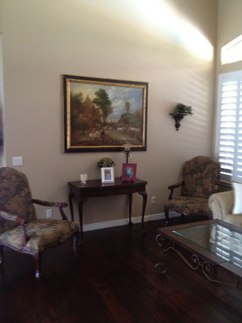
here is what her living room looked like 
before:
she wanted some simple updates for the space, wanted to keep her original furnishings, and needed to keep the paint color the same, since the living room is open to a large portion of the house. 
she had recently purchased some pillows from pottery barn with a robins egg blue and red and wanted to keep the color scheme established by the pillows.

here a a few of the things we discussed during our phone call:
 **add a neutral rug to tone down the formality of the armoire and other furniture.
**add new lamps
**move the round table to the other side of the sofa to create balance and bring the side chair more in front of the console table
**change the upholstery on the side chairs to a simple, classic stripe
**paint the small console table blue to break up all of the brown
**add items to the side of the large painting, and some shelves to the side of the armoire for
balance and 
**add a simple fabric to the back of the armoire for some contrast
**change the small side table near the armoire to a metal one with classic lines and top with a live plant
** add some additional pillows in blue 

i pinned my ideas and suggestions to the pinterest board that i created for her, and we talked through the ideas during our phone call.


after:

as you can see, the changes are rather minor, but make a big impact.
my favorite change (and hers!) are the chairs she has reupholstered in a wide taupe and ivory stripe.
the textured rug and the accents of glass (lamps), metal (side table), and color (console table and pillows) really help to update the room.


do you have a room that needs some simple updates? have questions about a space and
are not sure what to do? need advice on color? fabrics? floor plan layout?
contact me and schedule a time for us to chat! i am currently accepting clients for full room designs
for august and september, but i can fit a phone consultation or a pinterest board + phone consultation ANY time!
feel free to email me at: autumnclemons@yahoo.com

May 16, 2012

affordable find: swing arm sconce

swing arm sconces can be a lifesaver in a tight space, especially next to a bed. they have
become quite popular over the last year, and are pretty difficult to find under $100.
but looky what i just spotted:
modern functions swing arm wall sconce
$89

i have already pinned this to my affordable find board, so you can
click here to re-pin it!

May 15, 2012

seeds of inspiration--pimlico magazine

pimlico magazine is a new (it will launch in about a month!) online magazine dedicated  to "artful celebrations and inspired gift giving". 
it is the brain-child of my friend, jen, (whom i collaborated with on this room), and her friend allison.
jen contacted me and asked me if i would be willing to pull together an inspiration plan for a summer get together that they would stage and photograph.

my first task was to pick some color inspiration, and so i looked through jessica's amazing selection of color inspiring "design seeds".  
i finally settled on this one:
(you can see more design seeds here.)
i loved the fresh, summery feel of the tomato hues, and the vibrant greens mixed with the deep peach and vivid red.

from there, i decided that i wanted something casual.
something fun.
something approachable.
my theme became "preppy rustic"...with stripes, rustic wood, peach flowers, and fresh tomatoes.

here are a few of my inspiration images:


* the photo shoot was last week, and i will share some sneak peek pictures with you shortly!

 to see more of our ideas and inspiration, go here.
you can follow pimlico's blog here, and follow them on pinterest here.