Jul 29, 2011

buy this, not that: florida souvenir store/gas station/citrus center

i have been back from florida for a couple of weeks now, and have been meaning to post this,
but i was so busy catching up on *life that i just got a little bogged down.
here are a few great comments from my last post in this series, which you can check out here:


 i am finally back in full swing now, and wanted to share with you some goodies that i found at a souvenir gas station in florida (yeah---i KNOW that sounds incredibly classy...but trust me, EVEN here, you can find a few things that are attractive.) 
first off--a couple "overall" shots. just so you can see what we are dealing with here:

it was a little difficult to find some beauty among all of this stuff, but i DID.
(you are WELCOME.)


shall we begin?

buy THIS:
shells are, in my opinion, a spectacular gift from mother nature. the shapes, the textures, the colors...all
so unique and varied and beautiful. a large, pretty shell placed on a stack of books on a coffee
table can become a casual and elegant vignette.

not THAT:
 
ok. first off, this really scared me. i mean... not many things are MORE tacky and disturbing
that a toothless, cigar-smoking shell-man with weird claw feet. WHO is buying this stuff? 

buy THIS:
 natural. pretty. seeing a pattern here?

not THAT:
"hi honey. i just got back from florida, and as soon as i saw this plastic dolphin, with
it's torso splayed open and it's internal organs and spine replaced with a sparkly, plastic reef 
complete with little fish swimming in it, i just KNEW it would be perfect for you!"

buy THIS:

 or this:
 these frames are pretty simple, monochromatic, and made from REAL shells.
i approve. as long as you don't pair them with 76 other shell frames. things like these
shell frames look great when balanced with simple silver or wood frames.

not THAT:
uh. just don't do it. 
no matter how much you love pelicans.

buy THIS:
as far as souvenir glass objects go, this one is actually rather pretty. the colors are natural, and the shape 
is appealing. i have a *thing for birds. i love those vintage audobon birds etchings, and have a 
few metal bird paperweights in my office. 

not THAT:
 i really do think that handmade glass objects are really interesting, but the color and the weird
eyeballs on this octopus really put me off. 

buy THIS:

looking for a great housewarming gift for a friend? present this little orange tree in a pretty pot! the
tree will eventually produce edible fruit, and add color all year long. this could also make a fun and
different baby gift. it can grow right alongside the little one....and if you live in a tropical zone, it can be planted outside, where it can really thrive!


not THIS:
i don't EVEN need to comment on this one, do i?

buy THIS:
another simple, classy purchase. i imagine the light filtering through the shells when a candle is lit
inside this votive would be very pretty...

not THAT:
 uh....um...i don't even know what to say. 
poor coconut.
this about sums it up. poor, poor coconut.

and last of all...
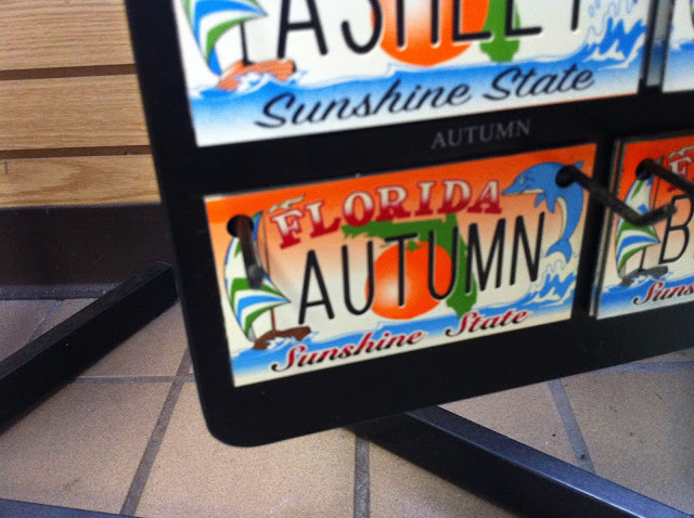
where was THIS when i was 9?? i would have snatched this up in a heartbeat!
but should i be worried that i am finding my name on plastic licence plates in a florida gas station/souvenir store??
 cuz i am....

if you have missed my other installments of "buy this, not that",
click here and here.


Jul 28, 2011

golden gate dining room: e-design update

ahhh...the magic of e-design! 
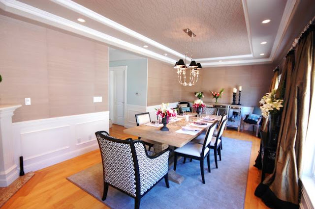
remember this room?


well....here it is now:


my client has been VERY busy the last few months, working on the design of this room with me,
ordering all of the elements, overseeing the installation of the wallpaper and wainscoting (and everything else), getting the rug made, taking some amazing photographs for our collage wall, and
....oh, yeah...giving birth to her first baby!  
a few weeks ago, i had the immense pleasure of getting to meet not only
my amazing client, but her sweet husband, her parents, and her d-a-r-l-i-n-g baby boy when they
were in salt lake city. it was the highlight of my july! (well, that AND getting these 
pictures in my inbox!)


what we did:
*new wainscoting was installed on the lower portion of the wall.
*grasscloth wallpaper was added to the upper part of the walls.
*the ceiling was painted a soft mocha color, and a subtle metallic wallpaper was installed in the inner-most tray of the ceiling.
*4 new chairs were added to the existing 6 leather dining chairs.
*new chandelier
*new curtain rods and custom silk drapes
*mirrored buffet added
*new, custom rug was made to fit the long room.


 the items in this room are from a large variety of sources, including ikea, pier 1, west elm, wisteria,
restoration hardware,  and other online retailers. the additions of a few "splurge" items, like the black and cream upholstered chairs,  wallpaper, and great chandelier really elevate this room and give 
it a very high-end look.


this dining room needed to seat a lot of people. my client has large family get togethers several times a
year, and wanted to maximize seating.
she already had the extendable dining table and 6 cream leather chairs. we brought in two larger upholstered chairs for the heads of the table and had them custom upholstered in a graphic cream and black cut velvet. two additional chairs flank the mirrored buffet, and a new grey velvet loveseat (on backorder, but should arrive in the next few weeks) will anchor the wall near the fireplace, and provide even more seating.


the curtains were custom made for us at village workroom, one of my sponsors. as always, i am thrilled with the results!
the curtains are a bronze dupioni silk with a small band of black silk at the top, and a larger band at the bottom. they are SO yummy!
the new rug is a very unique size---approximately 7 feet by 15 feet. we had it cut from a neutral colored,
textured wall to wall carpet and had it bound...this was a fraction of the cost that a truly custom rug would have been!


chairs upholstered in a black wool with a subtle stripe flank the mirrored buffet. eventually, new lamps and a great piece of art will eventually round out this vignette. the larger pillows will go on the new love seat, but the smaller lumbar pillows with the peacock dotted velvet will stay on the striped chairs.


my client and i both agree that one of our favorite elements of the room is the sublte metallic wallpaper we installed in the innermost trey of the ceiling. the soft mocha background and bronze and gold strings of "pearls" really tie the room together and add just the right  hint of sparkle. the pictures really do NOT do this wallpaper justice...it really is GORGEOUS in person.
as i stated in my post yesterday, there are several elements that are yet to be added to the room...but that is the beauty of e-design...you get to pace the design and installation of the room according to your own budget, needs, and timeline. 

Jul 27, 2011

design plan: golden gate dining room

i started working on this  san francisco e-design dining room early in the year. as soon as i saw pictures of the rest of my clients home, i knew this room had to be pretty special. we wanted something that was sophisticated, and wanted the color palette to be soft. the minute i saw that shallow trey in the ceiling, i knew that i wanted to slather it with wallpaper. thank goodness my client was on board!
here are some before pictures:


 here is the design plan, which includes custom silk drapes, a mirrored console, grass cloth wall covering above newly installed wainscoting, and a subtle metallic wallpaper in the inner trey of the ceiling.

i will be sharing "after" pictures tomorrow! there are still some missing items, but all of the big elements are in place and the room is looking great.
***
and, just for fun...a quick peek at the other spaces in my clients home that she decorated herself...arent' they great?
 yay for black walls!

all photos taken by my client

interested in working together to create a more functional and beautiful space? email me at autumnclemons@yahoo.com for more information and rates. i have slowly (emphasis on the s-l-o-w been working on the tabs at the top of my blog, and should have some information on my services 
s-o-o-n.) 

Jul 25, 2011

8 modern classic chairs you should know

one of my favorite classes in college was an interior design history class. the class focused on the last 100 years of interior design, and one of the elements that i enjoyed the most was the section on modern classic furniture. there are literally hundreds of chairs that are considered "modern classics", but these happen to be my favorites, and the ones that i feel blend most effectively into a more traditional setting.

barcelona chair
designer: ludwig mies van der rohe
1929


klismos chair
t.h. robsjohn-gibbings
1936

pony chaise
designer: le corbusier
1928


eames dkr shell chair
designers: charles and ray eames
1951


ant chair
designer: arne jacobsen
1955


wassily chair
designer: marcel breuer
1925


brno armchair
designer: ludwig mies van der rohe
1929


eames lounge chair
designers: charles and ray eames
1956 
(all images via pinterest)

*most of these chairs might look familiar because they are often used in residential and commercial spaces, and are often knocked off by large retailers. i love the way these chairs can add a little personality and an eclectic vibe to any traditional interior.