Mar 27, 2013

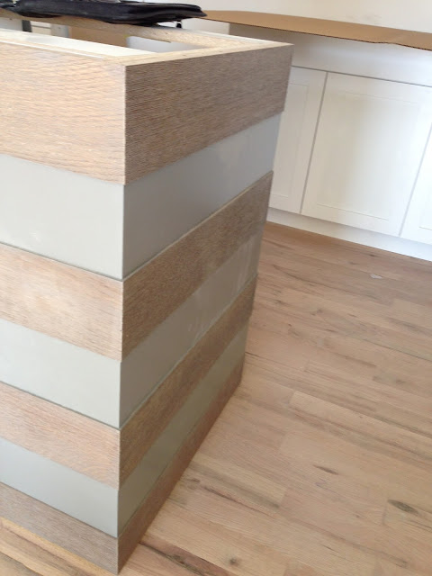
my custom striped island (!)

i love stripes. 
i have loved them f-o-r-e-v-e-r.
(i love them so much that i painted stripes on the foyer walls 12 years ago in house #1.
and 9 years ago in house #2, i painted stripes around my 12' tall fireplace wall, and had custom silk striped curtains made for house #3 and #5.)

i love them so much that i don't even mind that EVERYONE else likes them right now too.
yep.
THAT is dedication.
(and TRUE love.)
to me, they are timeless yet whimsical. 
classic yet fun.

when it came time to design my kitchen, i knew i wanted simple white cabinets, but i wanted the island to be unique. i thought...why not add stripes to the island?
at first, i thought that i would just paint the stripes on...but that didn't seem like it was enough.
i wanted the stripes to be textural as well. hmmm....why not alternate painted wood with stained wood?
here is a sketch i showed todd, the owner of millbrook cabinets:
(he was the only one of the three cabinet companies that didn't flinch or make a funny face when i showed him my preliminary idea for the island. that's why he got the job!)

after some brainstorming with todd, we decided to use wire brushed, straight grain oak (also called quarter sawn) for the rough/wood parts of the island. he had a sample of wire brushed wood in his shop, and it was exactly what i envisioned!

here is a picture i took a few weeks ago at the cabinet shop---the back of the island was just getting pieced together!

the front of the island will look like a regular cabinet--it will have a grey painted finish. only the sides and back of the island will have the stripes.
i decided to use restoration hardware's "slate" for the island, (including the smooth stripes.)
the shop already had "slate" on some of their office cabinets...eve though theirs have been distressed and glazed. i like that is is a soft, warm grey that has a nice depth to it.

i wanted the wire brushed oak to tie in with the painted areas, and so i asked that they be wiped with a watered down version of the paint. i still wanted to be able to see the grain of the oak through this stain/glaze.

i stopped by to see a sample of the wire brushed oak a few days later...
here you can see that they tested out 3 different versions of the stain/glaze. the top has a heavier application of the stain, the middle has the least, and the bottom is in between:

i definitely liked the area where the stain had been wiped away the most:

another sample of the wire brushed oak next to the island cabinet drawers:


and, finally....a look at the island in place!


 the house is super dusty because of all the trim we have been cutting, so you can see there is a lot of dust on the island! it will look even better when the we clean it off and the floors are stained!

as you can see from this picture, there is also a slight difference in depth between the painted parts and the wood parts. i was SO pleased with the craftsmanship and dedication of the team at millbrook cabinets! to me, the island is a work of art. they did a tremendous job of turning my sketch into a reality.


Mar 26, 2013

design board: upstairs "boys" bathroom

after weeks of trying to narrow down the possibilities, i finally decided on the tile for the upstairs bathroom that will be used primarily by my son. i wanted a simple, masculine feel in this room, with a few fun details.
 i started with the floors. at first, i wanted to use some patterned concrete tiles from villa lagoon tile. i even called and talked to the owner of the company (who was completely amazing and sweet!), but realized that there was just no way that their gorgeous tiles were going to fit in my budget. in fact, just the shipping alone was more than could spend on tile for both the shower and the floor!

onto plan B.

i looked at a LOT of tiles, and kept coming back to black slate.
i ended up choosing 12 x 24 tiles in montauk black slate. the slate retails for around $6 a square foot. i purchased my tile from modern tile in salt lake city.  they have been amazing to work with!

at first, i was considering using the black slate in the shower as well, but ultimately decided that i wanted a contrast to the larger tiles on the floor. i selected a mosaic white subway, available here.
of course, there are still some details left to select...i need to find some remnant stone for the counter top still...i am hoping to find a simple black granite. i would prefer honed, but i may have to go with whatever our fabricator has one hand.


here is the design board:


i am really excited to see it come together!
our target move-in date is the end of april, so things are moving fast!
can't wait....!

Mar 25, 2013

exterior lights

when selecting the lights for the outside of my house, i knew i wanted something classic...with either a silver or a dark grey/black finish. scale is a HUGE (no pun intended) issue when selecting exterior lights. most purchase lights that are dwarfed by the elements of their home's exterior. of course, you need to take measurements of where the light will be installed and make sure that the light will FIT, but if you are deciding between the "medium" light, and the "big" light, i say it is almost always better to go BIG.

i looked at hundreds and hundreds of lights, and it seemed like every time i found something that i loved it was super, duper expensive.
anyone else out there have a similar problem? 
i thought so.
i kept coming back to the selection at restoration hardware. they have several finishes available on nearly all of their lighting, and they are so classic. it was hard to pass up.

here are the lights that will be mounted on the front pilasters---on either side of the front door.

they are the stockholm sconces from restoration hardware in the weathered zinc finish. i totally lucked out and managed to get them on clearance for $159 each, which is pretty insane, considering the size and look of these lights! even though i ordered them 2 months ago, they are on back order until the middle of may.
sadly, this light is not available anymore, but the pendant version is available here.


this light will be mounted in the small recessed entry, outside the front door:
it is called the vintage barn flush mount light, also in the weathered zinc finish.

i am hoping one day 3 of these lights will be installed between the garage doors:

since there are 3 of them, and i have been busy buying other lights...and tile and sinks and carpet and hardwood, i haven't had money in the budget to purchase these yet.

instead, three of these $5 beauties will hold their place for a while.
(i am actually using 4 of these in the bonus play area as well....i mean, for $5, how can you go wrong?)


these lights will also be installed in the front until my stockholm pendants come in. i am sure my neighbors will wonder why i have such teeny-tiny lights on the outside of the house! it should make for some interesting conversations!

Mar 21, 2013

construction progress week 20

here's what's been happening around my new house this past week:

the cabinet boxes arrived. walking in and "seeing" the kitchen for the first time was pretty thrilling, i have to say!
once they are installed, the drawer and cabinet fronts will be added, and the crown molding will be put up.

the large tower to the right is the pantry. the open space next to it is where the fridge and freezer will be.

here is the cabinet box for the master bedroom...

doors and casings and trim started going up. this picture is of the cased opening going from the entry/living area into the master bedroom and powder room vestibule.

we (and by "we", i mean my husband and a friend of his!) installed the backer board for the tile.
this is the smaller upstairs bath....the bath that will mainly be used for my son.

this is the master bath...looking into the master bedroom.

here we are messing around with the tile layout for the master floor. i originally wanted to do  double herringbone, but we needed a tile that was longer than a 3" x 6", and it was going to blow our budget. instead, we will be using these 3 x 6 marble tiles from home depot that were much more affordable.

on the outside, the BIG news, of course, is that the house is PAINTED!!

here is the house with just the garage side painted... i was so surprised to see how quickly the house got painted! it really only took three days, including prep. 

here is the house the following day....everything is painted except the side of the house you cant see...


the concrete sill that goes between the siding and the stone started going up as well...


a peek at the back of the house. you can see the concrete sill really well here.
i am really happy with "white dove" from benjamin moore. it is just what i wanted...a nice, soft slightly creamy white.


a close up view of the entry.
there will be a light on each of the pilasters, and another light on the ceiling of the recessed entry.
and here she is all painted!
we will still be adding shutters, landscaping, front steps, and eventually a window box or two. (arent window boxes dripping with flowers the BEST?)
there will also be a small (around 3-4 feet high) retaining wall right at the front sidewalk.
we still have a LOT of work to do on the back retaining wall...but it is all really coming along!
thanks for following along!


Mar 18, 2013

jonathan adler + jc penney

i was really HAPPY to find out that our favorite happy chic designer, jonathan adler has teamed up with jc penney to offer some high style, mid-priced items for the home.


here are some of my picks:


$28


$1850


$10


crescent heights lacquer coffee table (available in 5 colors)
$575


$35


$500

elizabeth faux linon curtain panel
$40

tray table
$170

$45

$22

crescent heights laquer console table (available in 4 colors)
$1100
$32

see the entire collection here!
happy shopping!