Feb 26, 2014

design plan: master bath remodel

i wanted to share with you the design plan for a master bath remodel that i worked on with a repeat e-design client.  this client wanted a warm, updated bathroom with touches of wood and whispers of pattern.
here is the design plan for the space:


do you have a room in your home that needs some improvement?
send me an email, and lets work together!
autumnclemons@yahoo.com


Feb 24, 2014

adding trim to ikea panels (custom shower curtain project)

another simple project that is cheap, easy and has enormous "design payoff"!

i personally love the look of extra long shower curtains. a standard shower curtains is 72" x 72", which can look really squatty in a room with high ceilings.
i used a pair of regular 84" curtains that i purchased at marshalls (that are dead ringers for west elms ogee panels) in my sons bathroom, and i loved the effect:

i decided to do the same thing in my girls bathroom with some inexpensive panels from ikea:

here is what i started with:

* pair of ikea ritva panels (a favorite of mine. i recommend them ALL. THE. TIME to clients!)
* extra long fabric shower curtain. i bought mine at bed bath and beyond.
*trim

to add the trim, i used a fabric glue.

i bought my trim for about $2.50 a yard on ebay, which i think is a huge bargain. if you have ever shopped for trim, you know that most run in the range of $8-15 per yard. do yourself a favor and check out ebay!


to attach the trim, i just put a bead of glue on the edge of my panel, and pressed the trim onto it.

at the ends, i folded it under carefully and secured it with a binder clip. i also put a clip about every 18" or so up the panel.

 i used two different rods to hang the real/functional shower curtain and the decorative panels, but you could also use a double rod, which i used in my sons bathroom.


have a great monday!


Feb 20, 2014

before + after: e-design guest bedroom (the power of an hour)

i just received some "after" pictures from a repeat e-design client. (yay! my favorite kind of email to open!)
a few months ago, we worked on a pinterest board + phone call consultation for a guest  bedroom in her house. 

here is the 
before:

what needed to stay:
*the bed
*the dresser
*the ceiling fan

what we wanted to change:
the wall color
update bedding
add window treatments
add wall decor
update nightstand + lighting


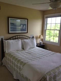
after:
the wall color and simple window panels instantly update this space. new bedding and accent pillows
make the space feel welcoming and add pattern and depth.

from my client:
"The wall color is BM Coventry Gray.  Our guest room faces west and get a great deal of afternoon light. The room looks true gray in the morning and evening and a light blue/gray in the afternoons. I love the color; it is very peaceful which is what I was aiming for in the guest room. 
I just wish I had your creativity and vision; that is such a wonderful gift you have been given."


color was added in fun yet controlled doses with the schumacher pillow and botanical + bird prints in simple, inexpensive frames. for a simple update, new pulls were added to the existing dresser.

the existing nightstand was painted a few shades darker than the wall and a more scale appropriate and timeless lamp was added.

thank you so much for sharing these picture with me ML!

just for fun, here are some ideas of how to mix color and pattern on a bed:
guest bedroom are a great place to do some "experimenting" with pattern and color. if you have a simple white duvet cover, you can throw any pillows on for an instant room update!

interested in working together?
email me at autumnclemons@yahoo.com and lets get going on that room you need to update!
click here to see my services and rates.

Feb 19, 2014

my new entry rug

i have been deciding what type of rug to put in my entry since we moved in last summer.  most of the rugs that i have fallen in love with have been way out of my price range. i finally decided to take a chance on this rug that i found for a client on overstock.


 i am glad i did.


for a very affordable price (i paid right around $150 for a 5 x 8), i think it adds a soft graphic appeal yet manages to stay simple and classic.
(and HEY--i actually hung some things on my walls this weekend! more on that later...)


the rug is a nice ivory sand beige stipe,  and so far has done a decent job of camouflaging dirt...(although i don't think i would put this somewhere where heavy soiling would take place.)
i picked up the little console at tj maxx home goods for just over $100, and it is just a placeholder until i can get a piece that i LOVE here. the veneer is kinda peeling off the front, and i need to fix it...i may change out the hardware too.
the little stool was a $5 thrift store find that i have recovered.


  there is still SO much to do in this little space. at some future date, we will be adding extensive crown molding. i also want this wall to be a trim feature wall, and will most likely do something like the grid wall that we installed in the dining room in house #5.
we also need to paint the walls, replace the light fixture, get a new piece of furniture, and i will most likely wallpaper the ceiling in here with the yummy malachite wallpaper that i thought about adding here.
once all that is done, i may replace this rug....but until then, it is doing a great job of softening the entry and adding some pattern.


the rug pad is from rug pad USA, a site that offers rug pads for oriental rugs. they have an extensive collection of rug pads for application on hardwood floors, hardwood floors, carpet, laminate, and even outdoors! my rug pad is the eco-cushion pad, and it is surprisingly thick and soft. i love it!
you can find rug pads to fit any of your needs at rug pad usa.

i am also working on a little revamp of my living room, which i will be sharing over the next few weeks. if you follow me on instagram, you will see that i hung a gallery wall over the weekend. i also need to rework the pillows, and add some simple window treatments.  so much to do! isn't it fun?

Feb 13, 2014

TOTALLY last minute valentines treats

sometimes i like to live life on the edge....and by "the edge", i mean that SOMETIMES i don't even THINK about what we are having for dinner until 5:30, and SOMETIMES i wait until the day before valentines day to pull together a treat for my kids classmates. ok, ok...who am i kidding? this happens kinda, sometimes, maybe, perhaps  a LOT.
but it all manages to work out.
we always end up eating dinner, (even if it is pancakes and scrambled eggs), and i always manage to have something for my kids to give out to their friends on valentines day.

this year, i decided to go with something a little easier and more "grown-up"....a pack of breath-freshening sugar-free gum with a customized peel and stick label. yes! no glue sticks or tape involved. so refreshing.

(i bought the bulk pack of extra  gum at costco)


these can be printed out in about 5 seconds and slapped on a pack of gum or just about anything else, and you are GOOD TO GO!


these are  meant to be printed on avery name badge labels :

i designed them so that the left side lines up with the pack of gum, and the right side folds over a bit.


here is what the label looks like printed out:

and here is a jpg version...you should just be able to import it into a document and print!
(make sure you set your page said as 4 x 6)


happy LAST MINUTE valentines day!


Feb 12, 2014

diy "awesome" gold embossed sign

another easy project that i featured in my girls bathroom:


if you are even a slightly crafty person, you may already have many of the items you need for this sign. since i already had all of the supplies except for the paper, this project only cost me about $2.

i used:
watercolor paper, cut to fit your frame or mat (you can use ANY type of paper you want.)
a printer
a gold leaf adhesive pen (or embossing adhesive pen)
gold embossing powder
a heat gun
a frame

i bought my frame for $1 at a thrift store. i liked it's oblong shape and the fact that it was REAL wood. unique items like my frame are one of the reasons why i go to thrift stores regularly...most times, i walk out empty handed, but sometimes i walk out with a treasure or two!

the first thing i did was create my design. you can use whatever word program and font you want.
i used pages, and the font "dear joe 4". the arrows are the standard arrows in pages, and i changed the line to a dashed one for a more whimsical effect.
once i had my design laid out, i printed it out in very light ink on my watercolor paper.

i traced the words using a gold leaf adhesive pen:


then, i sprinkled gold embossing powder on the words...


and tapped off the excess.
it is ok if there is still some extra powder, but if it bothers you, use a small brush to remove.

next, turn on your heat gun and gently move it over the areas where the embossing powder is stuck to the paper.
the heat gun "melts" the emoting powder, and you are left with shiny, raised words.


here is a close up of the finished product!