Apr 29, 2015

one room challenge week #5: crunch time

it's the home stretch, and i think it's pretty fair to say that everyone involved in this challenge is feeling the crunch! there is only a week left to finish our rooms, and make them PRETTY!

of course, on the road to pretty, there is a whole lot of mess + ugliness!

my room is coming along!
i painted three walls a neutral shade called "old soul" by benjamin moore. it is SUCH a great neutral color....similar to revere pewter, but a bit warmer and darker.


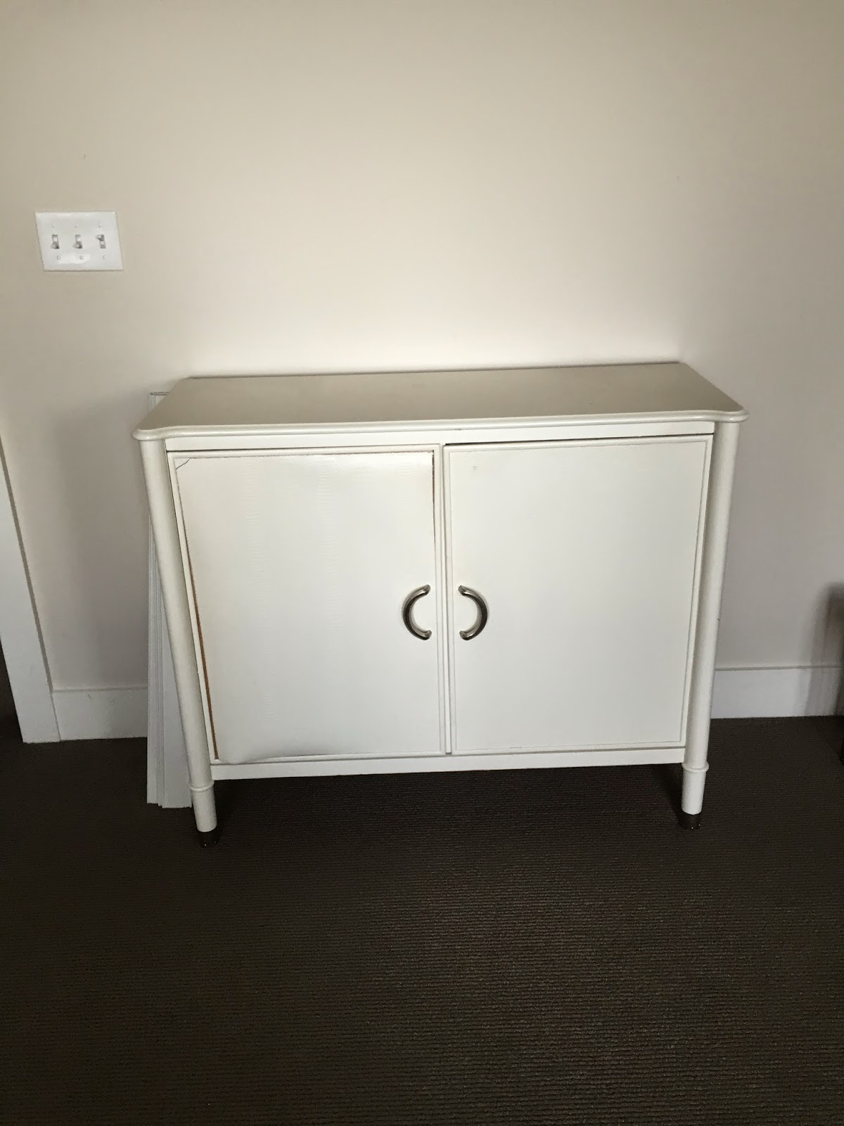
i fixed the peeling veneer on this chest and swapped out the hardware.


the new hardware is from chinese brass hardware. LOVE it.


 the revamped chest in its new location...
i am still deciding where to place the minted art pieces.


the back wall will be alternating stripes in chalkboard paint and cork! i just finished the chalkboard paint last night. the cork should be up tomorrow.


the new bedskirt and shams from loom decor are stunning! i ordered extra of this same faux bois/zebra fabric, and am having my window treatments made from it!

the curtains should be ready by tomorrow, and i will be picking up the chairs either today and tomorrow. ( be sure to follow me on instagram to get a sneak peek before next week!)

check out the rest of the gang here!


Trademarked by Calling it Home


Apr 24, 2015

coastal e-design: ocean winds villa, part 3


i was able to see this project in person for the first time last week, and it was pretty exciting! 
(to see the post on part 1 of this project, click here. to see part 2 of this project click here)

my parents and i spent a few days making some minor changes and adding the last layers to the space. minor changes included rotating and shifting rugs, moving around some art pieces, and adding pillows and accessories. 

the overall feel of the bedrooms was influenced by the art that my parents wanted to use in each space. the art that was selected for the guest bedroom is brighter and a bit more "fun", while the master bedroom has a more sophisticated, muted feel. 


after a LOT of talking and planning, here are the design plans for the 3 sleeping areas:


i will be posting some "after" pictures i took of this project shortly!

and, just to prove that it always looks worse before it looks better, here are some during shots of the work that has been happening at the vila over the last few months:


the biggest change was removing the upper cabinets in the kitchen:
going....

GONE!

the light fixture was replaced.

and all of the furniture and housewares brought in.

the kitchen cabinets before they were painted:


and lots of stuff was unpacked and put in place!


next week i will be sharing the after pictures!
stay tuned.


Apr 21, 2015

one room challenge week #4: paint, pillows + pretty stuff

it is now week #4 of the one room challenge, and things are about to get DONE in olivia's room.
i know that most of the other designers have probably already painted their spaces, but i am just getting started. i FINALLY chose a color: "old soul" by benjamin moore. it is a soft, warm neutral that will ground the room.


i was out of town last week, but when i arrived back home, i had a ton of packages waiting for me!


all of my pillow covers have come in the mail, including these beauties from decorators best.


this fabric is even prettier in person!


i also received some art from minted...


and this vintage road sign from ebay.


(perfect for the teenager who is currently learning to drive.)


also arrived: a custom bedskirt and shams from loom decor.


if you haven't checked out their website, you should! it is so fun to play around with all of the color and pattern options...especially the shams. you can choose a front, back and edge banding in hundreds of different colors. guaranteed to keep design-crazed people busy for hours!


i got the caning on my vintage chairs fixed (to the tune of $120. yikes.), and painted them. (i got a quote to paint them for $180. i figured i could do it myself and save some money.


to paint the chairs, i used white spray paint (it took about 2 cans per chair) and then rubbed some stain over the paint and immediately wiped it off to tone down the crispness of the white. this gave the chair a very subtle glazed look. (in the picture below, the chair on the left has the glaze applied. the one on the right is just the spray paint)


i dropped the chair off yesterday at the upholstery shop.
yeah. i know.
i am cutting it close, but they are going to fast track the chairs and have them ready by next week. can't wait to see these chairs in their new glory!


here is a picture of the room taken last night:
(yuck.)


the room actually looks worse now than it did a couple of weeks ago, (just keeping it real) but i PROMISE, by next week it will be nearly transformed!


be sure to check out what the other designers are up to!


Trademarked by Calling it Home


Apr 15, 2015

one room challenge week #3: making shades + buying harps

if you follow me on instagram, then you will know that i have just arrived in south carolina to iron out a few last minute details for the ocean winds villa. (you can read more about that project here and here. after pictures are coming soon!)

the last week was a bit of a blur, and i managed to get a lot done!

brought these babies to the upholstery shop:


i dropped off my vintage lamps to get rewired, and to order some new shades.


if you happen to get lucky and find an awesome vintage lamp, rewiring is a must. the older plugs are a fire hazard! (there is a great store here in salt lake where i go called the lamp store. yeah. i know. pretty easy to remember, right? it is located just across from liberty park.)


 i paid $29 each to have my lamps rewired, and they also sturdied up one of the lamps that was a bit wobbly.

and now...onto the new shades!
the shades that the lamp came with were in pretty sad shape--cracking, water stains, and also screamed 1974. i knew i wanted a crisp, simple shade for the lamps, and so i tried out a few options.
it is simply amazing how much the shape of the shade affects the look of the lamp!

here are a few i tested: (i totally felt like goldilocks with the porridge!)

too big.


nice. but perhaps a bit too formal.


also nice, but i really want to play up the linear lines of these unique lamps, and this shade breaks that long lean line that i am looking for.


yesss....! the winner.

 i looked at all of the fabric options for the company that makes these shades, but the one that i really liked was going to take 4-6 weeks to be made. yikes. that was cutting it too close.


HOWEVER, i could have one nearly identical made IN THE STORE for almost 40% less AND i could customize it in any size. uh....duh. sign me up! i ended up ordering some custom shades, that were 1" longer than the last picture.

fast forward 4 days.
yeah. thats right. they FIXED, and rewired my lamps and made me custom lampshades in under a week. good stuff!

when i went to pick them up, i still had ONE more decision to make...the size of the HARP. you know, this thing:


they come in a TON of sizes:


and, just a little tidbit of info---the size is stamped on the top! (which i didn't know before this project! don't you love learning new things?)

here is the rewired lamp and new CUSTOM shade with an 11.5" harp:

toooo high.


and an 11" harp:

still a little high....


and, the one i ended up with...a 10.5" harp:


still a lot more to do, but i am really excited about how everything is coming together!

be sure to check out the other participants progress!


Trademarked by Calling it Home