when i read THIS article, i was a....well, confused. and totally NOT in agreement with the "dead list".
i am going to paste the entire article here, so that you can see it, (including the pictures that were used.)
you will see my rants in red, just under each item!
Design Trends That Are Dead in 2015
The start of a new year isn’t just the perfect time to get serious about fitness, health, career, and maybe even finding love.
It’s also a chance to dump some tired, tacky, and downright troubling design ideas and make a fresh start for your home. Yahoo DIY is here to help with 10 trends to banish this year (and beyond). Make up your own mind, of course, but don’t be afraid to toss out those old design ideas along with those 2014 calendars.
1. Smocked Bedding:
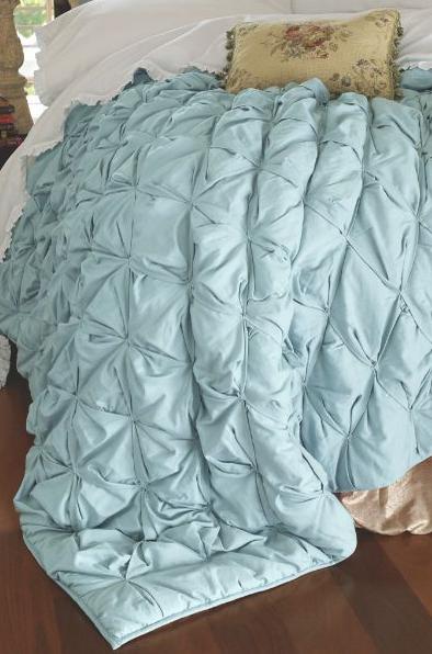
Because you do not want your bedding to look like old curtains from “Gone with the Wind” or a bridesmaid dresses that you never wear again.
OK. quite honestly..is this really a trend? i mean, yes, we see these duvets fairly often, and west elm, pottery barn, and target all have their versions of this look, but anyone with a (AHEM) *messy teenage girl, would see this as an awesome solution to an always-wrinked-anyway bed situation. yah. that would be me.
so...say it is a trend. I'm still not hating it enough to be over it. maybe i am off on this one. but just read on. it gets better.2. Tile and Marble Everywhere:
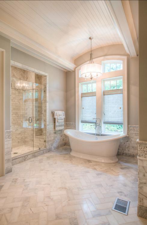
YES! You can have too much of a good thing.
UH, did she really just say that? having tile on your floors and walls AND shower is TOO much? i totally disagree. i think this is a classic look that will always be in style. and i am sorry, but she should have tried a LOT harder to find an uglier picture of this "trend". i mean, this bathroom is pretty dang nice, and i would venture that just about anyone would agree that it doesn't feel overdone.
3. ALL One Color ALL the Time:
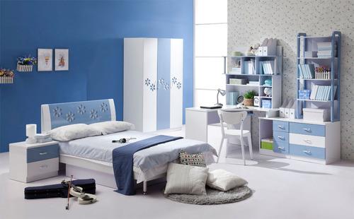
Shake it UP! Because this gets old so fast. You have to have varied shades and colors in a room to keep it feeling alive!
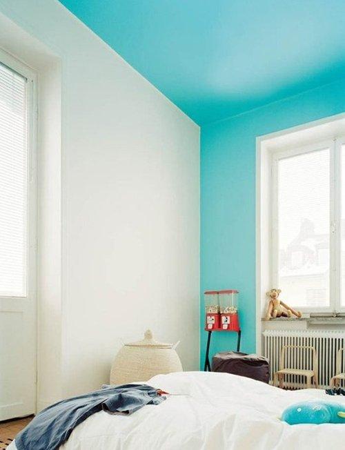
so...not sure how i feel about this "dead trend"...i mean, i happen to like the use of a single color in a space. several shades of a single color can add a lot of depth and interest to a room, and i don't see this approach to interiors a trend. some of the most beautiful rooms i have ever seen are rooms in which a single color is used judiciously and expertly, to yield dramatic and beautiful results.
4. Indoor Hammocks:
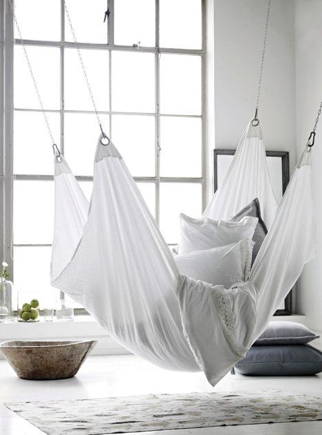
Hammocks should stay outside. It takes up way too much room and makes it nearly impossible to create a nice flow through a room.
5. Fake Canopy Beds:






I totally agree with you. Half of the list of full of things that didn't even make it to full trend status and then the other half is full of things that she's just dead wrong about. I thought she was like a martha stewart baker/crafter girl? What's she doing talking about design trends?
ReplyDeleteYES! right? i totally agree. why in the world is she writing posts about design trends? they should totally hire someone who knows what they are talking about. like you or me! :)
Deletenot sure I agree with some of these....who decided this?!?! LOL
ReplyDeletefor real. its almost like she was TRYING to stir up controversy! WAY off.
DeleteI agree. I saw this article yesterday, and thought didn't even know lots of these were trends. Besides your home is just that, YOUR home. Do what your like!!
ReplyDeleteagree! everyone has their own ideas and thoughts on what makes a great room, but your home is a reflection of YOU, and so if you love something, it will always feel right in YOUR home.
DeleteThis is hilarious! I'm not one to bash, but I do agree with you. My son wants a place to hang his hammock inside because it is 10 degrees outside. Not sure this was ever a trend though. I remember her show from back in the 90's & didn't realize she was still around, lol. We have features in our local paper like this that make me crazy and I'm afraid the locals might be taking it heart.
ReplyDeletetotally agree. i also avoid bashing, or even voicing strong opinions about certain things, but there were just SO many things that rubbed me the wrong way about this article, i needed to get some feedback from others to check my sanity. and yeah. she is still around. crazy. who is watching her show?
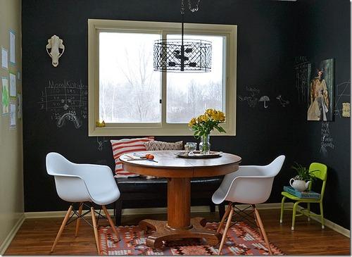
Deleteoh, and you tell your son to HANG THAT HAMMOCK....on a chalkboard wall, with a stuffed deer head above it, and surround it with a canopy!! ;)
I had to comment again after checking out who this Katie Brown woman is and finding this on her website. http://katiebrownhomeworkshop.com/project/waterlilies-vase/
ReplyDeleteShould we really be taking decorating advice from her? Wow.
um. yeah. i know, right?
DeleteOther than the taxidermy and chalkboard paint as being overdone trends, she is way off. You are not crazy, she comes off as mean and clueless.
ReplyDeleteAGREE!! i think her negative approach is what bothered me even more than her way-off base LIST.
DeleteLike Sue, I decided to google her and we are not the only ones that feel the same way. http://www.yelp.com/topic/chicago-i-cant-stand-the-katie-brown-workshop-anyone-else
ReplyDeleteoh. my. gosh. just spent like an hour reading all of the posts and was laughing so hard i cried!
DeleteI have to agree with you! I never really care for the "Trends that Should Die...NOW" advice anyway. Trends do come and go, but some people will like certain things long after they're trendy. And if they want to continue using them, I believe they should! After all, our homes are supposed to be an expression of our taste, not what someone else says it should be. :)
ReplyDeleteYES! i am all about letting people live with things they love. if you love something, it will always be "IN" to you. trends are going to come and go...and lately, those trends are cycling through at lighting speed. stick with what you love, and be selective about what trends you choose to embrace.
DeleteHave you seen her show? She's clueless.
ReplyDeletethe last time i tried to watch it, i was really surprised that there is an audience for it. WHO is watching it?
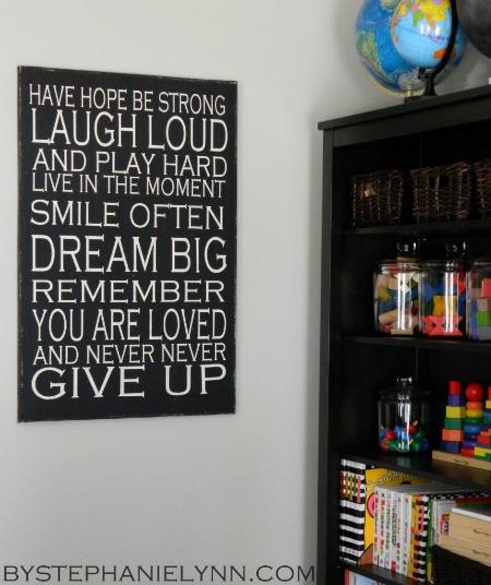
DeleteThe "texture" one is what got me…I mean, texture is SO important to any room. You really cannot have too much texture (well, within reason!) I think that kitchen looks great. As for "preachy words", they are everywhere on everything and in every magazine article, blog, and thousands of Etsy shops. Not for me, but they are going strong!
ReplyDeleteyep. i was already a little chapped when i got that one, but this one was the straw that broke the camels back.
DeleteYou know, I hate the whole approach of writing an article on trends that are "out" instead of just talking about what's going to be popular. It automatically puts people on the defensive--especially if they like (or have!) some of the mentioned trends.
ReplyDeleteOn a side note, I've never even thought of hanging our hammock indoors, but now that sounds kind of fun to me :)
agree! YES...i was really bothered by the strong and negative words that were used in this article. i agree that a positive approach is so much more useful and inspiring. and you are so right about people feeling on the defensive if they happen to like these "trends" or have some (or all!) of them in their home.
Deletei look forward to an entire post on your blog dedicated to indoor hammocks! :)
I think you're spot on. Some of the trends I read in this article have been out for a long time in my book. And some of them are definitely personal preference. The one I strongly disagree with the most is the use of texture. Yes, you can always go overboard, but the mix of matte with smooth, rough with shiny--regardless of what it is, gives a room personality.
ReplyDeleteyes! one of my favorite design elements is the use of texture. it is imperative to have texture...especially in rooms that have very little color. love your comment!
DeleteYou are spot on with every single comment. She clearly has no idea what she's talking about.
ReplyDeleteTaxidermy is still alive and well in Texas!! Funny how trends will fade in and out of popularity! Looking forward to what's new in 2015!!
ReplyDeletexo. Leslie
Segreto Finishes
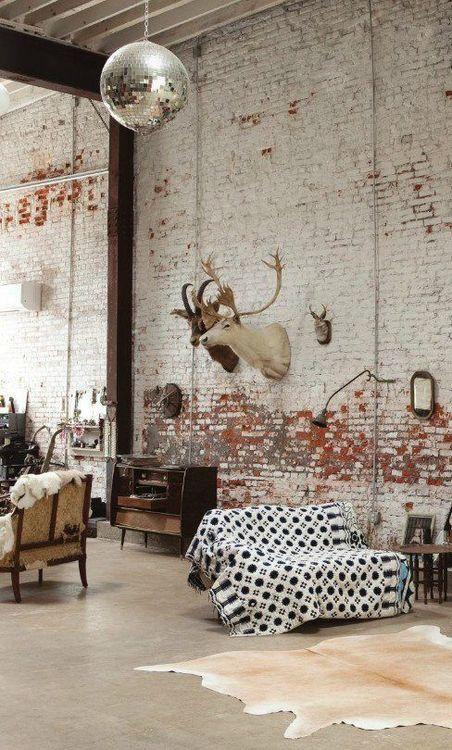
Late to the party...I didn't even know who she was, but I didn't think she picked good photos to illustrate her points. Like you said, that's a pretty nice bathroom, and besides, it's not completely tiled (not to mention, having all surfaces tiled and marbled is practical). But the best is the photo for taxidermy. I mean, there's a disco ball and a settee with ripped upholstery draped with some skin and a hi-fi that doesn't appear in good repair. Maybe those are coming trends? Stay tuned.
ReplyDeletetotally totally crazy! I agreed with you!
ReplyDeleteIt seems that she was in a really bad mood when she wrote this article. ;-) I can't disagree with #10 though. I really don't want to see big signage that says 'EAT' when I walk into a kitchen.
ReplyDelete