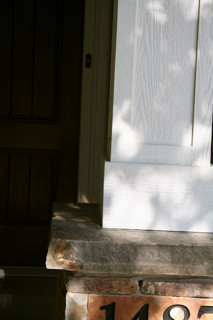
we took some pictures of homes that appealed to my clients, and then i sketched up a detail and worked with the trim carpenter to make our vision a reality.
before:
sorry about the before picture. i thought i had taken one on my phone, but i must have deleted it! thank goodness for google street view...not the best picture, but you can get the idea of what it looked like before.
after:

new stone based columns, timber framing, and a king truss break up the empty entry and add structure. before, the roof projection over the porch seemed to be floating, but it is now grounded by the visual mass of the columns and the timber framing. the stone on the base of the columns and surrounding the window add some additional texture and color.
the slight arch helps to soften the rather severe angle of the roof. the dark trim of the entry door was swapped out for a lighter paint, and new doors and light fixtures were added.
my clients needed paint colors that would blend with the existing soffit and windows, since they were staying, so i chose paint colors that were slightly darker than the soffit and trim for the brick and new shakes.
the house now looks updated and has a more appealing, traditional feel to it. isn't it amazing what some
properly scaled columns, some paint and a little bit of stone can do?


Fabulous Autumn! Details, well thought through, always make a difference!
ReplyDeleteCathy
WOW Looks great! What a difference!
ReplyDeleteThe after is so great! Love the beam work. It really made a huge difference on the look of the entire home. M.
ReplyDeleteReally impressive Autumn! As an interior designer I sometimes find being creative with exteriors challenging. This simple and beautiful design adds so much character!
ReplyDeleteGood job! I didn't realize designers can help with exteriors also.
ReplyDeleteVery lovely!
ReplyDeleteGreat job on all the work. It really made a huge difference. You should get a commission all these updates to rentals :)
ReplyDelete