FINALLY, i am posting pictures of the before and after of the ocean winds project! this 2 bedroom, 2 bathroom villa, located on seabrook island, sc, was purchased recently by my parents. i have been working with them long distance over the last several months to furnish and decorate it.
(i have to be honest...i had this entire post written about a week ago. i was previewing it before i published it, and all of the sudden, it....disappeared. in all the years i have been using blogger, i have never had this happen to me. i have to admit, i freaked out a bit. for any of you that have ever written a blog post, you know that a post with lists of pictures and added links can take HOURS. i tried everything i could to retrieve the post, but to no avail. it took a few days before i was even willing to start over again. phew. sorry for that long winded write up, just thought y'all might want to know what in the world has taken so long!)
the see the
introduction to this project, click here.
part 2 is here, and
part 3 here
here is a quick before + after of the entire villa!
(all pictures by me...which is why they aren't that great. sure wish i could talk
sara into coming out to take some GOOD pictures!)
living space before:
 after:
 before:
 after:
 kitchen before:
 after:
 master bedroom before:
master bedroom after:
guest bedroom before:
guest bedroom after:
a few more details...
(all artwork in the space is from my parents collection)

the living space is longer than it is wide, and i had to be careful about keeping the seating area close enough to the fireplace to open up the walkway behind it. i created 3 "zones" to the living space--the main tv watching/lounge zone, a desk area, and an auxiliary seating area with two wingback chairs.
to keep the budget in check, i integrated items that my parents already had with new pieces, which are a mix of high and low.

after my parents and i discussed the overall look of the condo, the first items that we decided on were the sofas. we went back and forth between dark and light, and explored options in every price range. we ultimately decided on the alex slipcovered sofa from mitchell gold + bob williams.

the coffee table is existing, the herringbone jute rug is from
west elm.
the long console table and driftwood lamp are also existing. the square side table is
from west elm.

the
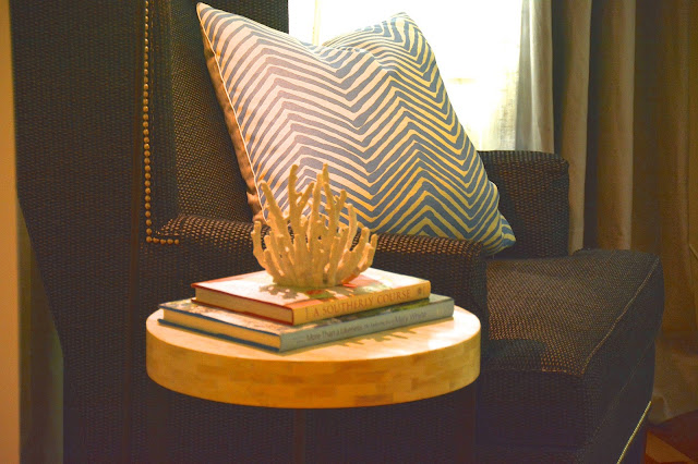
new wingback chairs create a comfortable reading area to relax. the lamp is the
kristie from arteriors.
the
curtain panels and
curtain hardware are from west elm. the round table is existing.
the wall color is existing. eventually, they will be painted winds breath, by benjamin moore. all accessories in the space are from either target, home goods, ikea, gdc home, or were brought from my parents house.

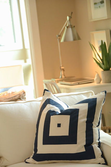
the concentric stripe pillows were custom
made by K&R from
this fabric.
the solid blue basket weave pillows are
from pottery barn. the other pillows were purchased from etsy.

the ikea bookcase and mirror were brought from my parents house.
this desk area is one of my parents favorite spots. they love using
the technology lamp to plug in their laptop and phones.
the
parsons desk is from overstock.

the long narrow sunroom was divided into two spaces---a "reading nook", and a "sleeping nook".
the reading nook is a bright, sunny spot to sit and talk or read. the space is divided in half with a couple of bookcases...(soon to be a wall) all furniture in this space was existing.
the sleeping nook can be used as an additional bedroom area for guests. the alex pullout sofa, is from mitchell gold + bob williams. the room can be partitioned off from the dining room by pulling the curtains on the inside of the space closed. the storage ottomans are
from crate and barrel. the rug is from
west elm.

the entry console was purchased from
GDC home. the mirror is from home goods. eventually, we will replace that mirror with something with a little more panache.
the master bedroom:

the master bedroom is a peaceful retreat, done in varying shades of gray. even though this is a beach retreat, my parents wanted the room to feel elegant.
the woven bed, night stands, and dresser are all from
rooms to go. the
marble pillar lamp is from west elm. we opted to use another
technology lamp in this room to make cel phone charging convenient. the
linen grommet curtain panels are from west elm, and the curtain hardware is from
pottery barn. the
geometric gray wool rug is from overstock. the
slatted bench is from wayfair.
since this villa will be a rental, we opted to keep the bed simple with a single lumbar pillow on both of the beds. the 14 x 44 pillow was custom made by
K&R from
kelly wearstler's bengal bazaar.
the wingback chair is from ethan allen. the bone side table is from
west elm. the lamp is existing.

my parents will most likely remodel the kitchen and both bathrooms in the next couple of years. for now, we added a rug, some accessories to perk up the master bathroom.
the guest bedroom:

this room was influenced by the art work that my parents wanted to showcase in here...it has a bit more color than the rest of the villa. striped drapes and rug add to the casual vibe.

the
zen platform bed is from home decorators and the night stands are existing.
the
striped rug is from wayfair. the
curtain hardware and
striped panels are from pottery barn.

the dresser was another rooms to go find. we managed to find quite a few very tasteful, affordable items from there!


the
bench is from wayfair.

one more look at the kitchen: removing the upper cabinets opened the space up a ton! the cabinets were painted swiss coffee (be benjamin moore), and new pulls were added.
to see more images of the villa, or to inquire about renting it,


