here are just a few pictures of the house i have been working on for the last several months with some amazing clients. we still have several items to put in place, but they have moved in, and things are looking great! as soon as i can get some nicer photos taken, i will share all the paint colors and sources for other items.
until then, take a peek:
i have showed you glimpses of the mudroom before, but not with the light fixtures in and
the floors uncovered. we still need to hang the wallpaper in the adjoining mudroom, and have
a window seat cover made for the window seat....
the amazing staircase! (and can you see a peek of the overstock rug in the distance?)
i haven't showed you this area before, because until recently, it looked like a construction site.
it's really a generous and impressive space in person.
a look at the great room...
we kept the owners leather sofa and ottoman, but mixed in some new chairs and a love seat....we still have a few pieces that haven't arrived yet, and the drapes still need to be hung.
i really like how the master vanity turned out. the soft green glass tile on the backsplash adds a hint of color, and those mirrors?...are from ikea!!
here's to mixing high and low!
Oct 31, 2011
Oct 27, 2011
trick or treat at my house + 3 halloween printables
i like halloween. a lot.
i think that's because i like candy. a lot.
happy halloween!
i think that's because i like candy. a lot.
one of the things that i have always loved to do is to give away treat bags to trick-or-treaters. sure, it takes more time and a bit more cash than just handing out a single piece of candy, but it is something that i really enjoy doing! two years ago i made these, but this year, i decided to hand out something a little easier to throw together...full size candy bars with my customized printable wrappers.
these wrappers are made for the full size candy bars.
the "from" area on the back is helpful if you plan to give out the candy bars at a party or a school or church function.
i bought my candy from costco in a variety pack, which contains hersheys bars, hershey almond bars, reeses peanut butter cups and kit kat. i got 30 bars for just about $17. i bought two packs.
each printable can be printed out, cut and then you can use tape or a glue stick to attach the back together.
click below to download:
happy halloween!
Labels:
halloween
Oct 26, 2011
guesting...
hi friends!
today i am over at heather peterson's blog "love your space" with some advice on "design by the numbers".
check it out here.
Labels:
featured at...
Oct 25, 2011
front entry before + after
early in the spring, some clients contacted me, needing some advice on the exterior of their home. they were planning on repainting, and needed some help selecting colors, but also wanted to add some curb appeal to their entry. they had just put a new roof on, and didn't want to change the pitch of the roof, so we worked to come up with a solution.
after:
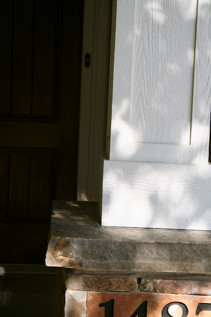
new stone based columns, timber framing, and a king truss break up the empty entry and add structure. before, the roof projection over the porch seemed to be floating, but it is now grounded by the visual mass of the columns and the timber framing. the stone on the base of the columns and surrounding the window add some additional texture and color.
the slight arch helps to soften the rather severe angle of the roof. the dark trim of the entry door was swapped out for a lighter paint, and new doors and light fixtures were added.
my clients needed paint colors that would blend with the existing soffit and windows, since they were staying, so i chose paint colors that were slightly darker than the soffit and trim for the brick and new shakes.
these columns are properly scaled to the surrounding structure, and the stone bases help to keep them from looking too tall. columns that are too small or too slender can look "spindly" and out of scale.
we took some pictures of homes that appealed to my clients, and then i sketched up a detail and worked with the trim carpenter to make our vision a reality.
before:
sorry about the before picture. i thought i had taken one on my phone, but i must have deleted it! thank goodness for google street view...not the best picture, but you can get the idea of what it looked like before.
after:
new stone based columns, timber framing, and a king truss break up the empty entry and add structure. before, the roof projection over the porch seemed to be floating, but it is now grounded by the visual mass of the columns and the timber framing. the stone on the base of the columns and surrounding the window add some additional texture and color.
the slight arch helps to soften the rather severe angle of the roof. the dark trim of the entry door was swapped out for a lighter paint, and new doors and light fixtures were added.
my clients needed paint colors that would blend with the existing soffit and windows, since they were staying, so i chose paint colors that were slightly darker than the soffit and trim for the brick and new shakes.
the house now looks updated and has a more appealing, traditional feel to it. isn't it amazing what some
properly scaled columns, some paint and a little bit of stone can do?
Labels:
exterior,
my projects
Oct 21, 2011
Oct 19, 2011
ikea favorites
i spent a good portion of my day yesterday strolling around ikea. usually when i go to ikea, i am in and out in less than 30 minutes. impressive, i know. i usually only have a few things i need to get, and i walk in with a list and my game face on as i zip through the aisles.
yesterday, i took my time. went and walked around the showroom for the first time in two years. ikea does a brilliant job of staging their showroom.i found myself wanting to linger and touch everything!
here are a few of my favorite things from ikea:
ektorp upholstery.
the classic, traditional shape of this line is clean and simple, and the slipcovers are available in a lot of colors. you can get a couch, a chair, a love seat and a sectional in this line.
merete panels.
at $29.99 for a pack of two, these grommet topped panels are a budget shoppers dream. the texture is great, and the fabric hangs nicely. these are available in bleached, beige, brown and purple.
eivor throw.
i fell head over heels in love when i spotted this! it is already gracing the sofa in a local clients home.
sometimes throws may look great online, but then they feel cheap and scratchy in person...this throw is soft, has a nice weight to it and doesn't feel cheap...and it's only $19.99.
sanela cushion cover.
the oblong shape and velveteen fabric make this a very versatile, affordable ($7) addition to any pillow arsenal. to dress them up, consider adding greek key trim. it is available in 5 colors.
besta burs desk.
i love the long, lean shape of this desk. it's great for those tight spaces, and fits a laptop or an imac perfectly. available in high gloss red, black, grey and white.
barometer lamp.
i use this classy little task light pretty often in my design plans. it looks much more expensive than it's $49.99 price tag, and the shape is reminiscent of a vintage architects lamp.
foto pendant.
$19.99.
simple. affordable. packs a visual punch. what's not to love?
koldby cow hide rug.
you won't find a more affordable cow hide rug anywhere. trust me, i've looked.
(if you do find one, let me know! please??)
ribba frames.
for real...who doesn't love these things? the price and selection alone are what often bring me to ikea. i know i can count on sturdy, good looking frames in a variety of great shapes and sizes. i picked up 3 yesterday!
ribba frames.
for real...who doesn't love these things? the price and selection alone are what often bring me to ikea. i know i can count on sturdy, good looking frames in a variety of great shapes and sizes. i picked up 3 yesterday!
plastis dishwashing brush.
i know...weird pick.
but i really love these! they are soft, work well, and wash up nicely in the dishwasher. and at only .99, i don't feel bad when it's time to "retire" one.
Labels:
ikea hack,
window shopping
Oct 18, 2011
the true (potential) cost of my vintage chairs
i am having some second thoughts on reupholstering my vintage chairs.
even though the chairs themselves were only $30 a piece, one of the chairs has some damage in the caning on the arm:
in order to get this fixed, i got an estimate of $150. (i was pretty surprised at this! i thought it would be half this cost..)
the upholstery estimate per chair is $225, and they each need about 2.5 yards of fabric. i already have enough of a simple nubby neutral fabric that i really love. i paid $15 per yard. however, because i plan to paint the chairs, i would need to deliver the chairs to the upholstery shop, let them strip the chairs, pick them up, take them to the restorations specialist to get the caning fixed, bring them home to paint them, and them bring them back to be reupholstered...and then, pick them up once they are finished. that's a lot of gas and time...
my bargain chairs are slowly becoming a potential money pit:
chairs: 2 at $30e ach=$60
caning restoration: $150
upholstery: 2 at $225 each=$450
fabric: 5 at $15=$75
paint: $30
gas, taxes, etc: $100?
total for both chairs: $865
i could save a little bit of money, and some driving by stripping the old upholstery off myself...i'm just trying to figure out if the hassle and time is worth it.
i have had my eye on these chairs for a while...i could get two new chairs for about the same cost that rehabbing the vintage chairs would be...i would probably get these in the grey or the beige, but the orange velvet is really pretty too!
some other budget friendly options:
i love the unique look of the vintage chairs, and the frames are nice and sturdy...just starting to reconsider the money and effort that will go into fixing them.
what do you think? are the costs and hassle worth it, or would you just order new?
Labels:
upholstery
Oct 17, 2011
touches of navy
most of us associate navy blue with summer or spring, probably because it pairs so nicely with crisp white, sunny yellow, and pastels like pink and lavender. but navy happens to be one of my favorite colors for fall. something amazing happens when navy blue is mixed with the warmer "fall" colors of deep oranges, camel and soft ivories...the result always makes me *sigh.
here are some beautiful rooms with touches of navy by one of my favorite design firms, marcuso warner miller:
i would LOVE to have this sofa in my house. that white trim on the navy velvet is just scrumptious.
this entry is the epitome if elegance! love.
loving the look of navy?
here are some great ways to add a touch of navy to your home:
this embroidered circles pillow has great texture and a great pattern.
this fun navy tray table would add a dose of blue in a preppy, classic way.
adding original art to your home is always a great idea: bottle of blue on etsy is a great choice...
i really like how the two shades of navy give a subtle pop of color in this geo dot rug.
love this medallion shower curtain.
i recently completed a design plan for a master bedroom, using some navy blue silk curtains, and this fabric (katsugi by schumacher) on some throw pillows on the bed. i adore this fabric!
marfil collection ivory/blue rug...bold and fun!
i am a sucker for houndstooth, and this navy houndstooth rug is so elegant and chic.
**by the way, rugs usa is having a 50% sale on a huge selection of rugs, including the above ones, and the homespun chevron rug i blogged about on friday! if you are needing a rug, now would be a terrific time to take the plunge...the deal expires today.
happy shopping!
let me know if you find something great! i SO want to buy myself a new rug for my family room or entry, but after evaluating my budget and list of projects, i have decided that i will get more bang for my buck by spending the money in other places.
Labels:
interiors,
window shopping
Subscribe to:
Posts (Atom)