May 21, 2014

organizing my mini office, PLUS a giveaway!

as i was planning the design of my mini office, i was contacted by the folks at staples, who wanted to know if i was interested in using some of their products to make my office as efficient as possible. 

now, i am a little bit of a nerd when it comes to organizing. my husband likes to joke that i like to buy "containers for my containers", and i have to admit there is a lot of truth to that statement!
of course, i was pretty thrilled, and have been SO happy with the items that i chose!

this little white stack and fit organizer is part of the martha stewart office collection at staples.


the bottom drawer has come in handy for all of my labels! the top stack and fit component is a great place to store those little odds and ends that never seem to have a really home!


don't even get me started on the retro style pencil sharpener!  i have gone through at least 3 pencil sharpeners in the last few years, and i finally decided to opt for a good old fashioned manual one. this one is just like the one i remember from elementary school--SOLID and sturdy and works amazingly well.


the magnet board is from ikea, but those clip on magnets have been PERFECT for holding all of those papers and bills that need immediate attention.


of course i also grabbed a few essentials---i am a zebra pen fanatic. they are the O.N.L.Y.  pen i use!! i also use a lot of highlighters in my planner, to color coordinate all of my consultations and activities for the kids, and who doesn't love a nice new sharpie? (answer--my KIDS. that is why i have them up high on a shelf inside one of these oskar boxes. shhh!!)


i took a chance and decided to order some of these oskar storage boxes. they come in some really pretty colors, but i chose gray.
they are really amazing. very sturdy, and they actually come with a metal label holder, but my shelves were too shallow, and so i turned them to the side and added these chalkboard labels.


they hold items that i do not need to access very often. like sharpies that i don't want my kids stealing.


i am really in love with these clear "project cases"


they have done an amazing job at making my fabric samples and trim samples more accessible. 


i love that they easily stack and fit on even the shallowest shelf space.

perhaps my favorite things are my coordinating file folders and file hangers! they make my file drawer look so pulled together. the avery martha stewart labels add just a touch of color, and for the first time ever, all of my files are labeled properly and look great.

i also ordered one of these really cool rubbermaid bento boxes.


 i actually had an AHA moment, and decided it would serve me better inside the armrest of my car!


i have been hunting for something that would fit all of the items that i use a lot, and this was the perfect fit!


the box actually has little fold out organizers so that you can customize the box to fit your needs, which is completely genius!


***this giveaway is now closed****

and, now some good news:
staples is offering $100 to one lucky reader to choose one home office item up to $100 in any of these three categories:


just leave a comment and you will be entered! i will be selecting a winner on MONDAY. so, someone will have a very happy memorial day.
i will announce the winner on instagram---and will also respond to their comment on the blog!

***this giveaway is now closed****

May 20, 2014

design plans: teen girls bedroom + bathroom

i was digging through some files on my computer this past weekend, and i found a few design plans that i have not shared! these plans are for a teen girl who loves fashion and photography and loves a dose of pink!
we worked on her bedroom first, and then took the color scheme into her adjacent bathroom.


at first, she wanted pink and a sunny yellow, but i talked to her about "tweaking" the colors a bit to make them more sophisticated. instead of pink, we opted for a deep fuchsia, and instead of a bright yellow, we used a mustard tone. i think the balance of the white bedding, gray walls, touches of gold and the hint of colors will make this room livable for years to come!


 the existing bathroom vanity will be brightened up with some grey and white stripes, and a  vintage gold mirror and large scale flower art will keep the space from feeling too sweet.


interested in working together to create a more functional and beautiful space in your home?
i am taking limited clients this summer, but still have some openings in late june and july! email me at autumnclemons@yahoo.com to set up a consultation!


May 12, 2014

e-design after: sonoma valley vacation home

over the years i have beed blessed to work with so many amazing clients. each client brings a personal perspective and vision for their space and assiting them to reach that vision is what i love about my job. each experience is new. each client is unique.

some clients are paralyzed with fear, and need and want a LOT  of help. they want a design, presented to them, which they can follow to the "t" and be assureed a great outcome.

other clients need general guidance and ideas that they can run with. they benefit from having a trained professional tell them "go for it!" having someone talk them through possible improvements in their room opens their eyes to possibilities and gives them a fresh perspective.

other clients just need...nudges. they need what i like to call "back-up". they already know what they want and just need a little guidance to get there.


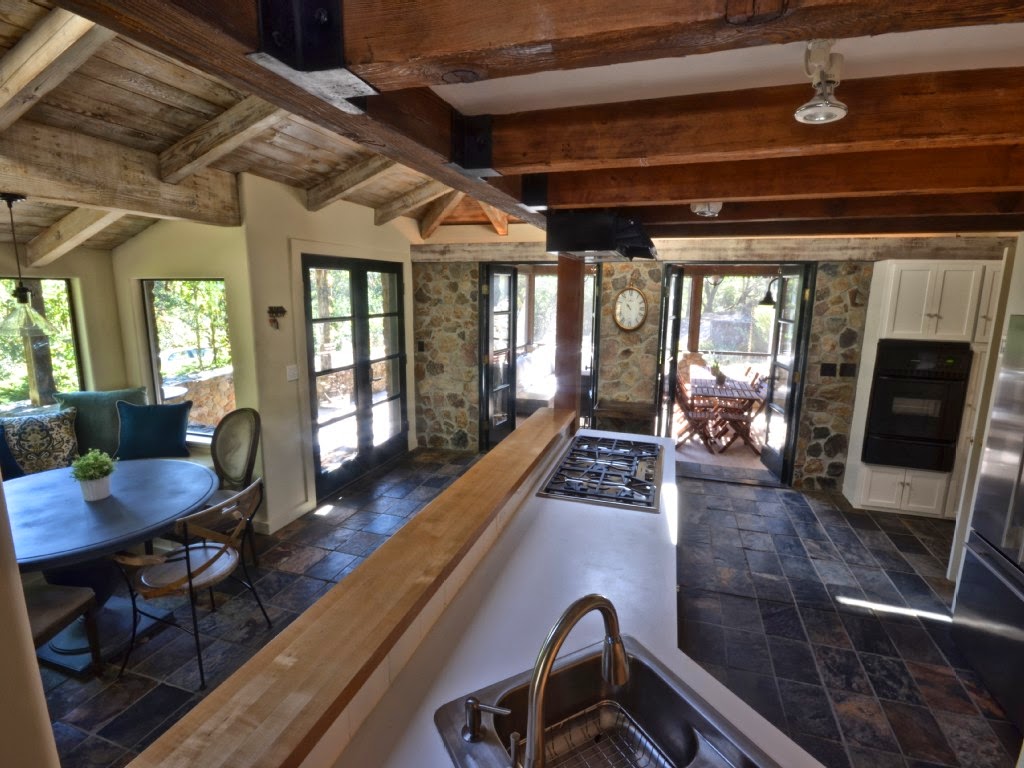
this beautiful home is the investment property of a repeat client of mine. she and her husband have been dreaming about acquiring a retreat property like this for many years, and when the timing was right, they jumped on board. the home did not need major remodeling, but it did need a more pulled together and updated look, and all new furnishings and light fixtures.


she hired me as her "back-up'...i sourced lighting and furnishings, we consulted on furniture placement, window treatments, paint colors and trim details. we bantered about where to place art, the different feel of each room, and how to give the space the updated, casual vibe she wanted.

oh, and did i mention she was on a budget? 
almost ALL of the furnishings were sourced from the following places:
-overstock
-kirklands
-ikea
-world market
-cb2
-pier 1
-decorators best
we also managed to score a few things on clearance at restoration hardware.


who wouldn't want to spend a leisurely weekend here?


and, for reference, some before pictures:


(the fireplace had to be removed)


if you are interested in staying at this home, and for more pictures, you can visit the listing on VRBO!
http://www.vrbo.com/498985


May 9, 2014

uncommon goods gift ideas

doesn't it seem that as soon as the leaves start budding and the flowers start blooming that there is an avalanche of birthdays, holidays (ahem, ahem, mothers DAY?) and weddings that require a thoughtful gift?  sure, gift cards can be nice, but for good friends i always like to put a little more thought into a present. one place that i often turn to for unique gifts is uncommon goods. i have used many or their quirky and whimsical clocks (one of may favorites is here) and accessories in my room designs, and they also have a tremendous selection of jewelry and art, as well as gifts for the garden, office, pet, entertaining and even games!

here are a few picks that are sure to please those wonderful women in your lives!


1 /  2  /  3  /  4  /  5  /  6  /  7  / 8  /  9


be sure to check out uncommon goods for more gift ideas for all those ALL special people (and pets) on your list that require a thoughtful and unique gift.

happy shopping!
this post was sponsored by uncommon goods

May 7, 2014

one room challenge REVEAL: my mini office

well, i am SO glad that 6 weeks ago i decided to jump on board and join in on the one room challenge  hosted by linda at calling it home. linking up was just the incentive i needed to get this little space finished.

here is a quick side by side comparison of the before and after of my mini office:

TA-DAAA!!

and just in case you haven't been following along, here is what i have been up to for the last 6 weeks:
week 1--more before pictures and introduction of design plan
week 2--painted the walls the perfect shade of deep blue (see my favorite deep blue paint picks here!)
week 3--added legs, numbers + hardware to the ikea storage unit 
week 4-shared some ways to put up a gallery wall on a budget
week 5--stripped the desk + put up shelves

 
the desk and chair are both vintage and the storage unit is from ikea.
the wall color is van deusen blue by benjamin moore. the trim and shelves are painted swiss coffee by benjamin moore.


the roman shades were made from quadrilles "la fiorentina"--i managed to snag just under a yard for about $60 on ebay. the black trim is from jo an fabrics.


the adjustable scissor sconce is also from ebay. i was considering buying a vintage one, but i am really glad i opted for this simple, new, polished chrome one. it has already come in handy!


the gallery wall is a combination of many different items:
*the tree + wagon painting at the bottom is a vintage original piece and the river scene above the agate is by my mom. there are also two other original pieces that you can read about here.
*some pieces are printed off the internet, the large piece in the middle with the linen frame was found at a thrift store for $20.
*the embroidered antelope and the butterflies are both from travels (mexico and charleston,sc.)
*the framed agate is from home goods
*the angel piece was a gift from eyes on walls
*the close up of the fence post is ikea


the bulletin board is from ikea.

the vintage chair sure shined up nicely with a little help from my new best friend!
read about how it helped to remove the rust from my chair and take the water spots on the top of my desk.

the chair fabric is kelly wearstlers' "agate" in linen.

the front of the drawers were painted in a high gloss black paint, and the the desk was stained with a custom mix from minwax "dark walnut" and "golden pecan".

the light fixture was an ebay dream score! it is arteriors large caviar pendant, and i got it for $81!
(and YES, i am still working on that post on how to find deals on ebay! more to come. hopefully very, very soon!)


this house terrarium is from west elm.

the gray storage boxes are from staples. i was able to partner with them on organizing my office, and i will be sharing more  details next week!


you can read about how i added these numbers here.
the hardware is from ikea. i painted it gold.

the crystal topped lacquer box was an EASY diy project that i will be sharing soon.


the hand is from home goods, and the bud vase is from wisteria.


this little space has gone from a nook off of the kitchen to the hub of the house! now that it is organized and DONE, i have SO much storage and am able to actually sit in here and get work done! i can't say enough about how this room has transformed the entire feel and function of the main floor of my house.


one final look!


thank you so much for stopping by!
i have been so thrilled with the sense of community that has come with my participation in the one room challenge. since we have been in a rental house for the last 5 years, i have missed out on some fun opportunities to get to know other bloggers and to get something DONE in my own house!
i can hardly wait until the next round of the one room challenge! so far, i only have 4 spaces done (of the 18) in my new house---you can see them here:


and now...off to check out the other fabulous rooms!