Showing posts with label salt lake. Show all posts

Feb 5, 2015

3 things you can learn from an ikea showroom

sometimes when i make a run to ikea, i actually have time to enjoy a stroll through the showroom. i am always impressed, and yes, inspired by the layouts, lighting, and styling of their mock living spaces.
there are a few things that an ikea showroom does especially well...
they layer their lighting, take advantage of wall storage, and aren't afraid to use dark colors.

top #1:
layer your lighting:

when i was in college, getting my degree in interior design (a million years ago), i had to take a lighting class. quite honestly, that class was REALLY boring, and the professor who taught it was incredibly hard to follow. (as in...i think she might have been a little bit coo-koo.) amidst all of the calculations for lumens and foot-candles (UGH!), i learned two things that will stay with me forever. the first: if you feel you need to shield your eyes when you are in restaurant (or any space for that matter!) then the lighting is too harsh. the second: every room benefits from different layers of lighting.
ikea does this SO well.

in this area, they have overhead lighting, as well as lighting above the storage cabinets and bed,


the clip-on wall lights make this long storage piece pull double duty as a work area.


most every dining room have overhead lighting...ikea has also added another layer of lighting under the wall cabinet.


tip #2:
take advantage of wall storage:

a picture says a thousand words, right?
so take a look at these....


the showrooms in ikea are FULL of room vignettes where cabinets are mounted above beds, sitting areas, desk areas and even eating areas. every inch is used to maximize storage space, which also frees floor space, which is at a premium in small spaces.


tip #3:
don't be afraid to use dark colors on your walls:

i STILL get asked all the time..."but won't painting the walls dark make the room feel smaller?"
the answer is no. of course there are exceptions to this, but most of the time, using dark colors on the walls makes the walls recede visually, which tricks your eye into thing the space is bigger than it actually is.


i thought this particular vignette in ikea was well done. there are a lot of dark items in the space...not only are the walls dark but so are the sofas, rugs, dining chairs, and all of the large storage pieces. there are just enough light and reflective items to create balance.


once of the things i love most about interior design is that i am constantly learning and refining my idea of beauty. small details seen in a hotel bathroom or shopping mall or magazine can inspire anything from a color scheme to a furniture layout. don't you feel the same way...you enjoy seeing and reading things that make your mind work and perhaps challenge the way you see beauty? taste evolves. our idea of beauty evolves. and when we take risks, and stretch ourselves, we are often rewarded with a broader understanding of how to bring that beauty into our everyday lives.


Apr 21, 2014

where am i? (again.)

i walked in an eatery last weekend, and was really impressed with the finishes.
can you guess where i am?

 hmmm. classic subway tile with dark grout....

 white carrara-like countertops with light gray shaker type cabinets...


 darker gray walls with ribbed glass inserts...

 reclaimed/distressed wood tables, classic metal stools.


fun metal detail on tables.


wood paneled walls...

brown "leather" seats with top stitching and metal legs...

 cross hatch/strie laminate tables with geometric print upholstered banquette backs.


HAVE YOU GUESSED YET?
no?
need more pictures??
ok.....

 red bar stools and tall tables...

 long glass and metal light (i think the glass is made from recycled coke bottles!)


i really loved the details on the inside of the women's bathroom!

ribbed glass...


red penny tile with gray grout...

there was also this fun low kids table area, complete with little stools:

LOVED the ceilings!

have you guessed yet??


ok, how about a wider shot?


and finally-----!
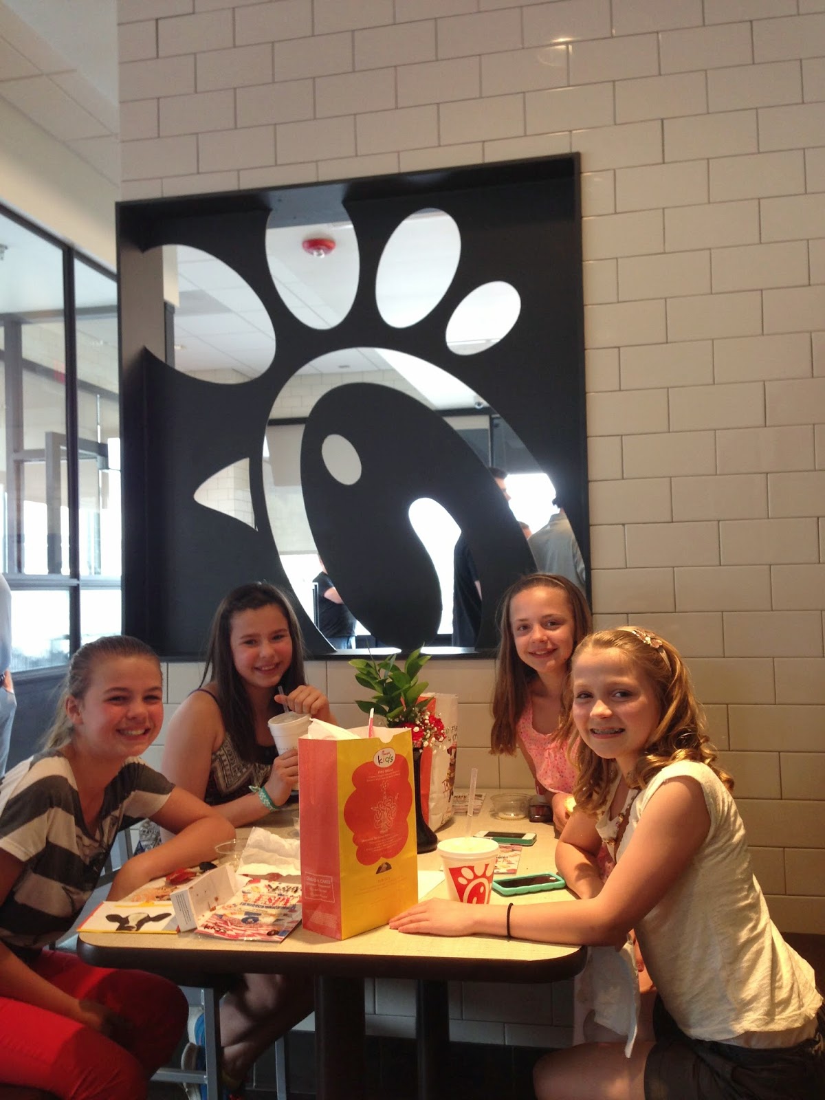
chick fil a!!
who'd a thunk it?
not me.
way to go chick fil a. i am super impressed.


now that you know where i took these, here are a few wider shots of the place:


inspiration is everywhere!!

what do you think?
have you been in any fast food restaurants lately and been pleasantly surprised by the finishes and attention to the design of the interiors?
(i blogged about another fast food resaturant that caught be pleasantly off guard here...)
do nice interiors make you want to eat at a place more often?


Oct 28, 2013

my target sucks

yeah.
that's right.
i said the "S" word.
now---i didn't say TARGET sucks...just the one near my house.
i am at target at least twice a month....sometimes to buy groceries, or a birthday present or clothes. (or whatever any of us go into target to buy before we inevitably end up with a cart full of things we didn't intend to purchase!) while i am there, i always pop over to the "home decor" section to see what nate or threshold has been up to. and usually i see....a sparse selection of the newest offerings, few particleboard bookcases, a dumpy ottoman or two, and a handful of lamps that i swear have been there for 3 years.

last week, i was at a home consultation a good 20 miles form my house, and decided to swing by a target to see if they had any better home stuff. i have been seeing all kinds of cute stuff online, and i wondered if ANY of it was in stores. (cuz it most certainly wasn't in MY target.)
ummm....
i hit the jackpot!
i couldn't believe how much stuff this target carried!
i felt like my target has been cheating on me with other targets in the area! why is all the good stuff going everywhere else?? this target had AISLES of great home decor items! what the??? i mean, take a look:
 i have seen this table online, but it was even prettier in person!


 there was tons of stuff on sale, including these column lamps with lucite bases.

 the contrast stitch on these little ottomans is a nice touch,

 new stuff from nate.


these preserved boxwoods look great ALL year round, but especially festive around the holidays.

 LOVED these frames!
wisteria has some that look very similar, for 2-3 times the price.

 i love the texture that bone inlaid frames give a room.


 is a trend officially over when you see it at places like target?
i still haven't fallen out of love with antlers and deer heads, but this display made me
feel like the trend is a little overdone....

 totally great little set of mirrors!

 and HEY---if you are going to do a "bed in a bag" look, at least start with something like this!
it's graphic without being too much, and the dots will coordinate with any pattern and can easily go masculine or feminine, depending on what it is paired with.

 i have always loved the thomas obrien bedding collections.

 another "seen online but not in person" piece. this little desk is a winner!

 that woven top table would add a lot of texture to any room, and the x base side table is a fabulous mix of texture and style.

 seriously?? my target has like two ottomans in stock. and they are both ugly.

 lovely little tweed chair! it would look so pretty paired with a fun patterned pillow.


 hello floor lamp!
if i didn't already have a lamp that could be your twin, i would have taken you home with me!


 more side table goodness.

 wouldn't these make great hampers?

 tortoise shell mirror.
would look great mixed in with a gallery wall....

 and how fun is this little tray?
makes me think of a certain song that has been playing way too much at my house lately!
(what does the fox say??)


and finally--loved these drink containers.

SO...if the target near your house sucks, like the one near mine---you might want to take a little field trip to the next closest one. you might just hit the jackpot, like it did!

happy shopping!