Showing posts with label entry. Show all posts

Jun 25, 2014

design plans: neutral residence with touches of green, blue + a hint of modern

sometimes, it can be a smart move to tackle several spaces in your home at the same time. usually, i suggest working on 1-2 spaces at a time (it can get overwhelming for your brain and your budget if you bite off more than you can chew!), but there are instances when working on everything at once is the way to go! 

this particular client had already endured a major remodel on the main floor of her historic home, and had made some beautiful choices. she was looking for some guidance on taking the decor to the next level...adding texture, color, and loved the idea of mixing in a few modern elements with her existing traditional pieces.
we worked together on a "super-sized" pinterest board + phone consultation (she also opted to add design boards) that included her entry, family room, breakfast room as well as a hallway and powder room. 

she was drawn to a neutral, texture rich palette with pops of kelly green and navy blue, and i love that she was willing to "go a little crazy" with the light fixtures! whenever i am pinning ideas for a client, i always try to gather an array of styles, whether it is a chair or a light fixture. some are very safe and traditional, and others are meant to "stretch" a persons design sensibilities...introduce them to something that they may never have otherwise considered. this client was right on board with some of my more "funky" choices, and i think the finished rooms will benefit greatly from her willingness to take a risk.

here are the design boards:

 the new lighting in these rooms will add an updated vibe and help make the spaces feel unique.
adding small, interesting vignettes can take a table from feeling dull... to layered and full of texture and interest!


this was a large living room, with a fireplace, french doors going to a porch, an entry from the entry hall, an entry to the kitchen, as well as several windows. rooms like these can be challenging to lay out. we discussed layout options, and the one we both agreed would work the best created three different ZONES in the room---the main seating area, a reading/bookcase zone, and an office area.


my summer is nearly booked, but i still have some spaces left in august! feel free to email me at autumnclemons@yahoo.com to set up a consultation!
you can read about my services here.

now offering:
* the pinterest board can now be modified to fit needs in SEVERAL rooms! for instance...you may need a new light fixture and drapes in your dining room, need paint suggestions and new hardware for your kitchen, and some new pillow and art ideas for your living room! (minor needs, but several rooms)  email me for more information if you are considering this option.


Feb 19, 2014

my new entry rug

i have been deciding what type of rug to put in my entry since we moved in last summer.  most of the rugs that i have fallen in love with have been way out of my price range. i finally decided to take a chance on this rug that i found for a client on overstock.


 i am glad i did.


for a very affordable price (i paid right around $150 for a 5 x 8), i think it adds a soft graphic appeal yet manages to stay simple and classic.
(and HEY--i actually hung some things on my walls this weekend! more on that later...)


the rug is a nice ivory sand beige stipe,  and so far has done a decent job of camouflaging dirt...(although i don't think i would put this somewhere where heavy soiling would take place.)
i picked up the little console at tj maxx home goods for just over $100, and it is just a placeholder until i can get a piece that i LOVE here. the veneer is kinda peeling off the front, and i need to fix it...i may change out the hardware too.
the little stool was a $5 thrift store find that i have recovered.


  there is still SO much to do in this little space. at some future date, we will be adding extensive crown molding. i also want this wall to be a trim feature wall, and will most likely do something like the grid wall that we installed in the dining room in house #5.
we also need to paint the walls, replace the light fixture, get a new piece of furniture, and i will most likely wallpaper the ceiling in here with the yummy malachite wallpaper that i thought about adding here.
once all that is done, i may replace this rug....but until then, it is doing a great job of softening the entry and adding some pattern.


the rug pad is from rug pad USA, a site that offers rug pads for oriental rugs. they have an extensive collection of rug pads for application on hardwood floors, hardwood floors, carpet, laminate, and even outdoors! my rug pad is the eco-cushion pad, and it is surprisingly thick and soft. i love it!
you can find rug pads to fit any of your needs at rug pad usa.

i am also working on a little revamp of my living room, which i will be sharing over the next few weeks. if you follow me on instagram, you will see that i hung a gallery wall over the weekend. i also need to rework the pillows, and add some simple window treatments.  so much to do! isn't it fun?

Jan 27, 2012

judging a book

admit it.
you do it too-
judge the interior of a house based on the way it looks from the outside...

i do it all the time. i love driving through historic and high-end neighborhoods, taking in all of the beautiful architecture. sadly, i am usually disappointed when i catch a glimpse of the interiors, as most homes are  not as glorious on the inside as they are on the outside.

i am fairly certain the interiors of these houses are just as amazing as the exteriors.
happy daydreaming friends!
(source)


( source)


(source)

and just for kicks...what may be the perfect entry:
i liked this image so much, i pinned it THREE times!
(pinning past midnight is sometimes a bad idea)
happy weekend!

Feb 2, 2011

iron mountain

in the last week, i have had several inquiries about the
paint color that i used for the 
front door and surround of house #5.
i finally located my notes, and the color is...
 benjamin moore's
iron mountain
2134-30
it is a really pretty dark grey
with brown undertones.
it always looked pretty....no matter what time 
of day of how the light was shining.
it was a great color for this project.
oh, and here's a before picture,
just on case you wanted to see.
you can read my original post on this entry here.

May 24, 2010

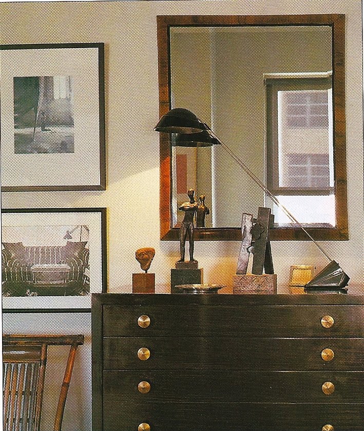
pretty vignettes

sometimes i tear a picture from a magazine
because i just love the
 styling of a vignette.
i like the stacked photos...
hung fairly low, 
and the eclectic, masculine feel of this one.
nice "wow" wallpaper
star light fixture,
gorgeous golden bamboo mirror
and matching lamps 
all had me swooning.
traditional with a little edge.
the greenery is really a nice touch.
love the architectural chairs against the 
chocolate walls,
with pops of chartreuse.
the layers and textures are so interesting in this one.
it really looks like a cozy place to sit...
simple and chic.
love the texture on the walls!
and you can never go wrong with orchids
or a great black and white photograph.
so simple.
so elegant.

Feb 19, 2010

pretty pictures

drool away...
um...love those chairs,
and the zebra rug!
orchids always look perfect.

again with the chairs!
love!

serene and beautiful
just what a bedroom should be.
black walls.
yummy.
love that mirror against the dark walls.
and the graphic element of the fabric.
oh, goodness.
i think this kitchen should be mine.
images found at scott laslie