Jun 29, 2010

wallpapers

it's no big secret that 
wallpaper is BACK.
in a BIG way.
last week, i received an e-mail from a client, 
who had spotted a wallpaper at this site that she loved.
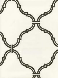
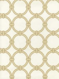
of course i had to take a look for myself... and found some real beauties.
i would love to use one of these in my
home or a project.
i think i would pick...

or maybe even maybe this one.
love this one

and this one too!

of course,this one would look great as well!
and so would this one.
i don't think i have ever seen so many
great, affordable wallpapers in one place, ever!
i'm happy to have a new place to search for great wallpapers.
i'll be back...

Jun 28, 2010

construction office lobby: a peek


so, i have been working on the lobby of a construction firm
for the last little while. i originally suggested a series of 6 or 9
large, framed abstract photos taken on construction sites
for this wall of the lobby. 
when the cost of framing turned out to be way over budget,
a collaborative meeting between myself, the vp of construction, 
and the design/build manager, turned up a much more
interesting and cost effective method.
(one reason why i am a firm believer that collaboration with the
client always turns out a more personal, and unique solution!)
we ultimately decided to mount the photos on three panels of metal screening.
this metallic "screen" is used to separate rocks at the
company's rock pit. the photos will be sandwiched in between
wood and glass, and mounted to the screening with a bolt at each corner.
 we will be using three different gauges
of the screen...the first panel will be the largest, 
and the last will be the smallest, 
with the medium in between.
i stopped in the office on friday, and the screens had been mounted.
i was super excited! 
can you see the difference in the gauges of the screens now?
the vp and design/build manager have done a fabulous job of bringing
our design vision to a reality! check out those bolts that are holding the 
VERY heavy screening to the wall. aren't they incredible?
 as soon as the photos are mounted, 
and the rest of the furniture is received, 
i will share some more pictures with you.


Jun 25, 2010

Jun 24, 2010

saltillo tile

a new client of mine has saltillo tile in her home.
it adds such charm and warmth into any space,
and i am looking forward to designing her tiled room.
her floors reminded me of a home that my husband built in tennessee.
the homeowners fell in love with the tiled floors of homes they had
visited in the south of france,
and wanted to replicate that 
warmth and timeless appeal in their home.
isn't this arch fabulous?
my husband dreams up the most glorious things!
don't believe me? check out this ceiling in house #5.
the gates actually function--the homeowners have
several dogs, and the gates keep them out of (or in)
the kitchen area.
the saltillo tile that the homeowners chose
was handmade in a tiny village in mexico. it was hand cut, and
then laid out in the sun to dry. if you look closely at it,
you can see chicken and dog prints all over the tile!
the homeowners love this detail, as they are animal lovers.
no, i am not the interior designer of these spaces...
i was involved in the early stages of the design process,
but when i got pregnant with baby #3, i decided to
step aside and concentrate on my family. 
i think the interiors turned out lovely.
here is a view of the front of the house...
because i know all of you were wondering!
it is even more beautiful in person.
here is a view of the back...
and a view of the view!
this, my friends, is why i miss living in east tennessee!
to see more pictures of this home, click here.

and many thanks to laurie at tip junkie,
who featured my chinese themed
birthday party today! you can check it out here.

Jun 23, 2010

design dazzle

just wanted to let you know
that my feature of grady's room has
been posted today at 
design dazzle!
check it out here


folding screens

another decor item i have an affinity for...
the folding screen.
i love folding screens for several reasons.
i love that they can define a space,
and add softness, interest, texture 
to any boring corner.
i really like the look of antiqued mirrors...
and on this folding screen, they are perfection.

i love the shape created with the nailhead trim.

can you imagine this room without the folding screen?
it really is the reason this angled seating arrangement works!
this one is nearly the same color as the walls,
and adds texture and interest to an otherwise boring corner.
i've seen this picture around the internet a million times.
there are so many things to love about this room...
but what really caught my eye (any why i ripped it out
of TH) was that silver-leafed folding screen!
it. is. gorgeous.
the fabric on this one is super fun.
this one is so simple, but really does a great
job of adding interest.
i love the unexpected height of this one!
go martha!

most of these pictures are from my "stash", and i am not 100%
certain where they all came from. i know that a few are from traditional home,
house beautiful and martha stewart living. sorry! i am trying to get better
about listing sources, and whenever i know where a picture is from, i will add a link.

Jun 22, 2010

dream laundry room

my laundry is backing up again.
the kids are home for the summer,
and i am spending far too much time neglecting my 
household duties. in our rental house, the "laundry room" is a
pass-through space on the way to the garage.
no door.
no window.
perfectly. blah.
i dream of a laundry room with 
some color
and texture, 
a fun rug, 
and an amazing light fixture.
maybe a little something like this:
dash and albert birmingham citrus rug
faucet from waterworks
wallpaper found here
quadrille fabric
anthroplogie knob
amazing light fixture


yes.
i am certain that if i had a laundry room
that looked like this, my laundry would
always be done. always.
at least that's what i like to tell myself...

Jun 21, 2010

father's day gift tutorial

it is almost mean that i am posting this today,

since father's day was yesterday!
of course, we could also consider it an
extremely generous gesture, as you now have over
51 weeks to gather supplies and
prepare to tackle one of these little projects!

in any case, here are some instructions on how to make the boxes...
let's start with the striped box:

you will need:
a paper mache box
an old mens shirt
a tie
some ribbon
(i bought mine at a thrift store. after trying
this project with a normal width tie, i found that the
proportions look best with a tie that is on the thin side)

you will also need:
adhesive (i used spray mount, tacky glue and a glue stick)
and scissors.
begin by cutting the face fabric (silk) away from the tie.
there are a lot more layers than you think!
carefully cut away all stitches holding the tie together, 
being careful not to puncture the silk.
once you have all of the layers removed,
cut the bottom portion of the silk off,
and iron it.
also cut a strip from the bottom of the shirt and iron it.

i took my supplies outside because:
a) it was a gorgeous day, and
b)i knew i would be using spray mount.
lightly spray the top lid of the box with spray mount 
(both the inside and the outside)
and start wrapping the silk around the lid.
wrap it like you would a gift,
and trim off any excess.
trace the lid onto a scrap of the shirt,
and cut it just a little smaller  to fit inside the lid.
the tacky glue can be used to adhere to edges down.

i lightly sprayed only the outside of the box,
and used a glue stick for most of the bottom.
the excess was trimmed off the top edge,
and a very light strip of tacky glue was applied.


for the wood box, i simply stained it using
stain/poly mix. i bought this at lowes, and it
cost about $4.50.
ta-da!

to give the tie a little more stability,
i traced it onto a thin piece of cardboard,
and cut it just a little bit smaller.

in order to get the cardboard in, you will
have to remove a few of the stitches on the back side of the tie
that hold it all in place. trim the cardboard as you go to get a good fit.

also, you will need to angle the top portion of the
cardboard in order for it to fit inside the
tie once it's been tied.
tie the tie!
if you need a little help, (like i did)
go to you tube and find an instructional video.
once i had the tie on the box, the thin part 
was hanging out about 4", so i cut it off,
and tucked it into the back of the tie.


and sadly, i don't have a tutorial for the boutonniere!
it was one of those projects that i did kinda
spur of the moment. if i have enough requests, i will
post a tutorial later.